



What defines an abstract background
An abstract background has no object to recognize. It works with lines, facets, gradients, light and blur. The eye reads it as atmosphere, not as a picture, so it stays behind your text instead of competing with it.
The collection covers several directions:
- Abstract blue background with wavy lines: thin flowing lines in deep blue and cyan on a dark navy field
- Abstract background with blue triangles: a low-poly mosaic of blue triangles from navy to sky blue
- 9 bokeh backgrounds: defocused gold and teal light circles on a dark field
- Subtle grain gradient set: a soft gradient from indigo to coral with fine film grain
- Night city bokeh background: blurred night city lights and headlights turned into amber and blue bokeh
- Abstract lighting background set: rendered glass ribbons glowing violet and cyan in dark space
- Soft gradient mesh backgrounds: blurred blobs of violet, peach and teal blending into an airy mesh
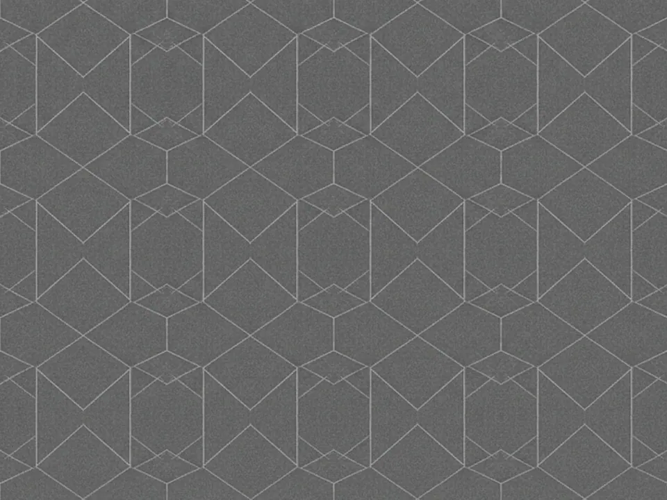
- Abstract geometric line pattern: thin white hexagon and triangle outlines on charcoal
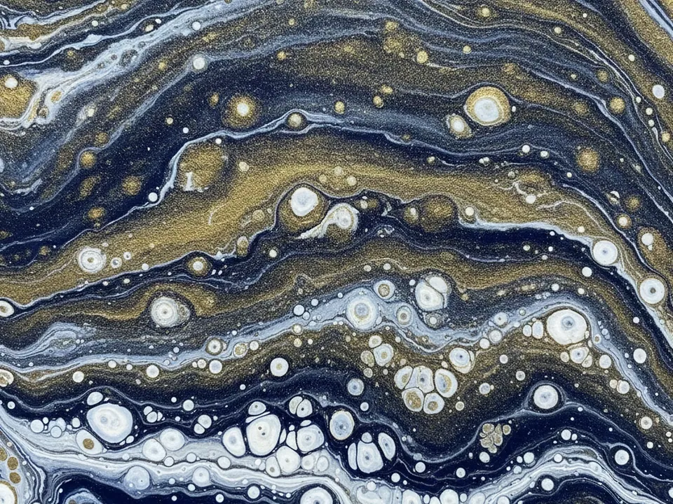
- Fluid ink marble background: swirling navy, gold and white ink cells like a marbled pour
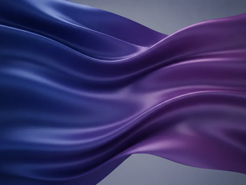
- 3D abstract waves background: rendered satin waves in deep blue and violet with glossy folds
All of these images avoid hard focal points. Detail is spread or softened, so a crop from any part of the frame still looks intentional. That is what makes abstract backgrounds flexible: one file can serve a wide banner, a square post and a tall mobile screen.

Where abstract backgrounds work
Abstract images suit products with no single photo to show. Software, finance, events and agencies use them often. They also work as a neutral base for slides, social posts and email headers.
Dark fields with grain or a glass render carry light type well. A gradient mesh feels calm and modern. Bokeh adds warmth and a sense of evening. Triangles and line patterns read as structured and technical, while fluid marble feels organic and premium.
Choose a palette close to your brand colors so the background supports the identity rather than adding a new one.

How to pick and use one
Start with the job the background has to do, then match the style to it.
| Need | Good fit | Watch for |
|---|---|---|
| Hero with a headline | Wavy lines, gradient mesh, grain gradient | Keep the bright area away from the text |
| Event or night mood | Bokeh, night city bokeh | Busy highlights behind small type |
| Tech or data product | Triangles, line pattern, 3D light, waves | Strong facets near body copy |
Every file is a 1600x1200 JPG. Use background-size: cover so it fills the section at any width, and set background-position to keep the calm part behind your text. Check that body text reaches a 4.5:1 contrast ratio against the lightest pixel it sits on. A semi-transparent overlay often solves this without changing the image.
For speed, compress the file to the largest size you display and serve a smaller version on phones with image-set() or media queries.