What is in the set
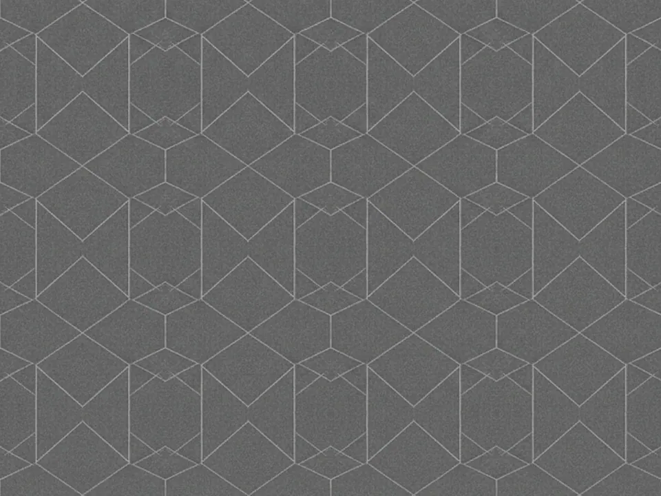
The set has three JPG files at 1600x1200 px. Each one shows a precise vector style line pattern: thin white lines forming interlocking hexagons and triangles, spread evenly across a deep charcoal background.
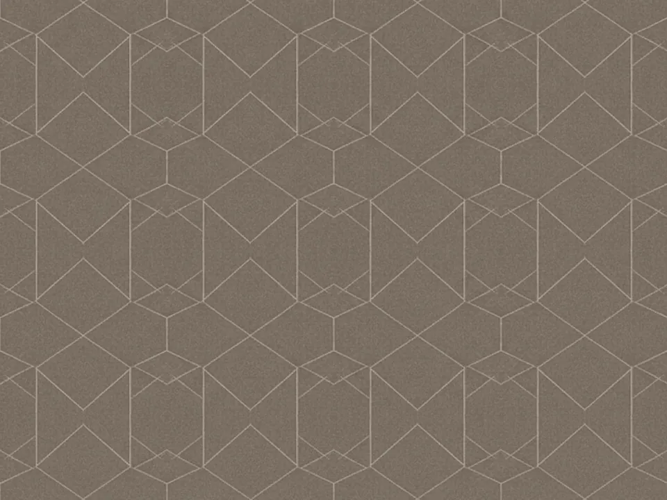
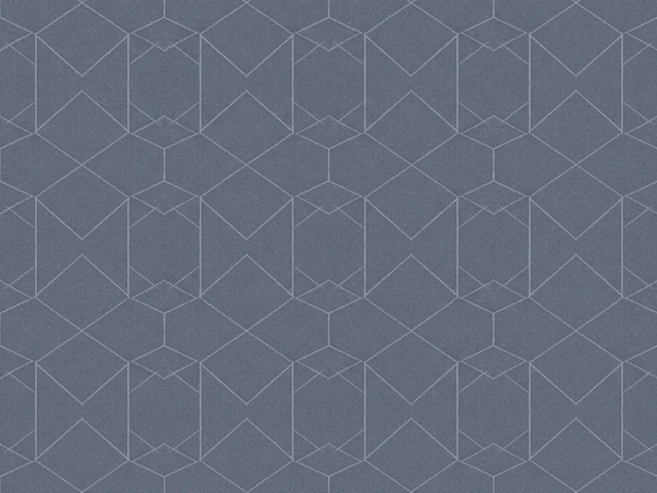
The three variants keep the same structure and shift in warmth and depth, from a neutral charcoal base to warmer and cooler readings of the same lines. Because the pattern is drawn with hairline strokes rather than filled shapes, it stays legible at both large hero sizes and smaller card sizes.
The lines are evenly spaced with no focal point, so you can crop any section of the frame and keep a balanced pattern, including narrow strips for sidebars or footers.
Where it works
The pattern reads as precise and technical, which suits:
- Tech, SaaS and developer tool dark sections
- Finance, analytics and dashboard product pages
- Conference, webinar and event decks
- Dark mode hero banners and footers
It is listed in both abstract backgrounds and retro backgrounds. For a softer abstract option without hard lines, see the soft gradient mesh backgrounds.
How to use it in CSS
Because the lines are thin and the background is dark, you can tint the whole image to match a brand accent with background-blend-mode instead of keeping it plain white on charcoal.
.panel {
  min-height: 480px;
  background-color: #141821;
  background-image:
    linear-gradient(0deg, rgba(79, 140, 255, 0.35), rgba(79, 140, 255, 0.35)),
    url("geometric-lines-02.jpg");
  background-blend-mode: screen, normal;
  background-size: cover;
}
The screen blend mode lightens the lines toward the accent color while leaving the dark charcoal mostly unchanged, so the pattern still reads as fine lines rather than a flat tint. More on blending backgrounds is in background blend mode.
Pairing and type tips
White or very light grey text sits comfortably on the charcoal areas, since the lines are thin enough not to break up letterforms. Keep heading weight medium to bold, since thin type can start to compete visually with the hairline strokes.
Use one accent color, matched to your brand, for buttons, links and small highlights. Avoid adding a second busy pattern, such as a grid or dot texture, on the same section, the page will read as cluttered rather than technical.
For long sections of body copy, move to a solid dark card so the lines do not run directly behind paragraphs. The pattern works best behind short headlines, stat callouts and navigation bars rather than full articles.