



What defines a retro background
Retro here means the bright, graphic end of nostalgia: flat shapes, saturated color and neon light, built the way posters and album covers from the 1980s and early 1990s were built, rather than the softer aged look of vintage retro.
The set includes:
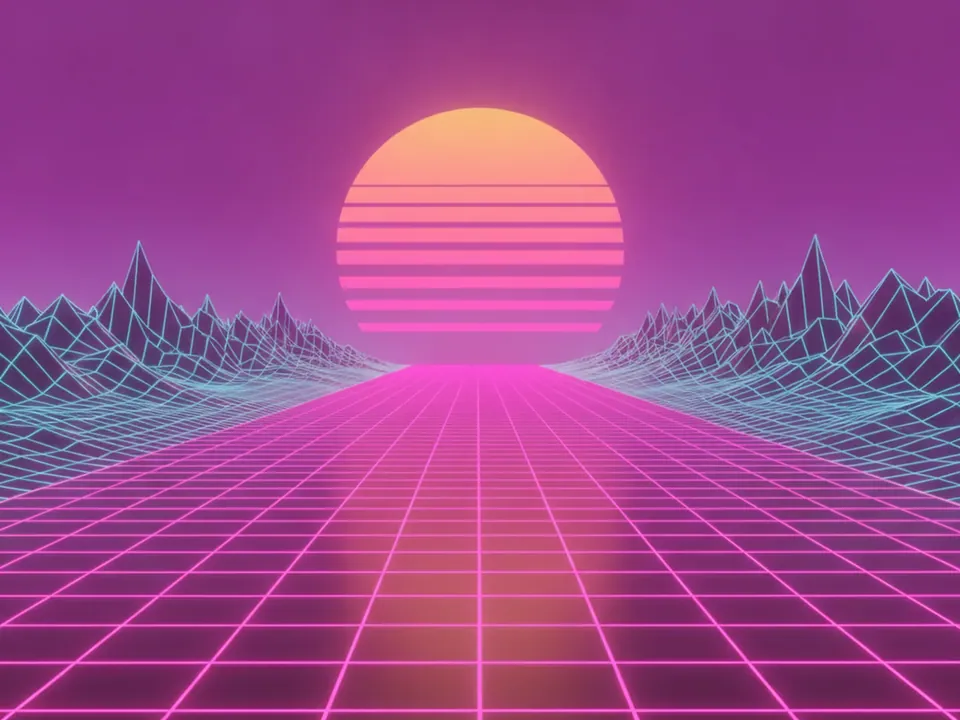
- Synthwave grid background: a neon magenta grid floor and striped sunset sun, 1980s style
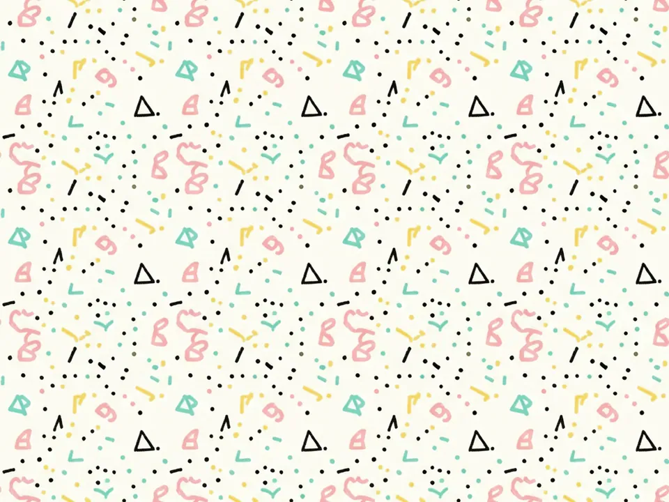
- Memphis pattern background: 1980s squiggles, dots and zigzags in pink, yellow and teal
- Retro sunburst background: faded orange and cream sunburst rays over worn paper
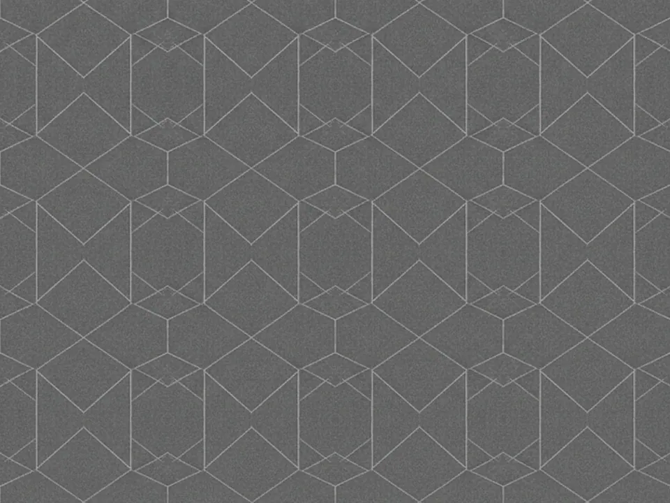
- Abstract geometric line pattern: thin hexagon and triangle outlines on charcoal
- Pop art halftone background: red halftone dots on a bright yellow field, comic book style
- 90s geometric pattern background: bold zigzags and confetti shapes in teal, purple and magenta
- Neon glow background: glowing pink and electric blue neon tube arcs on black
Color is doing most of the work in this category. Each background commits to two or three strong hues, which is what reads as a specific decade rather than a generic bright pattern.
Where retro backgrounds work
Retro suits music, gaming, streetwear, nightlife and any product that wants energy over subtlety. Synthwave and neon glow fit electronic music, gaming and anything set at night. Memphis and 90s geometric patterns fit playful consumer brands and youth-focused products. Pop art halftone fits comic, print and event design.
These backgrounds are busy by design, so they work best as a full hero statement or a section divider rather than behind dense paragraphs. Keep body copy on a plain panel and reserve the pattern for headlines, buttons or the page edges.
How to pick and use one
Match the pattern to the decade and energy you want.
| Mood | Background |
|---|---|
| Night, electronic | Synthwave grid, neon glow |
| Playful, graphic | Memphis pattern, 90s geometric |
| Print, comic | Pop art halftone, geometric line pattern |
Because these images are high contrast, test body text at a 4.5:1 ratio rather than assuming the dark areas are enough. A plain color panel for the text block usually reads better than text directly on the pattern:
.panel {
  background: #0b0b14;
  color: #fff;
  border-radius: 12px;
  padding: 2rem;
}
.hero {
  background-image: url("/img/synthwave-grid.jpg");
  background-size: cover;
}