What is in the set
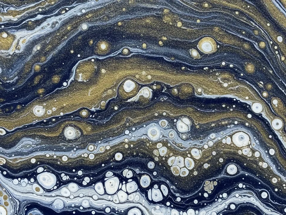
The set has four JPG files at 1600x1200 px, each a macro shot of fluid acrylic pour art. Deep navy, gold and white ink flow together in organic, cell like shapes that fill the whole frame with no visible canvas edge.
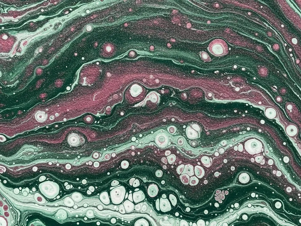
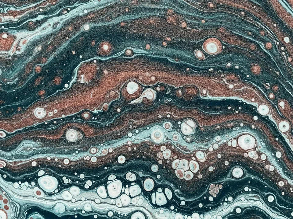
The four variants are hue shifts of the same pour: the original navy and gold reading, plus rose, violet and ember leaning versions where the warm and cool balance of the ink changes. The swirl pattern itself stays similarly organic across all four, so you can swap variants without changing the composition.
Because the cells are irregular and the colors blend smoothly, the image reads as rich and liquid rather than sharp or graphic, closer to stone or paint than to a flat digital pattern.
Where it works
Fluid marble suits content that wants to feel premium and tactile:
- Beauty, skincare and cosmetics product pages
- Fashion, jewelry and accessory sites
- Wedding invitations and event stationery
- Editorial and lifestyle article headers
It is filed under abstract backgrounds. For a calmer, less saturated abstract option, see the soft gradient mesh backgrounds.
How to use it in CSS
The cells in this image are large enough that you can pick a specific area to sit behind a heading by adjusting background-position per variant, rather than always centering the crop.
.hero {
  min-height: 60vh;
  background-color: #10131c;
  background-image: url("fluid-marble-03.jpg");
  background-size: cover;
  background-position: 70% 35%;
}

@media (min-width: 1200px) {
  .hero {
    background-position: 50% 20%;
  }
}
Shifting background-position at a wider breakpoint keeps the richest gold swirl near the text instead of letting it drift off screen as the viewport widens. For picking crops across more breakpoints, see responsive background images.
Pairing and type tips
White or pale gold text reads well over the navy areas of the pour, while dark text suits the lighter cells. Check your exact placement against the 4.5:1 contrast ratio for body text, since the ink has both light and dark pockets in the same frame.
Thin, elegant serif or script type matches the liquid feel better than bold geometric sans fonts. Keep ornamentation minimal elsewhere on the page, the marble itself is the decorative element.
For product shots placed on top, use a soft drop shadow rather than a hard edge, so the product feels set into the surface instead of pasted over it.