What is in the set
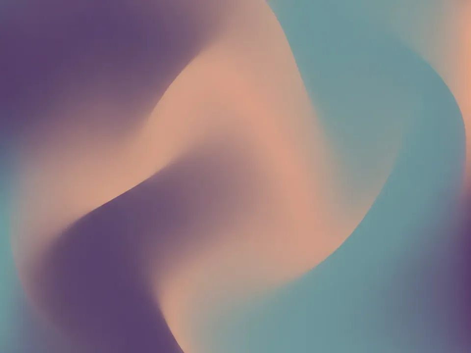
The set ships as six JPG files at 1600x1200 px. Each one shows a soft gradient mesh: large, blurred blobs of color flowing into one another with no hard edges, no shapes and no visible grain.
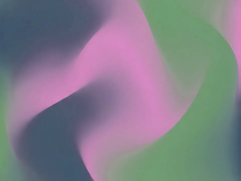
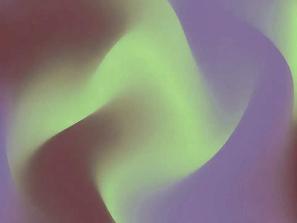
The six files are tone shifts of the same mesh, starting from the original violet, peach and teal blend and moving through warmer and cooler variations, including rose and ember leaning versions. Because the blobs are large and soft, every variant stays calm at any crop.
There is no texture or noise to notice up close, which makes this set different from the grain and fiber based backgrounds on the site. It reads as color and light, not as a surface.
Where it works
A gradient mesh gives a page color and depth without competing with content. It fits:
- SaaS, app and product landing pages
- Hero sections that carry a heading and a short line of text
- Slide decks, pitch covers and title slides
- Social share cards and open graph images
It sits in abstract backgrounds. For a similar soft blend with visible film grain instead of a clean gradient, compare the subtle grain gradient set.
How to use it in CSS
Because the colors shift gradually, you can safely scale the image well past its native size without banding becoming obvious, which makes cover a good default for full width heroes. Set a fallback color close to the mesh's mid tone so the first paint is not jarring.
.hero {
  min-height: 70vh;
  background-color: #7a5a86;
  background-image: url("gradient-mesh-01.jpg");
  background-size: cover;
  background-position: center;
}

.hero__title {
  color: #1b1326;
  text-shadow: 0 1px 2px rgba(255, 255, 255, 0.35);
}
Dark text on the lighter parts of the mesh usually clears 4.5:1 contrast, but check the exact spot behind your heading with a contrast checker, since the blobs are not uniform. For responsive crops across breakpoints, see responsive background images.
Pairing and type tips
Keep layout minimal: one heading, one short line, one button. A busy page on top of a gradient mesh fights the background's own softness. Use plenty of white space around the text block instead of a boxed card.
Typography should be light in weight, with generous letter spacing on headings. Avoid heavy drop shadows or thick strokes, they look out of place against a soft blend.
Pick one accent color from the mesh for buttons and links, and leave the rest of the UI neutral. If you need a darker variant for a footer or a dark mode section, use one of the deeper tone shifts rather than adding a dark overlay on top of the lightest file, since that tends to muddy the blend.