What is in the set
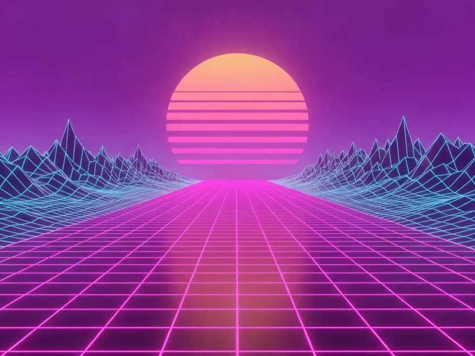
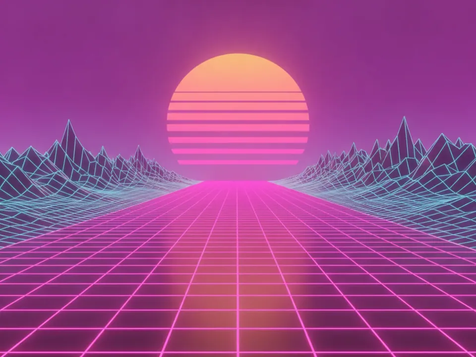
Two variants of one synthwave scene. The composition is the same in both: a perspective grid floor in magenta neon, a large sun cut by horizontal stripes, wireframe mountains on each side, and a sky that fades from purple to pink. There is no text in the image.
- Dusk: brighter pink sky, sun close to the horizon.
- Night: deeper purple sky, stronger glow on the grid lines.
Both are 1600x1200 px JPG. Browse more 80s and 90s styles in retro backgrounds.
Where it works
Synthwave carries a clear mood: arcade, VHS, night drives. Use it when the content shares that mood. Album and single pages, retro game launches, themed parties and stream intros are natural fits.
It is a poor fit for forms, long reading or pricing tables. The grid has strong converging lines that pull the eye to the center. Use the image as a hero and switch to a solid dark color for the content below.
How to use it in CSS
The horizon and sun carry the composition, so control what stays visible when the box changes shape. On wide, short heroes, cover crops the top and bottom. Anchoring at center 65% keeps the sun and the first rows of the grid in view. On tall mobile screens the sides are cropped instead, so the mountains go first and the sun stays centered.
.hero-synth {
  min-height: 70vh;
  background: #1a0b2e url("/img/synthwave-night.jpg") no-repeat;
  background-size: cover;
  background-position: center 65%;
}

@media (max-aspect-ratio: 3/4) {
  .hero-synth {
    min-height: 60vh;
    background-position: center;
  }
}
The dark purple color in the shorthand keeps the section on theme while the file loads. Our CSS background image guide explains how background-position works with cover.
Pairing and type tips
Put the headline in the sky area, above the sun. The sky is the calmest part of the image. White or pale cyan text reads well on the night variant. On the dusk variant, add a soft dark text shadow or a subtle dark panel. Glow effects can make text look bright while the measured ratio stays low, so follow our notes on text contrast on backgrounds and test the real pixels.
Wide, bold display fonts and chrome style lettering match the era. Keep body copy in a plain sans serif. Neon cyan and hot pink make good accent colors for buttons and links.