What is in the set
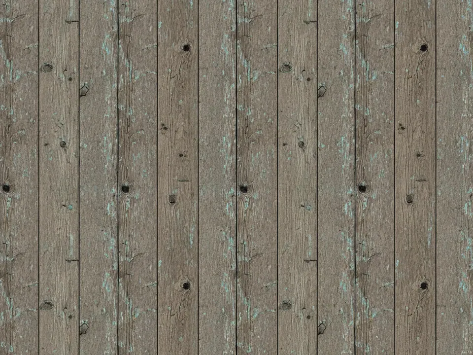
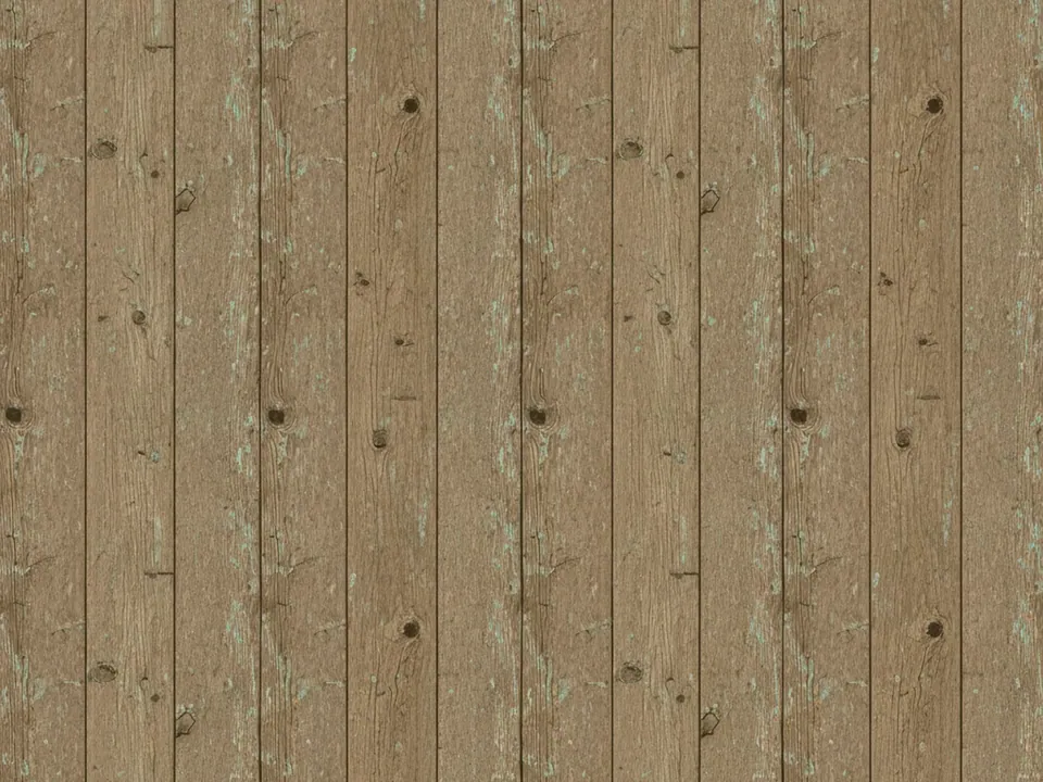
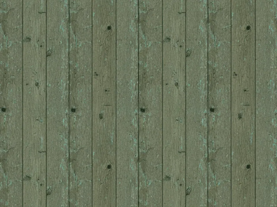
The set contains nine JPG files at 1600x1200 px. Each one is a flat, top-down photo of old wooden planks under even light. You can see open grain, dark knots, splits along the boards and patches of worn paint that has mostly flaked away.
The variants differ in tone and crop. Some are pale and dry, some darker and warmer, and the plank direction and paint residue change from file to file. Because the light is even, none of them has a hot spot that would pull focus from your content.
The texture fills the whole frame from edge to edge, with no table borders, props or shadows. That makes the files easy to crop. You can cut a narrow banner, a square social tile or a tall phone background from any of them and still get believable wood.
Where it works
Weathered wood says handmade, local and lived in. It works best when the content is physical:
- Menus, chalkboard style specials and cafe websites
- Flat lay product shots for crafts, coffee and food
- Invitations and signage for rustic events
- Headers for recipe, garden and DIY blogs
The set sits in both grunge backgrounds and wood backgrounds. If you need a cleaner, newer surface, look at the light oak planks.
How to use it in CSS
For a long page, you can repeat the texture instead of stretching it. Scale it down with a fixed background-size and let it tile. These photos are not built as seamless tiles, so check the joins at your chosen size.
body {
  background-color: #6b5844;
  background-image: url("wood-9-05.jpg");
  background-size: 800px 600px;
  background-repeat: repeat;
}

.menu-card {
  max-width: 640px;
  margin: 64px auto;
  padding: 40px;
  background: rgba(250, 246, 238, 0.94);
}
A tile at half size keeps the grain detailed and reduces the visible repeat compared with small tiles. Where a join shows, a plank edge often hides it. If you need a perfect repeat, the guide to seamless tileable textures shows how to prepare one.
Pairing and type tips
Wood grain is busy, so do not set body text directly on it. Use a light card, as in the snippet, or a dark one with cream text. Hand-lettered or slab serif headings suit the material, while body text should stay a plain, readable serif or sans.
Pick colors from the wood itself: a deep brown for text, a muted green or brick red for accents. Real objects, such as cups, herbs or tools, look natural when placed on top.
For product photos, shoot or cut out items with soft, top-down light so the shadows match the flat lighting of the planks. Hard side light on the product next to even light on the wood looks pasted in. Matching the light direction does more for realism than any filter.