What is in the set
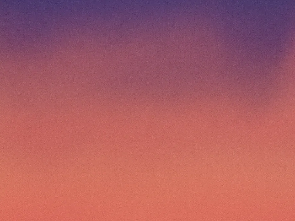
The set contains six gradient backgrounds. Each one moves from deep indigo into warm coral, with a layer of fine film grain across the whole frame. The variants differ in direction, in how far the coral reaches, and in overall brightness.
The grain is the point. A clean digital gradient often shows visible steps, called banding, on many screens and after JPG compression. Fine noise breaks those steps up, so the transition reads as smooth. Every file is 1600x1200 px JPG and part of both our background textures and abstract backgrounds collections.
Where it works
Grain gradients are built for minimal layouts. They give a page warmth without adding objects that fight your content.
- Software landing pages with one headline and one button.
- Mobile onboarding screens behind short copy.
- Email and newsletter headers, cropped to a wide strip.
- Presentation title slides and section dividers.
They also fit brands that use indigo, violet or coral in their palette. If your brand colors are far from that range, a tinted overlay can pull the image closer.
How to use it in CSS
Use image-set() to serve a lighter file where it is enough and the full file on dense screens. Put a plain CSS gradient first as a fallback for browsers that do not support image-set(). The later declaration wins where it is understood.
.hero-grain {
  background-color: #3b2f6b;
  background-image: linear-gradient(135deg, #2e2a6e, #e9806e);
  background-image: image-set(
    url("/img/grain-gradient-800.webp") 1x,
    url("/img/grain-gradient-1600.jpg") 2x
  );
  background-size: cover;
  background-position: center;
}
Do not compress the JPG too hard. Aggressive compression smears grain into blotches. Our guide to fast background images explains how to balance file size and quality.
Pairing and type tips
White text reads well over the indigo side. Over the coral side, contrast drops, so keep headlines on the darker half or check the ratio. Body text needs 4.5:1, large text needs 3:1.
Pair the set with a clean sans serif and generous spacing. Buttons in solid white or near black stand out more than colored buttons, which tend to blend into the gradient.