What is in the set
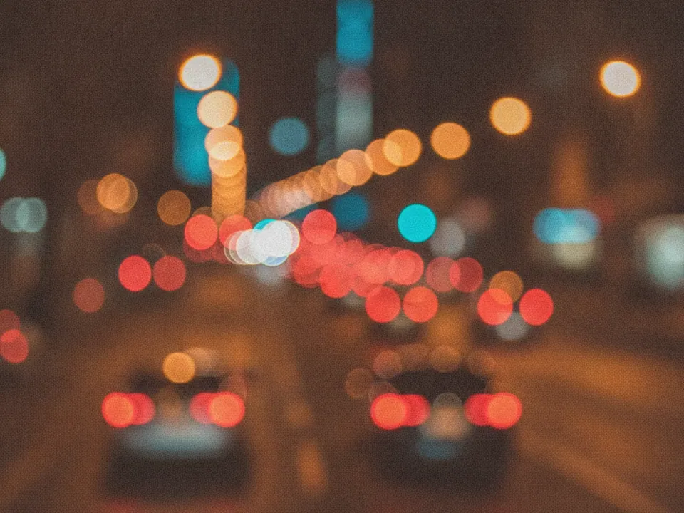
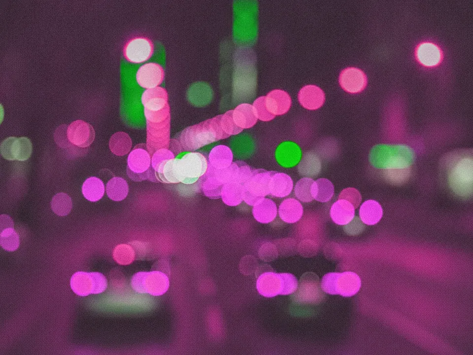
Two variants of a night street photo shot far out of focus. Nothing is sharp. Every light source turns into a soft circle, and the circles overlap in amber, red and blue against dark areas.
- Warm: amber and red dominate, like headlights and tail lights.
- Cool: more blue neon, darker overall.
Both are 1600x1200 px JPG. Find more in urban backgrounds and in our 9 bokeh backgrounds set, which uses golden and teal orbs instead.
Where it works
Bokeh suggests a city and a mood without showing any detail. No faces, no brands, no street names. That makes it a safe backdrop for nightlife, taxi and delivery services, concerts, late opening hours and evening campaigns.
The blur also helps text. A sharp photo competes with letters. A blurred one only adds color and light, so a headline can sit on top with the right overlay.
How to use it in CSS
Bright bokeh circles can land right behind your text. Add a gradient overlay as the top background layer. A dark gradient from the bottom left keeps the text area dark, while the lights stay visible on the other side.
.hero-night {
  min-height: 80vh;
  display: flex;
  align-items: flex-end;
  padding: 6vh 6vw;
  color: #fff;
  background:
    linear-gradient(20deg, rgba(8, 10, 20, 0.85) 0%, rgba(8, 10, 20, 0.4) 45%, rgba(8, 10, 20, 0) 75%),
    url("/img/night-bokeh-warm.jpg") center / cover no-repeat,
    #0c0e18;
}
In the background shorthand, the color must come last, in the final layer only. Text sits in the bottom left, where the overlay is darkest. Our article on text contrast on backgrounds explains how to check the result.
Pairing and type tips
White text over the darkened area is the simplest option. Light weights can look thin against glowing circles, so use regular or medium weights for body text and bold for headlines.
Pick one accent from the photo: amber for a warm brand, electric blue for a tech product. Avoid red buttons on the warm variant, since they blend into the tail lights. For delivery tips, see fast background images.