
What defines an urban background
Urban backgrounds picture the city, either from a distance as a skyline or up close as a street-level surface: brick, paint and asphalt that have seen years of weather and foot traffic.
The set includes:
- City landscape background: a flat vector-style city skyline silhouette against an evening sky
- Night city bokeh background: blurred street lights and headlights forming amber and blue bokeh
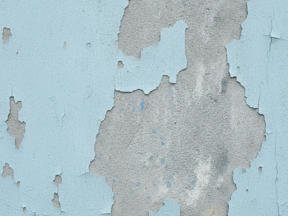
- Peeling paint wall texture: cracked, peeling pale blue paint over grey plaster
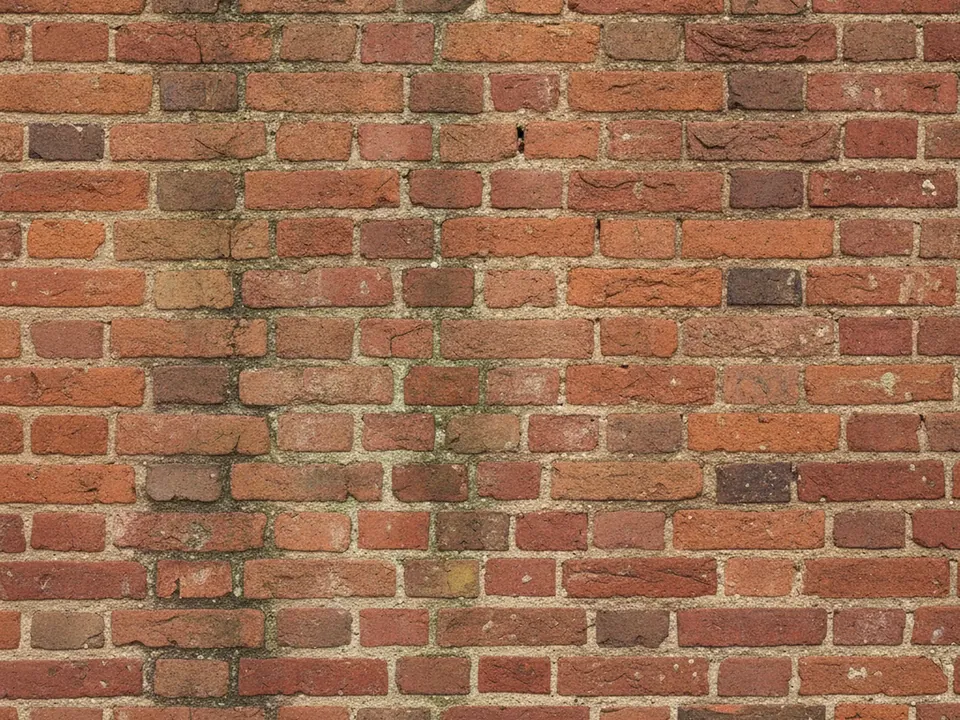
- Red brick wall background: an old red brick wall with worn mortar and chipped bricks
- Asphalt road texture: dark grey asphalt with fine gravel and tiny cracks
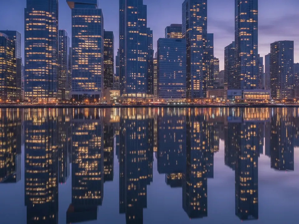
- City skyline at night background: a modern skyline at blue hour with lit office windows and water reflection
The skyline images are calm and work as a wide backdrop, while the surface textures are closer and busier, suited to smaller sections or a card rather than a full page.

Where urban backgrounds work
City skylines suit real estate, business travel, co-working, relocation and any brand that wants to signal a specific place without naming it. The flat vector skyline is quieter and reads at any size, while the night skyline and night bokeh images carry more mood and depth, good for an evening event or a nightlife brand.
Brick, peeling paint and asphalt suit street culture, music, coffee shops with an industrial look, and construction or trades businesses. They read as grounded and physical rather than polished, closer to the grunge category but tied specifically to city surfaces.

How to pick and use one
Decide if you need a skyline or a surface, then narrow by mood.
| Need | Background |
|---|---|
| Clean daytime hero | City landscape background |
| Evening or night mood | Night city bokeh, city skyline at night |
| Street-level texture | Red brick wall, peeling paint, asphalt |
Skyline images already have a dark sky band near the top, which is usually the best place for light text:
.hero {
  background-image: url("/img/city-skyline-night.jpg");
  background-size: cover;
  background-position: top;
}
For brick and asphalt, check contrast directly against the mortar lines or gravel flecks, since those lighter spots can sit right behind a letter even when the average tone passes a 4.5:1 ratio.