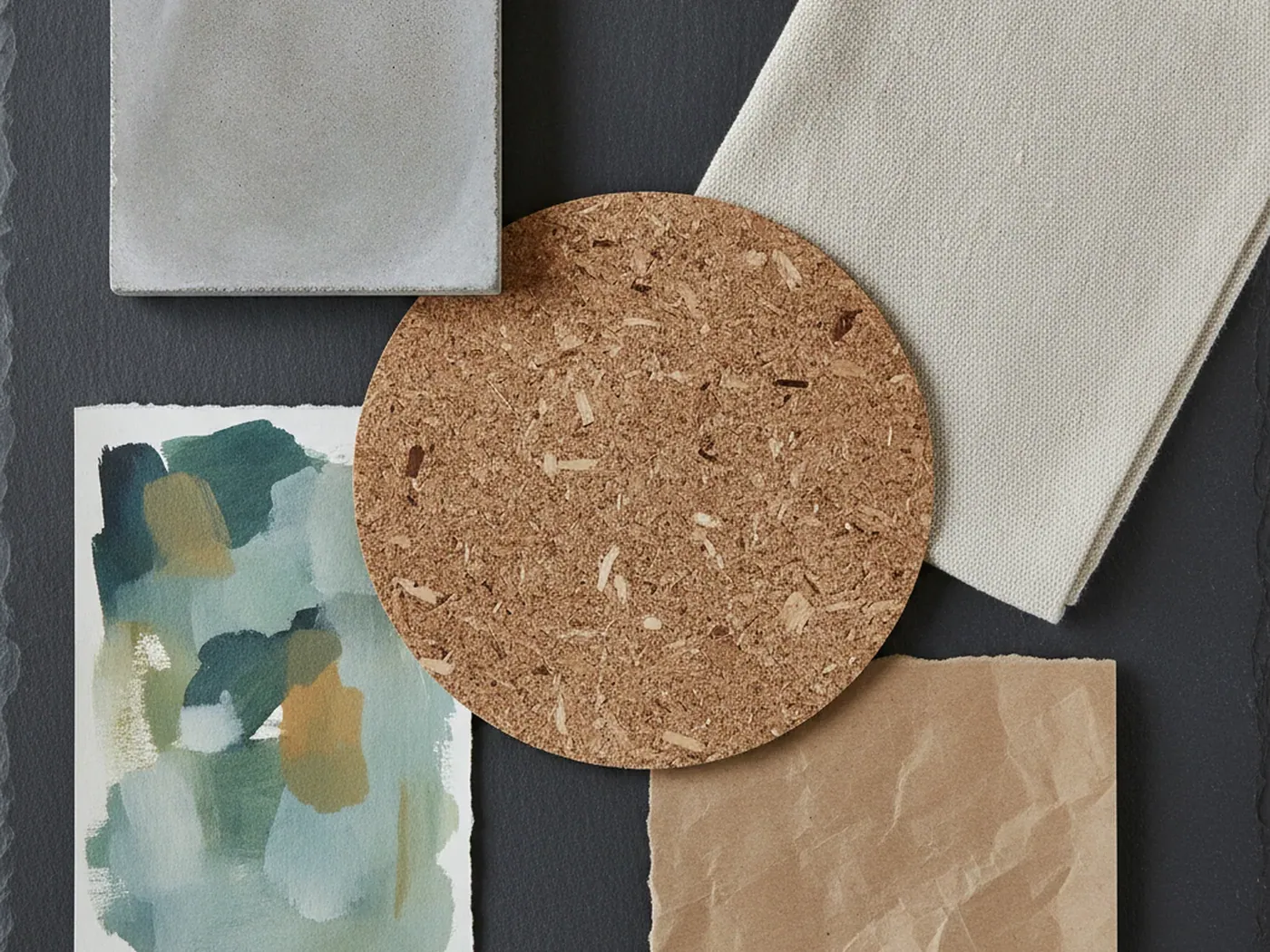
- Start from brand tone, then choose the material. Wood, paper and metal each say something different.
- Tint or grade the background toward your palette instead of adding new colors.
- One or two background styles per site is enough. Use them on purpose, not everywhere.
- Leave backgrounds out of forms, dense text and data. Plain surfaces read faster.
Start from tone, not from the image
Before you browse, write down three words that describe the brand's voice. Calm, technical, warm, playful, premium, rugged. Those words narrow the search faster than any category.
Materials and styles carry their own associations. These are common readings, not rules:
| Brand tone | Materials and styles that fit |
|---|---|
| Calm, natural, Nordic | Light wood, linen, soft paper |
| Premium, crafted | Dark wood, deep gradients with fine grain |
| Technical, precise | Brushed metal, clean geometric abstracts |
| Raw, industrial | Concrete, rust, grunge |
| Nostalgic, handmade | Aged paper, sepia print textures, sunbursts |
| Bold, playful | Memphis patterns, synthwave, bright flat graphics |
A furniture studio and a fintech dashboard can both want warmth. The studio might use light oak planks in a hero. The dashboard would show warmth through a soft gradient and leave materials out entirely. Tone guides the choice, but context decides how literal it gets.
Audience matters as much as voice. A rugged texture can feel honest to one audience and careless to another. Look at the brand's existing photography, type and logo. The background should sound like them, only quieter.
Pull color from the palette
A background should look like it belongs to the brand palette, not like it brought its own. Photos and textures rarely match brand colors out of the box. You have several ways to bring them in line:
- Tint with a layer. Put a semi transparent brand color over the image as a CSS layer. It shifts the whole image toward the palette.
- Use a blend mode.
background-blend-mode: multiplywith a brand color darkens and colors the texture in one step. - Grade the file. Adjust hue and saturation in an editor once, then export. This gives the most control.
- Desaturate. A grey or near grey texture takes on any color you place over it.
.section--brand {
  background-color: #1d3557;
  background-image: url("brushed-metal.jpg");
  background-size: cover;
  background-blend-mode: multiply;
}
Neutral materials are the easiest to brand. A brushed metal texture is almost colorless, so a multiply blend turns it into a branded surface with real depth.

Restraint is the brand skill
A strong background is loud. If every section has one, none of them stands out and the page feels heavy. The content also has to fight for attention.
Some working limits:
- Use one hero background per page. Let the sections below run on plain or lightly tinted surfaces.
- Reserve image backgrounds for moments: the hero, a section break, a closing call to action.
- Keep texture contrast low behind any text longer than a sentence.
- Prefer subtle over dramatic for anything that repeats across many pages.
Subtle backgrounds do more work than they appear to. The subtle grain gradient set adds depth and color with almost no visual noise. It can sit behind headlines without a heavy scrim, which keeps the layout calm.
Restraint also applies inside a single image. Lower the opacity of a busy texture, crop to its quietest area, or blur it slightly. Each step keeps the material recognizable while giving the content room. Check the result at a glance from across the room: if the background is the first thing you see, it is too strong.
Consistency across pages
A brand feels coherent when its surfaces follow rules. Visitors may not notice the rules, but they notice when they break.
Define the rules in one place. Name the backgrounds in your design tokens or CSS custom properties, so every page draws from the same short list.
:root {
  --bg-hero: #0b1b33 url("/img/wavy-lines.jpg") center / cover no-repeat;
  --bg-section: #f4f1ea;
  --bg-accent: #1d3557;
}
.hero { background: var(--bg-hero); }
Then decide where each one is allowed. A simple map helps a team stay aligned:
- Hero: the brand image background, always with the same scrim.
- Content sections: a plain or lightly textured neutral.
- Accent bands: one brand color, solid.
- Footer: a darker neutral that matches the hero's average tone.
If a set offers variants, use them to separate sections or products, not at random. Variants of one set share a resolution and a visual language, so they read as a family.
Review the rules every few months. New pages get built fast, and exceptions creep in. A quick audit of live pages against the token list catches drift early.

When not to use a background
Sometimes the right background is none. Plain surfaces read faster and load faster. Leave image backgrounds out of:
- Forms. Fields, labels and errors need maximum clarity. Input borders need 3:1 contrast against what surrounds them.
- Long text. Articles, documentation and legal pages read best on a flat, quiet color.
- Data. Tables and charts carry meaning in color and position. Texture adds false signals.
- Checkout and account pages. Visitors are completing a task. Decoration slows them down.
Also skip a background when the brand already has strong photography or illustration. Two image sources on one screen compete. Pick one to lead.
Every background should answer a question: what does this add that a plain surface does not? If the answer is unclear, leave it out.
Beyond the website
Brands live in more places than one site. Slides, social images, email headers, packaging and print all carry the same identity. A background chosen for the web should survive those formats too.
Each medium adds its own constraints:
- Slides are viewed on projectors that wash out dark, low contrast textures. Test them on a real screen.
- Social images get cropped to square and vertical frames. Choose images without a single critical edge detail.
- Email clients handle CSS backgrounds unevenly. Always pair the image with a solid fallback color.
- Print needs enough pixels for the physical size. A 1600×1200 file prints sharp at about 5.3 by 4 inches at 300 pixels per inch.
Pick backgrounds that work in at least two of these places. Reuse builds recognition faster than variety.
A short selection process
When you need to choose quickly, run the candidates through the same steps:
- Shortlist three backgrounds that fit the tone words.
- Tint each one toward the palette and place the real headline over it.
- Check text contrast against the worst area behind the letters: 4.5:1 for normal text, 3:1 for large.
- View the hero at phone and desktop widths. Make sure the crop still says the right thing.
- Place the logo on top. If the background competes with it, drop the option.
Retro and vintage styles need the most care here. A retro sunburst background has a strong center that pulls the eye. It suits a campaign or a single landing page better than a site wide theme.
Write down the decision once it is made. Note the file, the variant, the tint, the scrim and where it is allowed. The next designer on the project will thank you, and the brand will stay consistent long after launch.