What is in the set
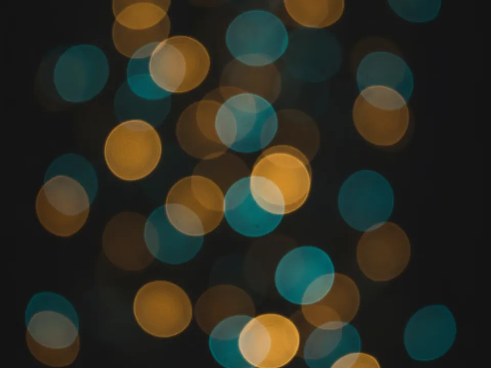
The set has nine JPG files, each 1600x1200 px. All of them are shallow depth of field photographs: points of light pushed out of focus until they become soft circles. Warm golden orbs mix with teal ones on a dark background.
The variants change the balance. Some lean gold, some lean teal, and the crops move the clusters of light to different parts of the frame. That gives you a choice of where the empty dark area falls, which is where your text will go.
Because the orbs are fully out of focus, there are no recognizable objects, places or people in the frames. That keeps the set flexible. The same image can sit behind a jazz night, a product launch or a year end message without telling a conflicting story. It also ages well, since nothing in it dates the design.
Where it works
Bokeh signals evening, celebration and atmosphere. Use it for:
- Event, concert and festival landing pages
- Seasonal promotions, gift guides and greeting cards
- Cover art for playlists, podcasts and music releases
- Intro slides for photo galleries and video titles
For a more urban take on the same idea, the night city bokeh background uses street lights and headlights instead of abstract orbs.
How to use it in CSS
Bokeh images are mostly soft gradients, and they compress very well to WebP or AVIF. Use image-set() to offer a lighter format while keeping the JPG as a fallback. The browser picks the first type it supports.
.event-hero {
  background-color: #0d0d12;
  background-image: url("bokeh-03.jpg");
  background-image: image-set(
    url("bokeh-03.avif") type("image/avif"),
    url("bokeh-03.webp") type("image/webp"),
    url("bokeh-03.jpg") type("image/jpeg")
  );
  background-size: cover;
  background-position: 70% 50%;
}
The first background-image line is a plain fallback for older browsers that do not understand image-set(). You create the AVIF and WebP copies yourself from the JPG. The percentage position keeps the brightest cluster off the left side where the headline sits. More format advice is in fast background images.
Pairing and type tips
Dark backgrounds with bright points need care. White text reads well over the dark areas but can disappear across a glowing orb. Place copy where the image is darkest, or add a soft dark gradient behind it. The text contrast guide explains how to measure against the brightest spot.
An elegant serif or a thin display sans matches the mood. Pull accent colors straight from the image: a warm gold for buttons, teal for links. Keep the layout sparse so the light stays the main texture.
When you use several variants on one site, keep the color balance consistent per section. A gold leaning file for the hero and a teal leaning one for the footer creates a clear rhythm. Mixing all nine on one page tends to feel scattered rather than rich. Pick two or three and repeat them with intent across the site.