


What defines a vintage retro background
Vintage retro covers the quieter, older end of retro design: aged paper, sepia tones, worn print and mid-century wallpaper patterns, as opposed to the bright neon of 1980s and 1990s retro.
The set includes:
- Old paper set: aged parchment, yellowed with brown stains and foxing spots
- Vintage grunge background: faded sepia tones, scratches and dust like an old poster backing
- Retro sunburst background: faded orange and cream sunburst rays over worn paper, a 1960s poster style
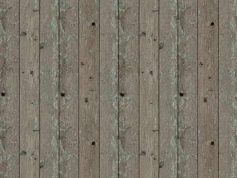
- Reclaimed barn wood background: reclaimed barn boards in grey, brown and faded red with nail holes
- Brown leather texture: soft brown full grain leather with natural pores and wrinkles
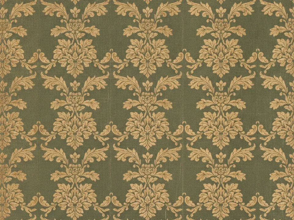
- Vintage damask wallpaper: an ornate baroque floral motif in faded gold on muted dark green
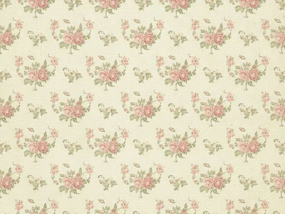
- Vintage floral wallpaper: a 1950s print of small roses and leaves on cream, lightly aged
Most of these images carry a soft vignette or a slightly uneven tone, since that unevenness is what reads as aged rather than simply muted or desaturated.

Where vintage retro backgrounds work
This category suits brands built on heritage, craft or nostalgia: bakeries, bookshops, record labels, family businesses and event invitations with a classic tone. Sunburst and damask patterns also work for posters and menus that want a mid-century feel without using a photo.
Leather and barn wood sit on the border with grunge and wood categories, chosen here for their worn, aged character rather than their raw material. Use them where the story is about time passing, not about an industrial surface.
Pair these backgrounds with a serif or script display face and a warm, slightly desaturated palette pulled from the image, rather than a bright modern accent color.

How to pick and use one
Pick by the decade or feeling you want to suggest.
| Feeling | Background |
|---|---|
| Letter or document | Old paper set, vintage grunge |
| Poster or menu | Retro sunburst, vintage damask, vintage floral |
| Rustic heritage | Reclaimed barn wood, brown leather |
These backgrounds already carry visual texture, so avoid adding a second noise or scratch overlay on top. Confirm contrast on the darkest version of the pattern before placing text, since damask and floral prints repeat and a letter can land on a darker motif:
.poster {
  background-image: url("/img/retro-sunburst.jpg");
  background-size: cover;
  background-position: center;
}