- SVG patterns stay sharp at any zoom level and pixel density, with no extra file for retina screens.
- repeating-linear-gradient and repeating-radial-gradient build simple patterns with no image request at all.
- A data URI can embed SVG in CSS, but # must be written as %23 or the pattern breaks silently.
- Photographed textures such as wood or fabric still beat vector patterns for organic, non-repeating detail.
Three ways to make a repeating pattern
A repeating pattern on the web comes from one of three sources. Each has a different cost and a different look.
- A photographed or rendered tile, exported as a raster image and repeated with
background-repeat. - An SVG pattern, built from shapes and paths and defined once with a
<pattern>element. - A CSS gradient pattern, built entirely from color stops, with no image file at all.
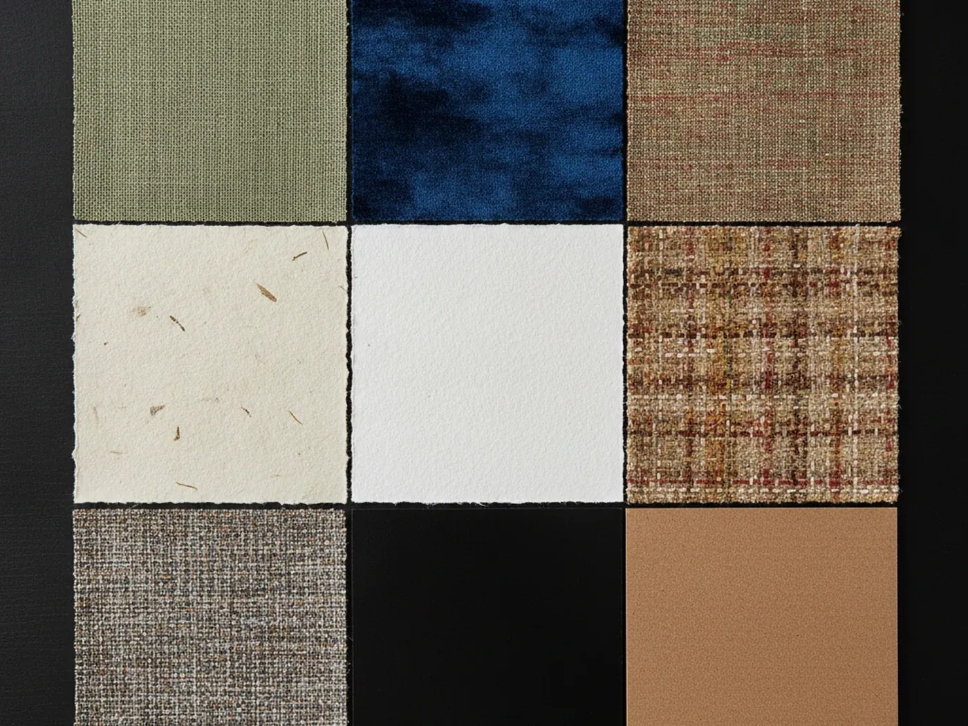
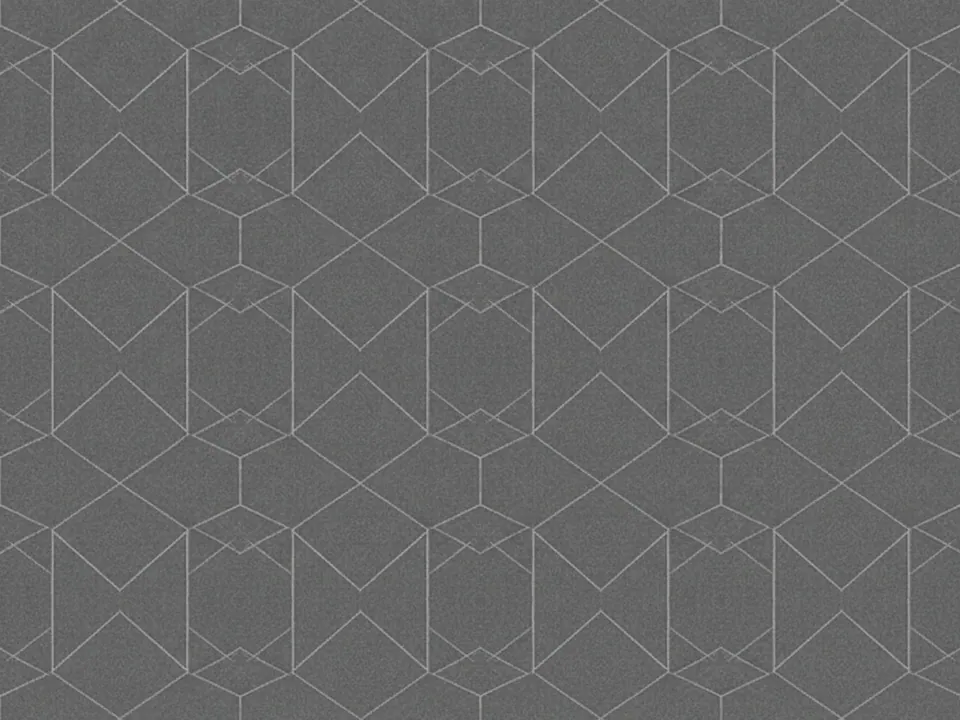
A photographed texture like a linen fabric texture captures detail no vector can draw from scratch. A flat graphic motif like a memphis pattern can go either way, since it is already made of simple shapes. The right choice depends on what the pattern needs to show, not on habit.
None of the three options is universally better. A raster tile wins on organic detail, an SVG pattern wins on sharpness and small file size for flat shapes, and a CSS gradient wins on simplicity when no file at all is the fastest option. Most design systems end up using all three in different places, not one for everything.
Building a repeating pattern in SVG
SVG has a dedicated element for repeating content: <pattern>. You define a tile once, give it a width and height, and reference it as a fill.
<svg width="0" height="0">
  <defs>
    <pattern id="dots" width="20" height="20"
             patternUnits="userSpaceOnUse">
      <circle cx="10" cy="10" r="3" fill="#2b2f77"/>
    </pattern>
  </defs>
  <rect width="100%" height="100%" fill="url(#dots)"/>
</svg>
patternUnits="userSpaceOnUse" means the width and height are measured in the same units as the rest of the document, so a 20 by 20 tile repeats every 20 units. The <rect> that fills with url(#dots) can be any size, and the pattern repeats to fill it. Add more shapes inside the pattern for stripes, grids or zigzags.
You can also use patternTransform to rotate or skew the tile without redrawing the shapes inside it, and reference the same pattern id from more than one element, so a single definition can style a card, a button and a section divider at once.
CSS-only patterns with repeating gradients
For stripes, checks and simple dots, CSS alone can do the job, with no image and no SVG markup.
.stripes {
  background-image: repeating-linear-gradient(
    45deg,
    #2b2f77 0 10px,
    #ffffff 10px 20px
  );
}
The color stops repeat at the interval you set, here every 20px. repeating-radial-gradient works the same way for rings and bullseyes. Combine two gradients in one background-image list to build a checkerboard, since CSS3 supports multiple background layers on a single element, each with its own size and position.
This approach loads instantly, since there is no request for an image file at all. Its limit is the shape vocabulary: straight lines, circles and color stops, nothing freeform.
Because the pattern is pure CSS, it also inherits the page's color scheme automatically if you drive the stops from CSS custom properties, so a single rule can produce both a light and a dark variant without a second file of any kind.
Putting an SVG into a CSS background
Once a pattern lives in SVG, you can use it as a CSS background two ways.
- Link to an external file.
background-image: url("pattern.svg");is cached by the browser like any other image and keeps your CSS file short. - Inline it as a data URI. The whole SVG markup sits inside the
url()value, so the pattern loads with the stylesheet and needs no second request.
A data URI is convenient for a small, one-off pattern that nothing else on the page reuses. For a pattern used across many pages, an external file is easier to cache and easier to edit later, since you are not hunting for it inside a long CSS value.
An external SVG file also works directly in an <img> tag or as the source of a <picture> fallback, which the inline data URI cannot do without duplicating the markup. If a pattern needs to appear both as a background and as a standalone graphic, the external file is the simpler route.

The data URI encoding trap
Inlining SVG inside a CSS url() has one sharp edge. If the SVG references its own pattern or gradient with fill="url(#dots)", that inner # has to be percent-encoded as %23 inside the outer data URI.
.tile {
  background-image: url('data:image/svg+xml,\
    <svg xmlns="http://www.w3.org/2000/svg" width="20" height="20">\
      <defs><pattern id="d" width="20" height="20" patternUnits="userSpaceOnUse">\
        <circle cx="10" cy="10" r="3" fill="%23222"/>\
      </pattern></defs>\
      <rect width="100%25" height="100%25" fill="url(%23d)"/>\
    </svg>');
}
The reason is that the browser parses the whole data URI as one URL first. An unencoded # marks a fragment, so everything after it is read as a fragment identifier and the fill reference never reaches the SVG parser. The pattern then renders as nothing, with no error in the console. A literal % sign used for percentage values, such as width="100%", needs the same treatment and becomes 100%25.
Choosing tile size and keeping files light
Vector patterns do not scale the same way raster tiles do. A small SVG pattern, made of a handful of shapes, is often a few hundred bytes, since it stores coordinates and colors rather than pixels. The same pattern exported as a PNG at a size large enough to look sharp on a high density screen can be many times heavier.
That gap grows at higher pixel density. A raster tile needs a 2x or 3x export to stay crisp on a retina screen, which multiplies its file size. An SVG pattern needs nothing extra: it is resolution independent and renders at whatever density the screen asks for.
The tradeoff shows up at the other end. An SVG with many small shapes, filters or gradients can cost more to render than it costs to download, especially if the pattern tiles across a large area. Test real pages, not just file size, before you commit to a complex vector pattern everywhere. Prefer simple shapes over filter effects such as blur or turbulence inside a repeating pattern, since filters are recalculated as the element resizes or scrolls, and keep the tile itself reasonably small so the browser is not repainting hundreds of tiny copies per screen.
There is also a middle ground worth knowing about: optimizing the SVG markup itself. Design tools often export extra metadata, unused ids and verbose path data. Running the file through an optimizer strips that overhead without changing how the pattern looks, which closes most of the gap between a hand-written pattern and an exported one.
When a photographed texture is still the better choice
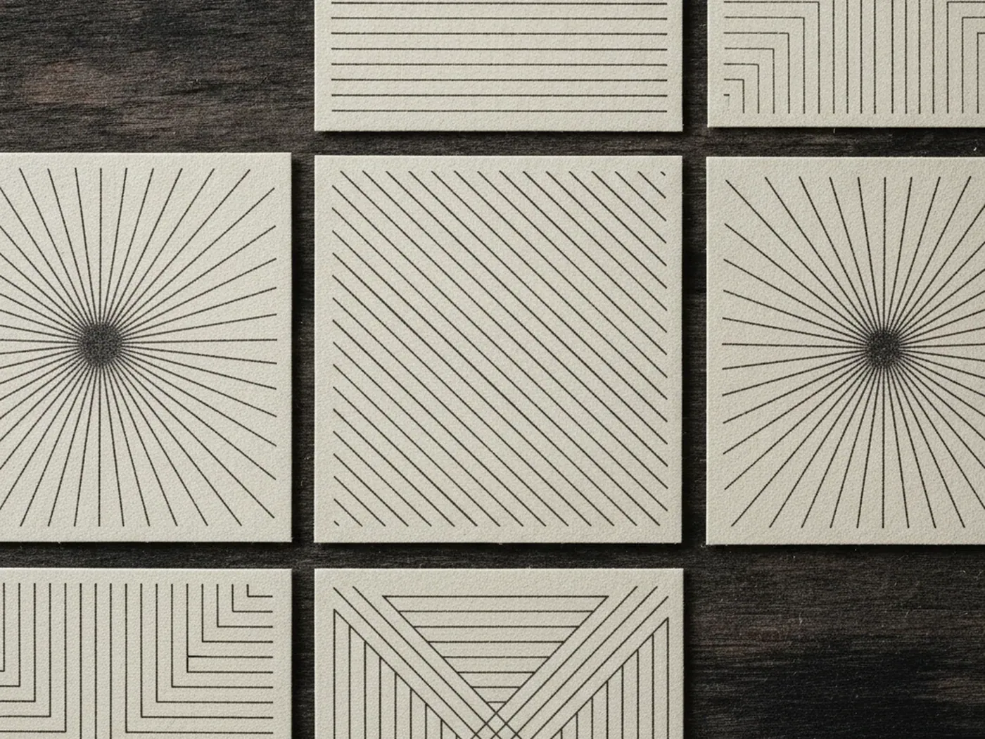
SVG and CSS gradients are strong for flat, geometric, evenly spaced motifs: dots, stripes, grids, chevrons. They are the wrong tool for organic, irregular surfaces.
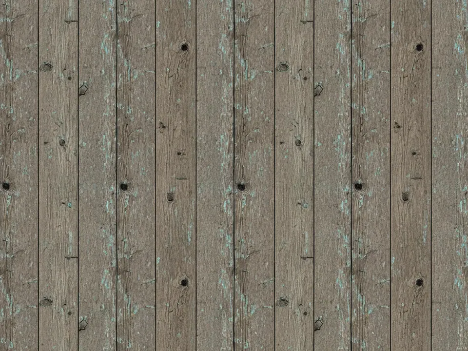
Wood grain, paper fiber, worn concrete and woven fabric each carry detail that does not reduce to a formula. A wood background or a kraft paper texture is defined by thousands of small, uneven variations, which is exactly what a photograph records and a path element cannot fake convincingly. For these surfaces, a raster tile from a camera or a scan is still the right source, and the rules in seamless tileable textures apply: even lighting, uniform detail, a flat perspective, and a tested repeat.
In practice, many sites mix both. A vector pattern sits behind a hero or a card as a crisp, scalable accent, while a photographed texture covers a section that needs to feel material. Pick by what the surface needs to show, and read more on image choice and loading in the CSS background image guide.
Accessibility, motion and a safe fallback
A busy pattern behind text is a readability risk before it is a style choice. A fine SVG grid or a dense repeating gradient can lower the effective contrast between text and its background, even when the base colors pass a contrast check on their own. Test the pattern with the text in place, not the pattern alone, and keep a solid color or a soft scrim behind any paragraph of body copy.
Patterns that scroll, shift or animate deserve the same caution as any other motion on a page. A background that pans continuously can bother users who have motion sensitivity. If a pattern moves, wrap the animation in a prefers-reduced-motion media query and provide a still version for people who have that preference set.
- Check contrast with real text sitting on the pattern, not a flat swatch of it.
- Keep high-frequency detail, such as fine dots or thin lines, away from areas with small text.
- Pause or remove animated patterns under
prefers-reduced-motion: reduce.
It also pays to set a plain background-color before the pattern rule. If the SVG or data URI ever fails to load, the solid color still gives the element a sensible appearance instead of leaving it blank.
.card {
  background-color: #f4f1ea;
  background-image: url("pattern.svg");
}