What is in the set
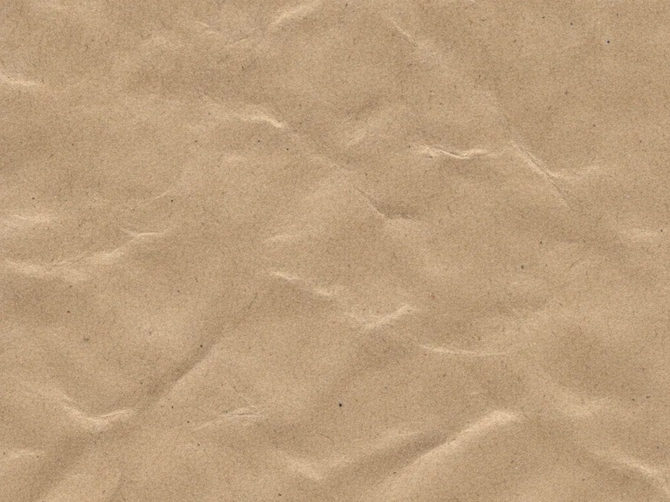
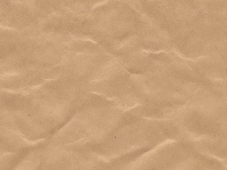
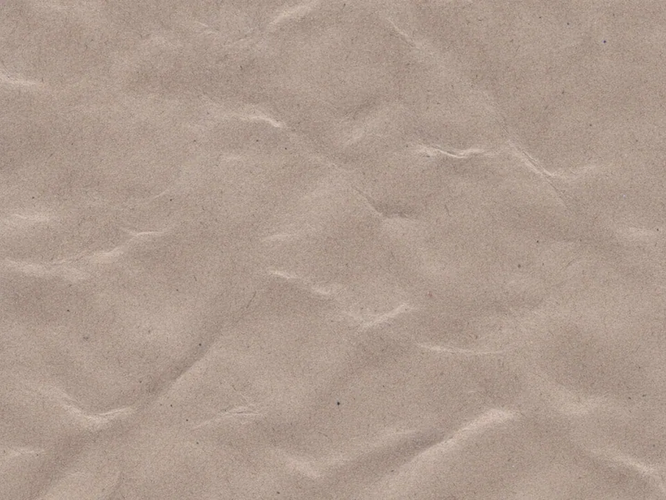
Three JPG files at 1600x1200 px. Each is an evenly lit scan of brown kraft paper, the recycled kind used for bags, mailers and wrapping. You can see short fibers in the surface and a few soft creases where the sheet was handled.
The variants differ in tone. One is lighter and sandier, one a mid brown and one a deeper, warmer shade. The texture fills the frame in every file, so it works as a full surface with no edges to crop around.
Kraft has less visual contrast than wood or concrete. The fibers are fine and the color is even, which makes it one of the calmer textures in the library.
Where it works
Kraft paper points to recycled materials, simple packaging and small makers. It fits:
- Websites for organic food, cosmetics and zero waste shops
- Packaging, label and sticker mockups
- Online stores for handmade goods and stationery
- Printable gift tags, cards and wrapping paper
More options sit in paper backgrounds. If you need an older, more decorative sheet, compare it with the old paper set.
Kraft is also practical inside interfaces. A strip of paper behind a promo banner, a product card or an order summary gives a shop a physical, wrapped feel. Because the texture is calm, it can sit behind short paragraphs, prices and buttons without hurting readability as much as wood or concrete would.
How to use it in CSS
Kraft takes color well. With background-blend-mode: overlay a flat color tints the paper and keeps the fibers visible. Overlay keeps light areas light and dark areas dark, so the result still looks like paper.
.label {
  display: grid;
  place-items: center;
  min-height: 320px;
  border-radius: 12px;
  color: #2a1d10;
  background:
    url("kraft-paper-02.jpg") center / cover,
    #7aa36b;
  background-blend-mode: overlay;
}
In the shorthand, the last layer is the color and the image sits above it. The blend then mixes them into a muted green paper. Change the color to make a set of matching labels from one file. The CSS background image guide explains multiple background layers.
Pairing and type tips
Dark brown or near black text sits well on kraft, as does white for short labels. Stamp style, typewriter and simple sans serif faces suit the material. A single ink color, like a printed bag, feels more authentic than many.
Medium brown is a mid tone, which limits contrast in both directions. Check body text carefully, or place longer text on an off-white panel. Simple line icons in dark ink match the stamped look better than full color illustrations.
For a cohesive brand, pair kraft with one natural accent such as sage green or terracotta, and repeat that color in buttons and links. A third color is rarely needed. Simple, honest layouts with plenty of space match the material best.