What is in the set
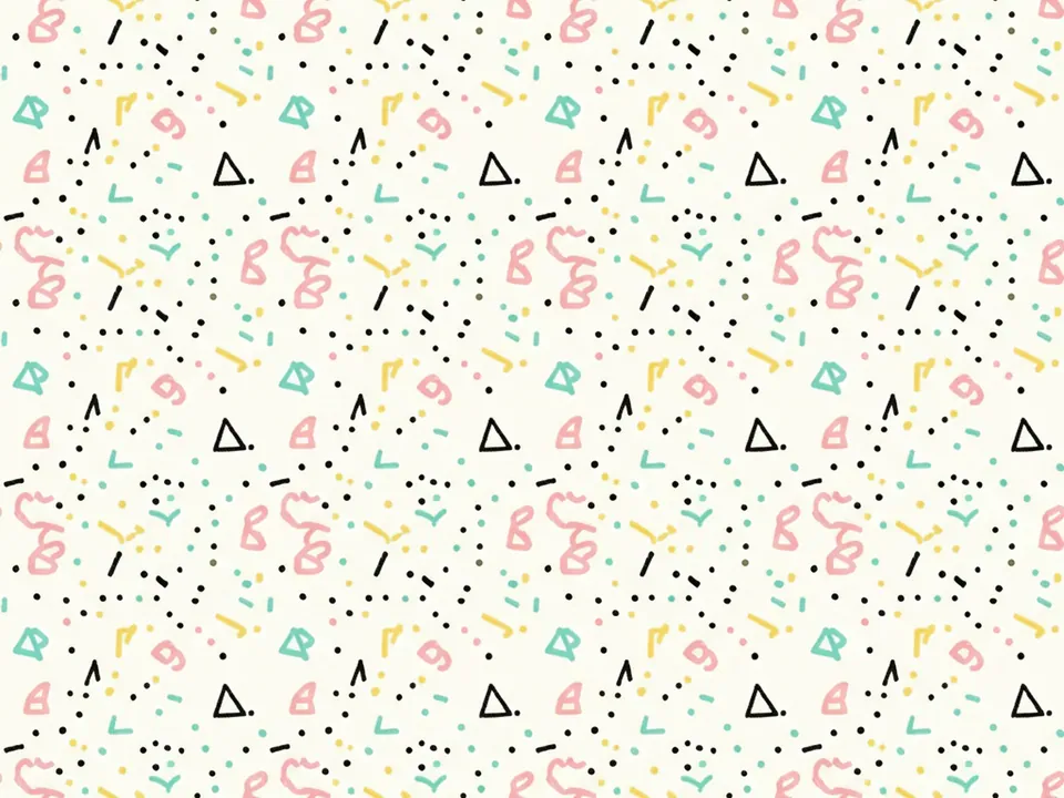
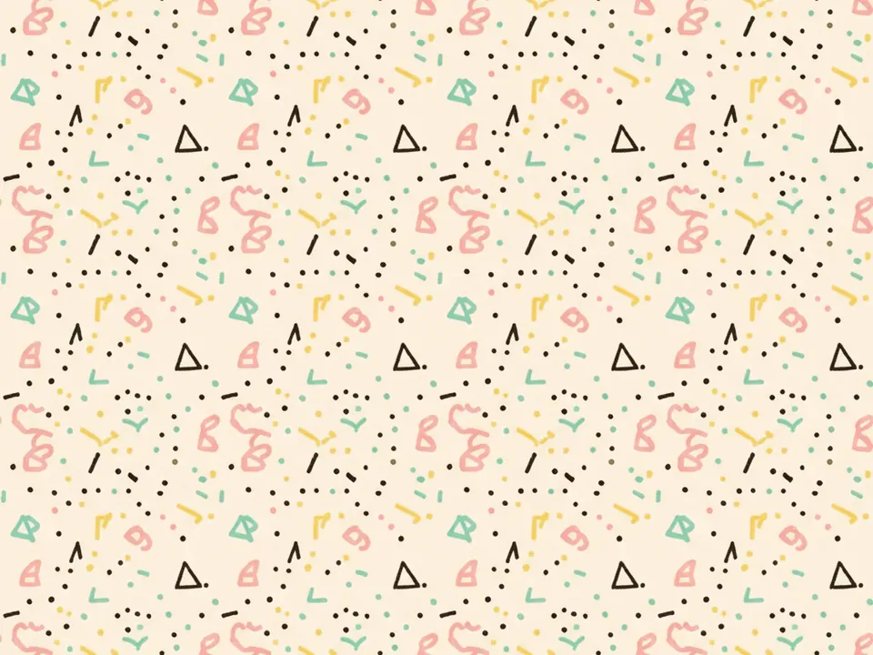
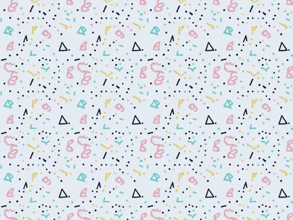
Three variants of a Memphis style pattern. Shapes are spread evenly across the frame, with no single focal point. Each variant uses the same visual language with a different balance.
- Classic: pink, yellow, teal and black at equal weight.
- Pastel: softer colors, fewer black accents.
- Dense: smaller shapes placed closer together.
Each file is 1600x1200 px JPG. More bold flat styles live in retro backgrounds.
Where it works
Memphis is loud by design. It works where energy is the message: kids products, creative workshops, birthday and party pages, pop culture newsletters, playful packaging. On social templates it makes a post recognizable at a glance.
It works less well for serious or financial content, and behind dense text. Treat the pattern as a frame. Let it fill margins, borders and section breaks, and keep the reading area plain. A good rule: the more text a block holds, the less pattern it should show.
How to use it in CSS
A useful technique is to show the pattern only around the edges of a section. mask-image with a radial gradient fades the pattern out toward the center, so text sits on the plain off-white field. Put the pattern on a pseudo element, so the mask does not hide your content.
.section-memphis {
  position: relative;
  background-color: #faf6ee;
}

.section-memphis::before {
  content: "";
  position: absolute;
  inset: 0;
  z-index: 0;
  background: url("/img/memphis-classic.jpg") center / cover;
  mask-image: radial-gradient(ellipse at center, transparent 35%, #000 75%);
}

.section-memphis > * {
  position: relative;
  z-index: 1;
}
In the mask, transparent areas hide the layer and opaque areas show it. Current browsers support the unprefixed mask-image. Learn more layering patterns in our CSS background image guide.
Pairing and type tips
Pull accent colors straight from the pattern: the pink or teal for buttons, the black for text. Black text on the off-white base passes 4.5:1 easily. Avoid placing text directly over the shapes.
Rounded geometric sans serifs and chunky display faces fit the style. If your brand already has a strong palette, read our notes on choosing backgrounds for a brand before mixing it with Memphis colors.