- background-size: cover fills the box and crops; contain shows the whole image and may leave gaps.
- The shorthand resets every property you leave out, including background-color.
- In the shorthand, size must follow position after a slash: center / cover.
- With multiple layers, the first one listed paints on top. Color goes only in the last layer.
The property set at a glance
A CSS background is a stack of layers painted behind an element's content. Each layer is described by a group of longhand properties. The shorthand background sets all of them at once.
| Property | Initial value | What it controls |
|---|---|---|
background-image | none | The image or gradient to paint |
background-size | auto | How large each image is drawn |
background-position | 0% 0% | Where the image is anchored |
background-repeat | repeat | Whether and how it tiles |
background-attachment | scroll | How it behaves when content scrolls |
background-origin | padding-box | The box used for positioning |
background-clip | border-box | The box the painting is cut to |
background-color | transparent | A solid fill under all image layers |
Notice the defaults. An image with no other settings sits in the top left corner at its natural size and repeats in both directions. That is right for small tiles and wrong for most photos.
Size: cover, contain and auto
background-size decides how the image maps onto the box. Three keywords cover most cases.
- cover scales the image until it fills the whole box. The aspect ratio is kept, so one axis overflows and gets cropped.
- contain scales the image until it fits entirely inside the box. Nothing is cropped, but empty bands may appear, and those bands repeat unless you stop them.
- auto draws the image at its intrinsic size. A 1600×1200 file stays 1600 by 1200 CSS pixels.
You can also pass lengths or percentages. background-size: 50% auto makes the image half the box width and keeps its ratio. Percentages refer to the positioning area, which is set by background-origin.
For a full bleed hero, cover is the usual choice. A photographic set such as the bokeh backgrounds crops well because it has no single focal point that must stay visible.

Position and repeat
background-position takes one to four values. Keywords like center or right bottom are readable. Percentages align a point in the image with the same point in the box, so 75% 50% lines up the image's 75% mark with the box's 75% mark. Edge offsets work too: right 24px bottom 16px.
With cover, position decides which part of the image survives the crop. Set it to the area you care about. A city skyline usually wants center bottom so the buildings never get cut off.
background-repeat accepts repeat, no-repeat, repeat-x, repeat-y, round and space. Two values set the axes separately. For any photo larger than its box, add no-repeat anyway. It costs nothing and prevents a visible tile edge when the box grows taller than expected.
Attachment, origin and clip
background-attachment has three values. scroll fixes the background to the element, so it moves with the page. fixed fixes it to the viewport, which creates the classic parallax look. local fixes it to the element's scrolled content, which matters for scrollable boxes.
Use fixed with care. Many mobile browsers ignore it and treat it as scroll. On desktop it can force extra repaints during scrolling. Test it before you build a layout around it.
background-origin sets the box used for position and percentage sizes: border-box, padding-box or content-box. background-clip sets where painting stops. It accepts the same three boxes, and text as well, which paints the background only inside the glyphs. Pair background-clip: text with a transparent text color, and keep a solid fallback color for readability.

Shorthand pitfalls
The background shorthand is compact, but it has rules that surprise people.
- It resets what you omit. Writing
background: url(bg.jpg)afterbackground-color: #0b1b33sets the color back totransparent. - Size needs a slash. Size can only appear right after position, separated by
/.center / coveris valid.cover centeris not. - Box keywords are positional. One box keyword sets both origin and clip. With two, the first is origin and the second is clip.
- One invalid token drops the whole line. The browser then keeps whatever background applied before.
A safe pattern is to use the shorthand once for the base, then override single longhands later. Always include a color that matches the image's average tone. It shows while the file loads and if it fails.
.hero {
  background: #0b1b33 url("wavy-lines.jpg") center / cover no-repeat;
}
.hero--light {
  background-position: center top;
}
Multiple layers
Each background property accepts a comma separated list. Every item in the list is a layer. The first layer paints on top, the last at the bottom. Values line up by index, so the second size applies to the second image.
The most common use is a gradient over a photo. The gradient darkens the image so text stays readable, and you keep a single element.
.banner {
  background:
    linear-gradient(rgb(0 0 0 / 0.55), rgb(0 0 0 / 0.15)),
    url("concrete-wall.jpg") center / cover no-repeat,
    #6b6b6b;
}
Two rules apply. A color is only valid in the final layer. If a list is shorter than the number of images, the browser repeats it to fill the gap. If it is longer, the extra values are ignored.
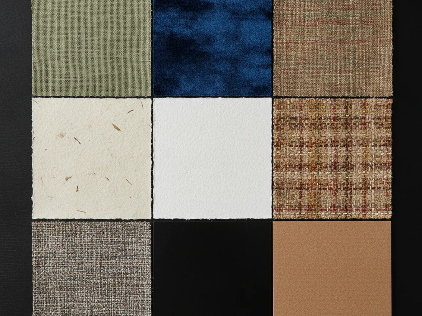
Layers also let you mix a texture with a flat tint. A linen fabric texture under a semi transparent brand color gives a surface with depth but a controlled tone. Browse more options in background textures and abstract backgrounds.
Gradients, and a final checklist
In CSS, a gradient is an image value. That means linear-gradient(), radial-gradient() and conic-gradient() go in background-image, not in background-color. They obey size, position and repeat exactly like a file does.
This has practical uses. A gradient has no intrinsic size, so by default it fills the positioning area. Give it a small background-size and it tiles, which is how simple stripes and grids are drawn without any download. repeating-linear-gradient() does the same in one value.
Gradients also cost nothing on the network. Use one as a placeholder behind a large photo, matched to the photo's main colors. If the image is slow, the page still looks intentional. If the image fails, the text over it keeps a predictable background.
Treat every layer as an image with its own size, position and repeat. Most background bugs come from forgetting that a gradient follows the same rules.
Checklist before you ship
- Set a
background-colorclose to the image's average tone. - Add
no-repeatto every photo that should not tile. - Choose a
background-positionthat protects the important part of the image. - Check the crop at narrow and wide viewports, because
covercrops differently at each width. - Measure text contrast against the busiest area of the image, not the average.
- Keep decorative images in CSS and meaningful images in HTML with
alttext.
The last point matters for accessibility. Screen readers do not announce CSS backgrounds. If an image carries information, it belongs in an <img> element.