What is in the set
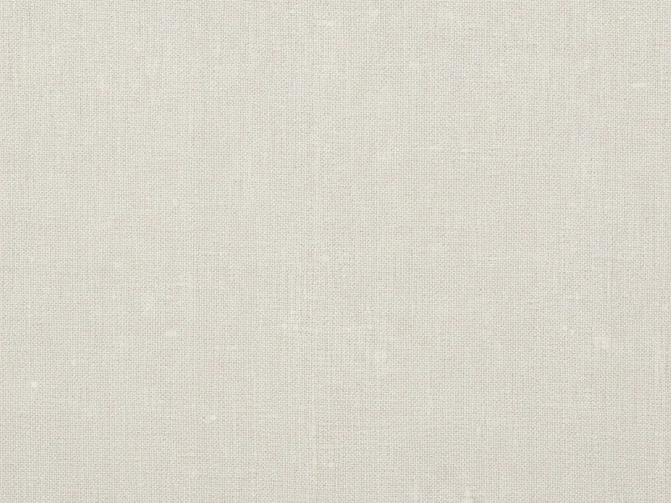
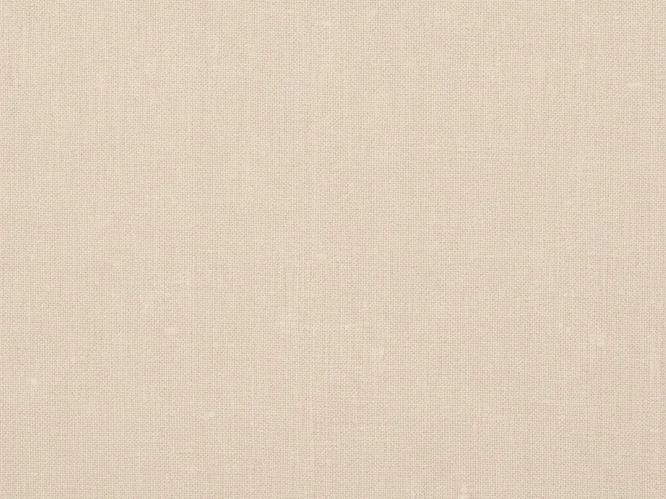
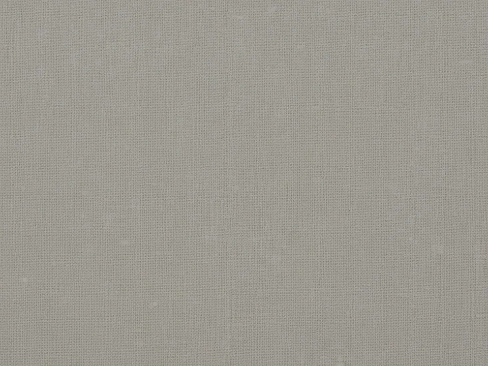
The set has four JPG files at 1600x1200 px. Each is a close, flat photo of natural off-white linen fabric under soft light. You can see the crossing threads of the weave, small slubs where a thread thickens, and fine fibers along the surface.
The variants differ in tone and crop. Some are cooler and closer to white, others warmer and closer to oatmeal, and the scale of the weave changes slightly between files. The fabric fills the frame in every file.
Linen is one of the quietest textures in the library. From a distance it reads as a light, slightly warm color. Up close it shows a real material.
Where it works
Linen feels natural, calm and considered. Use it for:
- Full page backgrounds that are almost, but not quite, flat
- Fashion, textile and home goods stores
- Stationery, wedding invitations and menus
- Covers for books, albums and portfolios
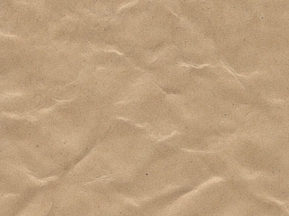
Find related surfaces in background textures. If you need a paper rather than a fabric, the kraft paper texture offers a warmer, rougher option.
How to use it in CSS
Linen works best at a reduced scale, repeated behind a whole page. Set a smaller background-size so the weave is fine, and use background-repeat: round. With round, the browser slightly scales each tile so a whole number of copies fits, which avoids cut off tiles at the edges.
html {
  background-color: #efe9df;
  background-image: url("linen-02.jpg");
  background-size: 480px 360px;
  background-repeat: round;
}

main {
  max-width: 720px;
  margin: 0 auto;
  padding: 48px 24px;
  color: #2e2a25;
}
Keep the 4:3 ratio in background-size so threads do not stretch. These photos are not prepared seamless tiles, so faint joins can appear. A busy weave hides them better than smooth fabric. The seamless tileable textures guide shows how to make a perfect repeat if you need one.
Pairing and type tips
Off-white linen gives dark text a comfortable surface. A warm charcoal or deep brown usually passes 4.5:1 with room to spare. Classic serifs, modern book faces and refined sans serifs all work.
Because the texture is light, it can sit directly behind body text, which few textures allow. Keep it subtle: if the weave is visible at reading distance, reduce the scale or pick a smoother variant.
Accents should be muted and natural: olive, rust, navy or soft clay. Thin rules and simple line icons suit the fabric.
On product pages for clothing or bedding, linen gives context without competing with the product photos. Keep the photos on plain white or light grey cards so the fabric texture around them reads as the page and the cards read as the content. That separation keeps a calm, gallery like order. Product photos with soft natural light fit best, since harsh flash looks cold against warm off-white fabric.