What is in the set
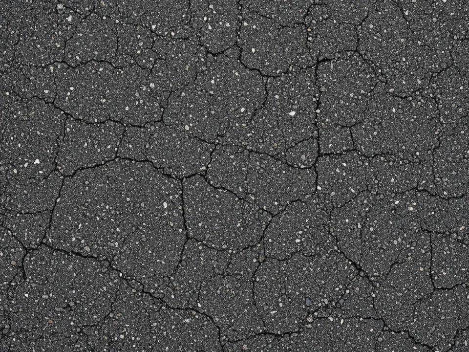
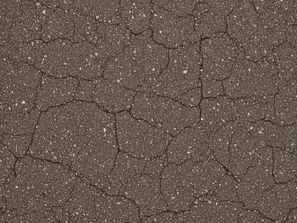
The set has two JPG files at 1600x1200 px. Each one is a top-down photo of a dark grey asphalt road, showing fine gravel aggregate packed into the surface and a scatter of tiny cracks, lit evenly under overcast light.
The two variants differ in tone: the original reads as a neutral charcoal grey, while the second shifts slightly warmer. Both keep the same fine, even texture with no tire marks, lane lines or debris, so they work as a clean backdrop rather than a scene.
Because the aggregate is fine and the lighting is flat, the surface stays calm even at large sizes, with no bright spot or shadow pulling the eye toward one area of the frame.
Where it works
Asphalt reads as practical and road related, which fits:
- Automotive, tire and car service sites
- Logistics, delivery and fleet management pages
- Motorsport and racing event pages
- Urban mobility and transport apps
It is part of urban backgrounds and background textures. For a built, vertical urban surface instead of a ground texture, see the red brick wall background.
How to use it in CSS
A full viewport hero on an automotive page often wants the road to appear fixed in place while content scrolls over it. On most desktop browsers that is background-attachment: fixed, but it is unreliable on iOS Safari, so pair it with a transform based fallback for mobile.
.road-hero {
  min-height: 100vh;
  background-color: #2b2b2e;
  background-image: url("asphalt-01.jpg");
  background-size: cover;
  background-attachment: fixed;
}

@media (max-width: 760px) {
  .road-hero {
    background-attachment: scroll;
  }
}
Switching back to scroll on small screens avoids the jumpy repaint some mobile browsers show with fixed backgrounds. For a transform based parallax alternative, see fixed and parallax backgrounds.
Pairing and type tips
White, yellow or safety orange text reads clearly on the dark grey surface, echoing road marking colors without needing an extra overlay in most cases. Bold, condensed sans serif headings match the industrial, utilitarian mood.
Keep photography of vehicles or products crisp and high contrast against the asphalt, since a busy, low contrast product shot can disappear into the grey tone. A subtle drop shadow under products helps them sit convincingly on the surface.
Avoid adding more than one texture per section. Asphalt paired with a second rough background, such as concrete or scratched metal, usually reads as noisy rather than layered.