What is in the set
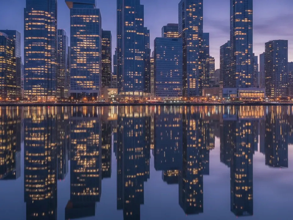
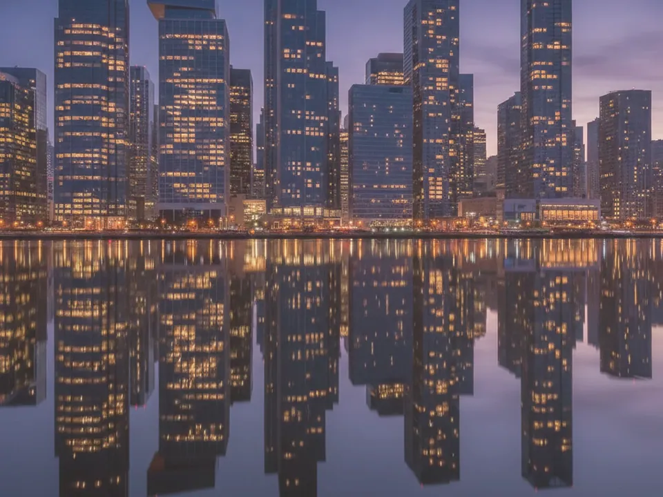
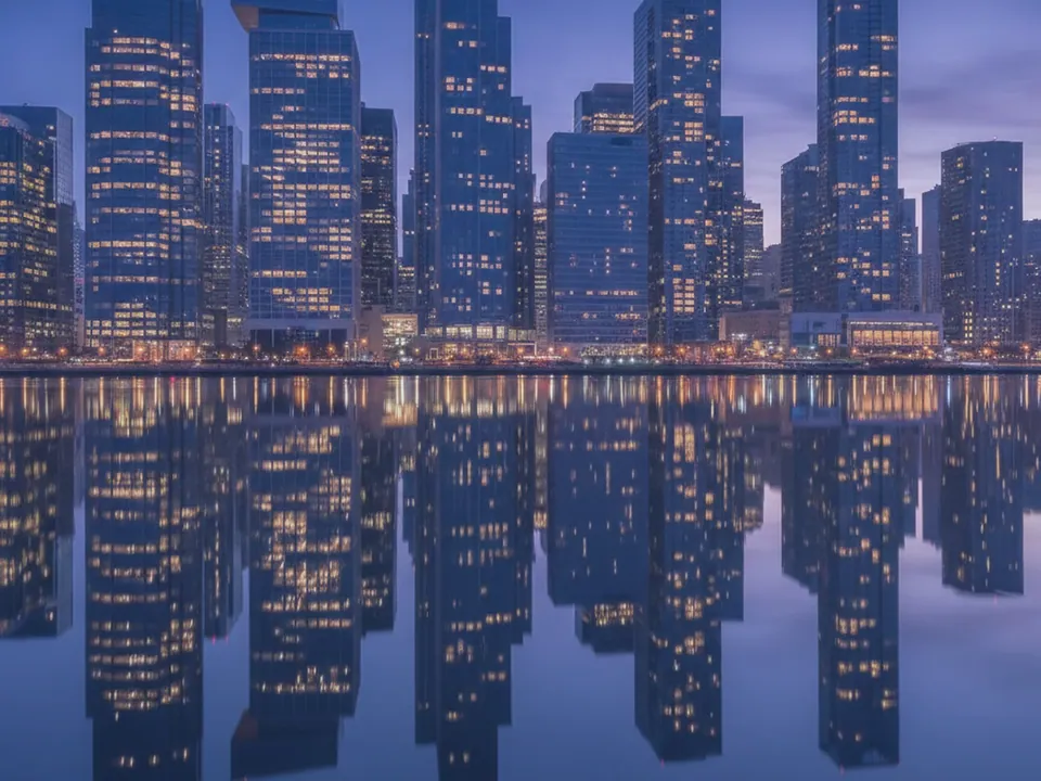
The set has three JPG files at 1600x1200 px. Each one is a wide photograph of a modern city skyline at blue hour, with office windows lit against a deep blue sky gradient and a calm body of water reflecting the lights below.
The three variants shift the overall tone from the original cool blue hour reading through additional warm and cool variations, changing how much orange or blue dominates the sky without changing the skyline itself. There is no visible text, logos or signage on any building.
Because the skyline sits in the middle third of the frame with open sky above and calm water below, the image crops well into both wide banners and taller hero sections.
Where it works
A lit skyline at blue hour signals scale, ambition and a global outlook, which suits:
- Finance, banking and investment sites
- Corporate and management consulting pages
- Travel, hotel and city guide booking sites
- Conference and business event landing pages
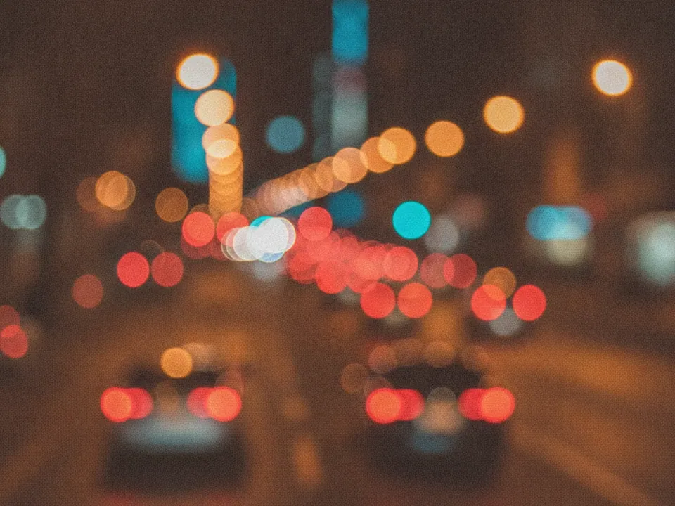
It is part of urban backgrounds. For a closer, more abstract take on city light, see the night city bokeh background.
How to use it in CSS
For a hero where the headline sits over the sky and the skyline anchors the bottom of the section, set background-position to favor the bottom of the frame so the buildings do not get cropped out on short viewports.
.hero {
  min-height: 85vh;
  background-color: #0e1b33;
  background-image: url("skyline-night-02.jpg");
  background-size: cover;
  background-position: center bottom;
}

.hero__text {
  max-width: 640px;
  color: #f5f7fb;
}
Keeping text in the upper half, over open sky rather than the busier skyline, is an easier way to guarantee the 4.5:1 contrast ratio than placing it directly over the lit windows. More on this pairing is in text contrast on backgrounds.
Pairing and type tips
White or pale blue text over the open sky area reads cleanly, while gold or amber accents echo the lit windows for buttons and highlights. Avoid placing long paragraphs directly over the densest cluster of lit windows, where contrast varies window by window.
A clean, confident sans serif in a medium or bold weight matches the corporate scale of the image. Keep supporting graphics, such as icons or charts, in flat colors rather than photographic textures, so they read clearly against the detailed skyline.
If the section includes a call to action button, give it a solid fill rather than an outline only, since outline buttons can lose definition against the busy window pattern.