What is in the set
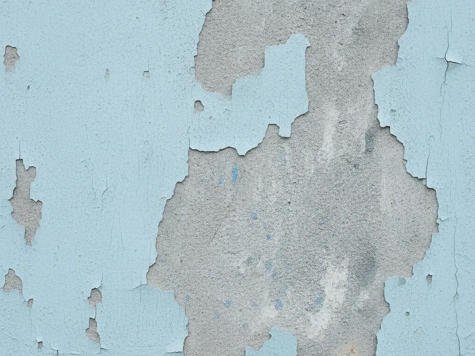
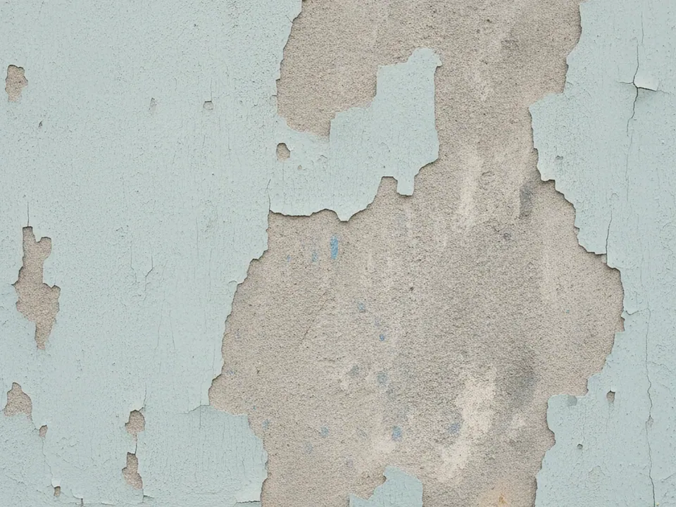
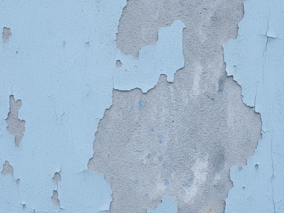
The set has three JPG files at 1600x1200 px. Each one is a flat, frontal photo of an aged wall where pale blue paint has cracked and flaked away in patches, exposing grey plaster underneath, under even light.
The three variants shift in overall warmth and depth, from the original pale blue and grey balance to warmer and cooler readings of the same wall. The pattern of cracks and flakes stays similarly irregular across all three, so the composition does not change, only the color mood.
Unlike a clean painted wall, this surface carries real history: uneven patches, hairline cracks and soft color variation, which gives it more character than a flat color fill while still staying calm enough to put content on top.
Where it works
Peeling paint reads as lived in and unpolished, which suits:
- Urban and street fashion brands
- Vintage, flea market and secondhand shops
- Punk, indie and alternative music pages
- Grunge style posters, flyers and event pages
It is listed in grunge backgrounds and urban backgrounds. For a cleaner masonry surface in the same mood, see the red brick wall background.
How to use it in CSS
Because the wall has both light grey plaster and darker paint patches, switching between cover and contain changes which part of the wall you see. For a banner where the exact crop matters less, cover is simpler to maintain across screen sizes.
.banner {
  min-height: 420px;
  background-color: #9aa6a3;
  background-image: url("peeling-paint-02.jpg");
  background-size: cover;
  background-position: center 40%;
}

.banner__card {
  background: rgba(255, 255, 255, 0.9);
  padding: 32px;
  max-width: 420px;
}
A white card over the texture, as in the snippet, is a simple way to guarantee contrast for body copy without covering the whole wall. For background sizing basics, see the CSS background image guide.
Pairing and type tips
Dark grey or black text works directly on the lighter plaster patches, but check contrast carefully over the blue paint areas, which are often mid toned and can fail the 4.5:1 ratio for body text without a card or overlay.
Rough stencil or marker style display fonts match the worn wall, paired with a plain sans for body copy so long passages stay easy to read.
Keep other decorative elements sparse: tape textures, stickers or torn paper edges can complement the wall, but stacking several grunge effects at once quickly looks cluttered rather than deliberate.