What is in the set
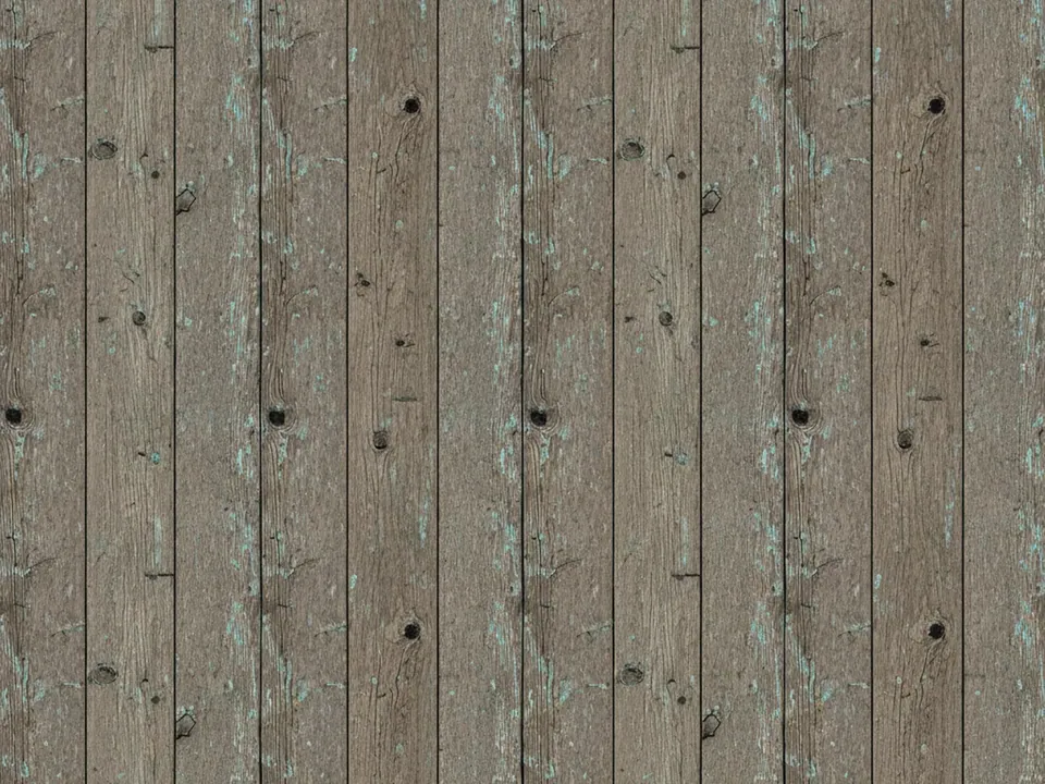
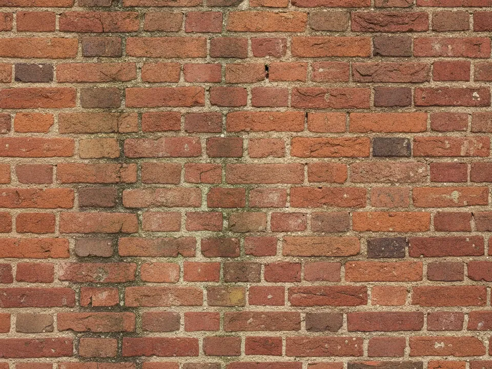
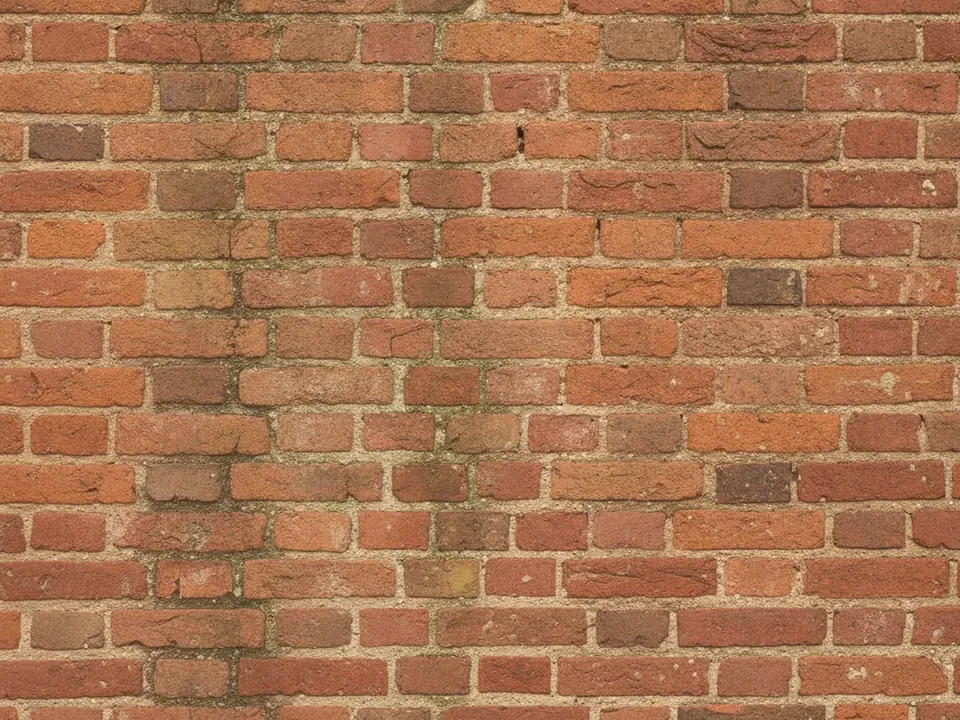
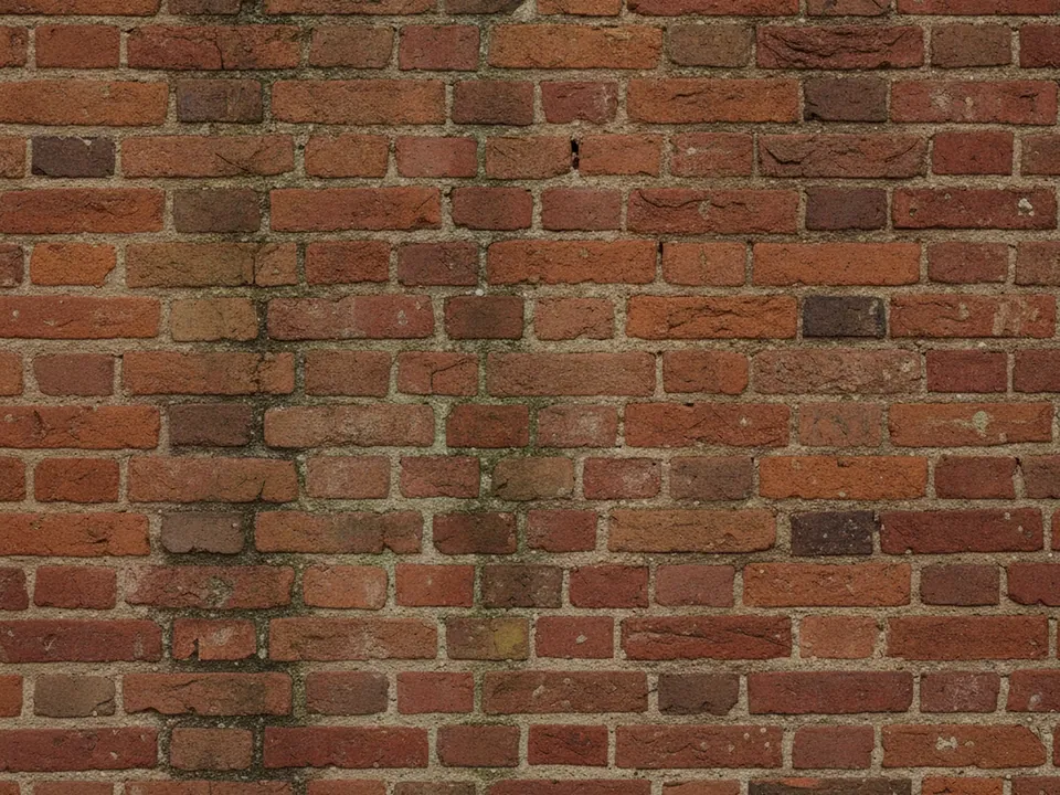
The set has four JPG files at 1600x1200 px. Each one is a flat, frontal photo of an old red brick wall, with worn mortar joints, a few chipped bricks and faint stains, lit by even daylight across the whole frame.
The four variants move from the original warm red through additional warm, cool and deep tone shifts of the same wall, so the brick pattern and mortar lines stay identical while the color mood changes. The deep variant reads almost brown, closer to a dim interior wall, while the cooler variant pulls the red toward a muted terracotta.
Brick courses run in clean horizontal lines, which makes the image easy to crop into wide banners without losing the sense of a real wall.
Where it works
Exposed brick signals a real, physical space, which suits:
- Cafe, bar and restaurant websites
- Loft style apartment and real estate listings
- Urban event spaces and venue pages
- Craft beer, bakery and artisan food branding
It is filed under urban backgrounds, grunge backgrounds and background textures. For a rougher road surface with a similar urban mood, see the asphalt road texture.
How to use it in CSS
Because the brick courses are horizontal and regular, a fixed background-size in pixels, rather than a percentage, keeps the mortar lines level across different section heights.
.menu-header {
  min-height: 360px;
  background-color: #7a3b2e;
  background-image: url("brick-wall-03.jpg");
  background-size: 1200px auto;
  background-repeat: repeat-x;
  background-position: center top;
}
Repeating only on the x axis keeps a single row of consistent brick height running the full width of wide screens, instead of stretching the whole photo and distorting the brick shape. For loading this kind of wide banner efficiently, see fast background images.
Pairing and type tips
White or cream text with a bold weight reads clearly against the red brick, especially set inside a dark semi-transparent band rather than placed directly over the mortar lines. Serif or hand-lettered display type suits a cafe or bakery mood, while a plain grotesque sans suits a more modern loft look.
Keep accent colors warm, matching the brick: mustard, cream or dark green pair naturally, while cool blues can feel at odds with the wall's warmth.
For menus and signage, a light card with a slight paper texture sitting on the brick reads as a sign pinned to a real wall, which feels more natural than text floating directly on the mortar.