What is in the set
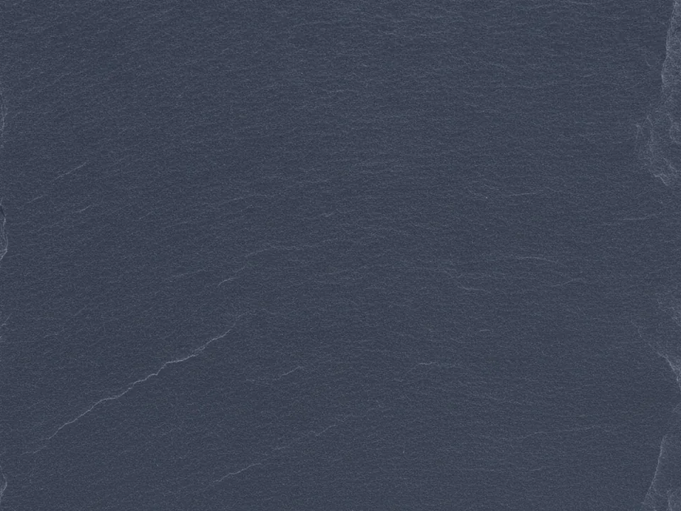
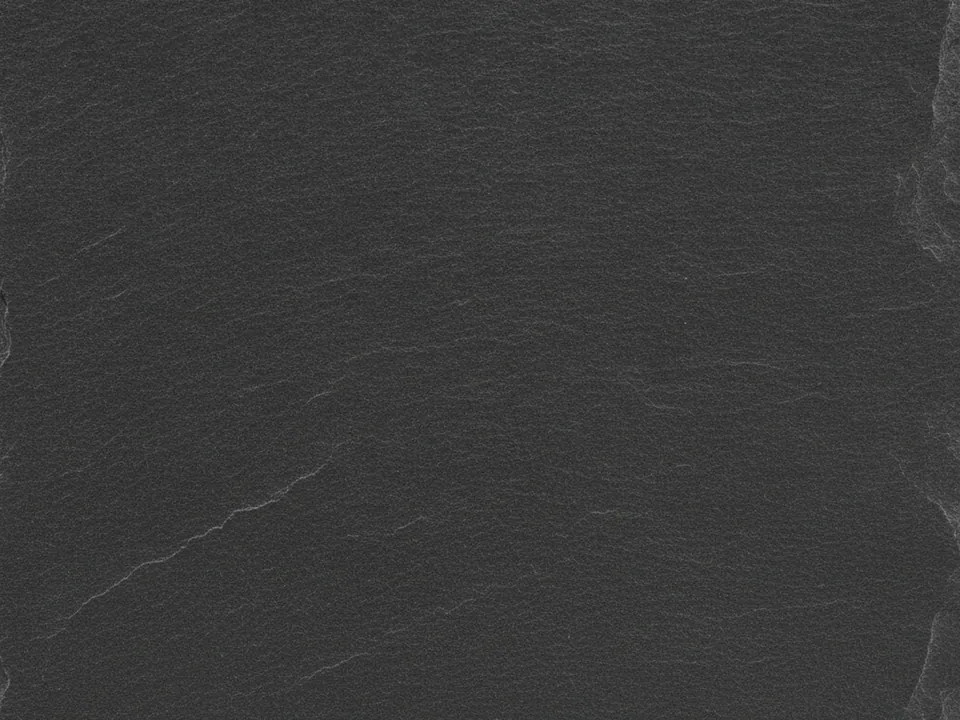
The set has three JPG files at 1600x1200 px, each a flat, top-down photo of natural dark grey slate. The stone shows fine, layered lines from how slate splits in thin sheets, and a subtle mineral sheen catches the even studio light without any harsh glare.
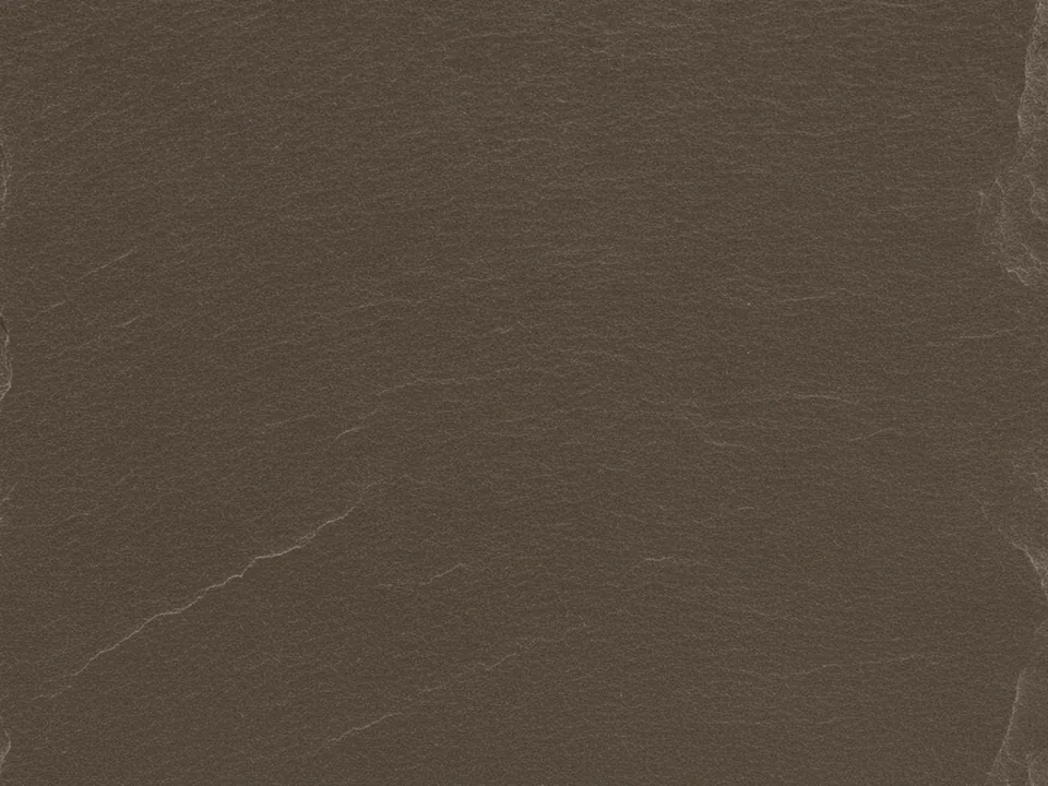
The variants are named Original, Warm and Cool. Original is a neutral charcoal grey, Warm adds a faint brown undertone, and Cool pushes slightly toward blue-grey, closer to a wet stone look. The layering is visible in all three, since it comes from the way the rock splits rather than from the color grading.
Slate is one of the darkest textures in background textures, with a natural, layered stone surface instead of a flat painted one. The low overall brightness makes it forgiving as a backdrop, since small exposure differences in placed photos are less noticeable against it.
Where it works
Dark slate reads as solid, technical and understated. It suits:
- Dark mode interfaces and app marketing pages
- Architecture, construction and stone supplier sites
- Technical, engineering and industrial portfolios
- Premium restaurant menus with a minimal, modern look
For contrast, pair it with the lighter white marble texture in a split layout.
How to use it in CSS
Slate is dark enough to work directly as a dark mode surface. Instead of swapping a separate light texture, you can keep slate as the default and only dim it further for users who prefer less contrast at night.
body {
  background-color: #44484b;
  background-image: url("slate-original.jpg");
  background-size: cover;
  background-attachment: fixed;
}

@media (prefers-color-scheme: dark) {
  body {
    background-image:
      linear-gradient(rgba(0, 0, 0, 0.35), rgba(0, 0, 0, 0.35)),
      url("slate-original.jpg");
  }
}
The extra gradient only darkens the same file, so there is no second image request. More patterns for theme switching are in backgrounds for dark mode.