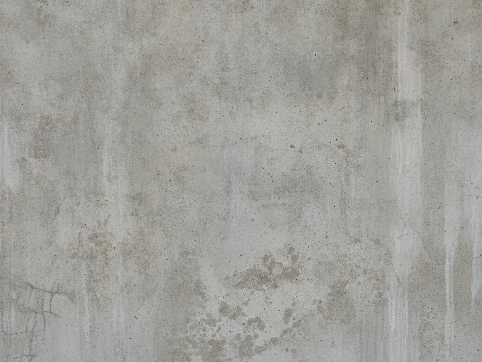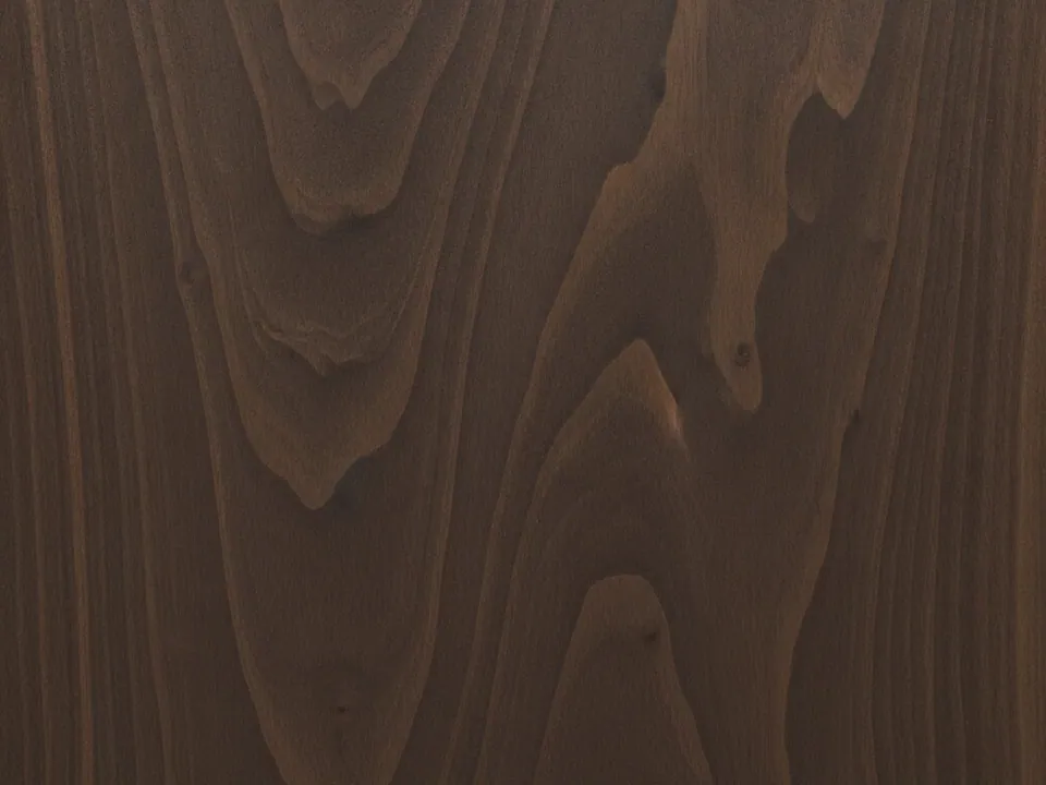
What is in the set
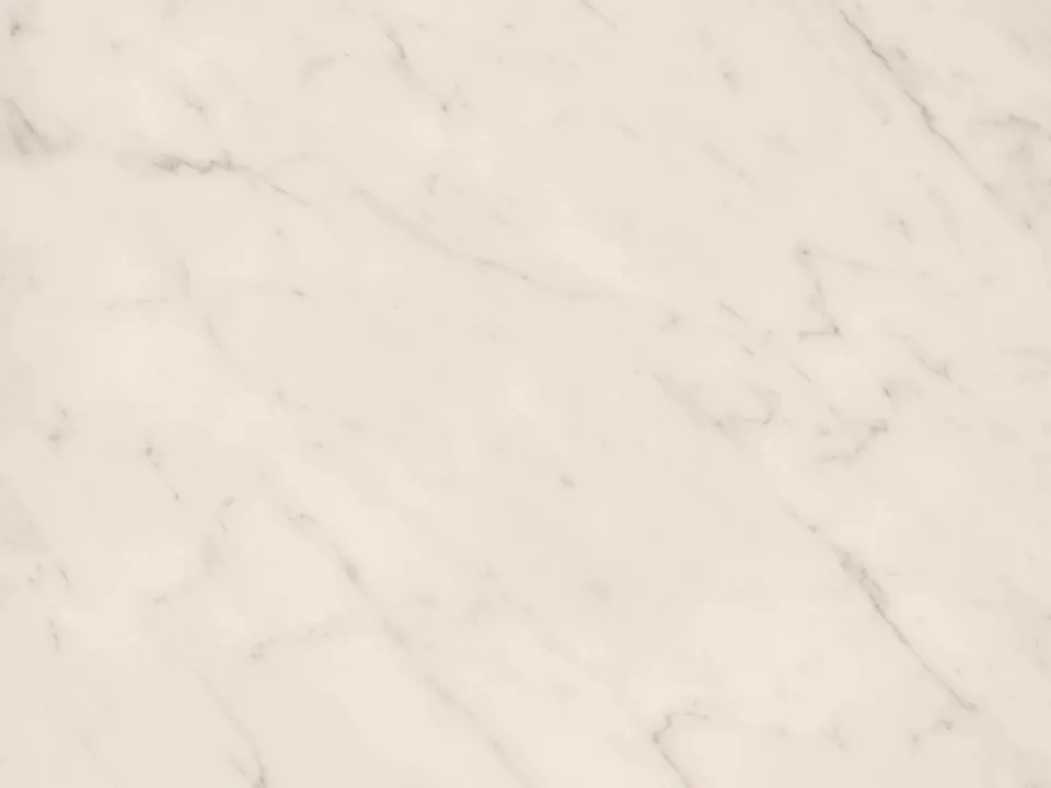
The set has four JPG files at 1600x1200 px, each a flat, top-down photo of a polished white carrara marble slab. Soft grey veins run across the stone in irregular, branching lines, and the surface has a faint reflective sheen from the even studio light.
The variants are named Original, Warm, Cool and Deep. Original is a balanced neutral white, Warm shifts slightly toward cream and beige, Cool reads cooler and more blue-grey, and Deep darkens the whole slab for a more dramatic, moody backdrop. All four share the same vein pattern, so swapping between them does not change the composition, only the color.
Marble is one of the brighter textures in background textures, with a hard, glossy surface instead of a matte fiber one. The polish also means the stone reflects a little studio light, which gives product shots placed on top a subtle, believable highlight.
Where it works
White marble reads as premium, clean and a little formal. It suits:
- Beauty, skincare and jewelry product pages
- Wedding sites and formal event invitations
- Luxury real estate and interior listings
- Fashion lookbooks and flat lay product photography
For a darker stone counterpart, pair it with dark slate stone texture in a two-tone layout.
How to use it in CSS
Marble is light, so plain dark text can fail contrast checks in the paler parts of the veining. A translucent dark overlay keeps the stone visible while raising contrast to a safe level for body copy.
.lux-hero {
  position: relative;
  background-color: #e8e6e2;
  background-image: url("marble-deep.jpg");
  background-size: cover;
  background-position: center;
}
.lux-hero::before {
  content: "";
  position: absolute;
  inset: 0;
  background: rgba(20, 20, 20, 0.45);
}
With white text at full opacity, that overlay reliably clears the 4.5:1 contrast ratio needed for normal size body text. More detail on checking ratios is in text contrast on backgrounds.