What is in the set
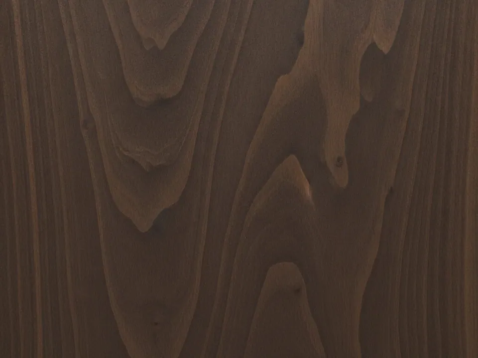
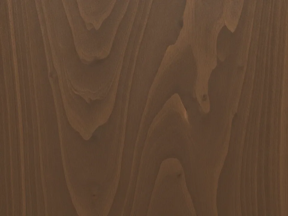
The set has two JPG files at 1600x1200 px. Both show a dark walnut surface up close and flat on. The grain swirls and flows, with deep brown tones and lighter streaks, and a satin oil finish adds a soft sheen without glare.
The two variants differ in tone and crop: one is darker and more chocolate, the other slightly warmer with more visible figure. The light is even, and the wood fills the whole frame.
Walnut is a dark mid tone texture. It carries a lot of richness, but it does not shout, which makes it more versatile than its color suggests.
Where it works
Dark walnut suggests craft, quality and evening. It suits:
- Product pages for watches, leather goods, audio and furniture
- Menus and websites for restaurants, bars and cafes
- Footers and dark sections under a lighter page
- Labels and packaging for whisky, coffee and chocolate
The set appears in wood backgrounds and background textures. Pair it with the light oak planks when you need a light and dark wood pair in one design.
How to use it in CSS
A soft spotlight makes walnut feel lit, like a table under a lamp. Layer a radial-gradient on top of the texture. The center stays clear and the edges fall into shadow, which also gives text a calmer area in the middle.
.site-footer {
  padding: 80px 24px;
  color: #f4ece1;
  background-color: #2b1c12;
  background-image:
    radial-gradient(ellipse at 50% 35%, rgba(0, 0, 0, 0) 0%, rgba(20, 12, 6, 0.75) 80%),
    url("walnut-01.jpg");
  background-size: cover, cover;
  background-position: center, center;
}

.site-footer a {
  color: #e6b872;
}
Each comma separated value in background-size and background-position maps to the layer in the same position. The gradient is first, so it paints on top. The CSS background image guide explains layer order.
Pairing and type tips
Light, warm text reads well on walnut: cream, ivory or pale gold. Avoid pure white, which looks harsh against the warm brown. The lighter streaks in the grain can lower contrast, so measure text against them. Aim for 4.5:1 for normal text. The text contrast guide shows how.
High contrast serifs and refined small caps fit the premium mood. Brass and gold accents are natural partners for links and buttons. Keep borders thin and spacing generous so the wood stays the luxury element.
Walnut also pairs well with photography. A dark product shot on walnut, such as a leather wallet or a pair of headphones, gives a catalog the feel of a showroom. Keep reflections soft so they match the satin finish, and let the product cast a small shadow so it sits on the surface rather than floating above it.
Use only one of the two variants per screen. Two different walnut grains side by side look like a mismatch rather than a choice.