- prefers-color-scheme: dark matches when the user's system or browser is set to a dark theme.
- A bright photographic background usually needs a darker variant, not only a filter.
- A darkening overlay or a CSS filter can adapt one image instead of exporting two files.
- color-scheme: light dark tells the browser to render native UI like scrollbars for both themes.
What prefers-color-scheme tells you
prefers-color-scheme is a media feature that matches the theme a user has chosen at the system or browser level. It takes one of two values, light or dark, and you query it the same way you query any other media feature.
@media (prefers-color-scheme: dark) {
  body { background-color: #0b1220; }
}
It only reports a preference. The page still has to apply it. Nothing about the feature touches images automatically, which is why a background that was tuned for a light page can look wrong the moment the media query flips.
Why bright backgrounds fight a dark theme
A photo shot for a light page is usually exposed to look good against white or pale surroundings. Against a near black interface, the same highlights read as too bright, and the jump in luminance between the dark UI and the bright image draws the eye to the wrong place.
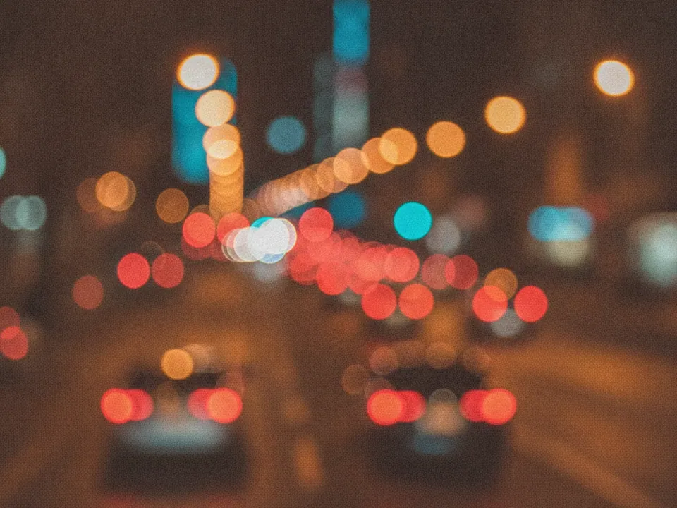
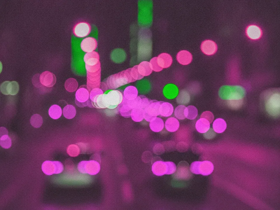
A photographic set built around glowing light, such as the night city bokeh background, actually sits closer to a dark theme's tone already, since its base is dark with isolated bright points rather than an evenly bright frame. That is worth keeping in mind when you pick a background for a page section that only shows up in dark mode.
The same mismatch shows up with flat, pale textures. A light paper or linen surface photographed under bright, even lighting carries a high average luminance, which looks correct next to white page chrome and looks like a lit rectangle cut into an otherwise dark page. If a brand still wants that material in a dark section, pairing it with a darkening overlay, rather than dropping it in untouched, keeps the luminance closer to its surroundings.

Swapping the image entirely
The most direct fix is to load a different file for each theme, inside the same media query used for color.
.hero {
  background-image: url("hero-light.jpg");
}
@media (prefers-color-scheme: dark) {
  .hero { background-image: url("hero-dark.jpg"); }
}
This works well when a set already includes variants in different tones. A texture set such as the subtle grain gradient set, where the six variants differ by color and tone, gives you a lighter and a darker option to assign without commissioning new artwork.
Swapping full files also composes with the responsive techniques used for breakpoints. A media query list can combine both conditions, so a page can serve a smaller file on narrow viewports and a darker file when the dark theme is active, in the same stylesheet, by nesting or chaining the two media features.
Dimming instead of swapping
When a second file is not available, you can dim one image with CSS instead. A filter on the element works, but it also dims any text inside that element, which is rarely what you want.
A safer version stacks a dark, semi transparent gradient on top of the photo, the same layering technique described in the CSS background-image guide, and raises its opacity only inside the dark media query.
.hero {
  background:
    linear-gradient(rgb(0 0 0 / 0.15), rgb(0 0 0 / 0.15)),
    url("hero.jpg") center / cover no-repeat;
}
@media (prefers-color-scheme: dark) {
  .hero {
    background-image:
      linear-gradient(rgb(0 0 0 / 0.55), rgb(0 0 0 / 0.55)),
      url("hero.jpg");
  }
}
The text and any foreground elements are untouched, since the gradient sits in the background stack, not over the whole element.
Picking a background that already suits a dark section
The least amount of CSS wins when the background you pick is already dark by nature, rather than one you have to darken after the fact. Grunge and metal textures with a black or near black base, such as the scratched black grunge texture, read correctly in a dark themed section with no overlay at all.
The same logic applies to anything shot or rendered against a dark field: neon and glow effects, night photography and most 3D renders with a black backdrop sit close to a dark UI's tone by default. Save the overlay technique for images that were only ever exported in one, bright version.
color-scheme and the light-dark() shorthand
color-scheme is a separate, related property. It tells the browser which theme or themes an element supports, so it can render built in UI such as form controls, scrollbars and the default page background in a matching style, instead of assuming light.
:root {
  color-scheme: light dark;
}
Its initial value is normal, which leaves the decision to the browser's own default. Setting light dark tells the browser the page actively supports both, which keeps native widgets from clashing with a custom dark background you built yourself.
Once color-scheme is set, the light-dark() function can read it directly. It takes two color values and returns whichever one matches the current scheme, without a separate media query.
.overlay {
  background-color: light-dark(rgb(255 255 255 / 0.1), rgb(0 0 0 / 0.55));
}
This is useful for an overlay tint that needs a different strength in each theme: instead of repeating the dark media query just to change one color, light-dark() keeps both values in a single declaration. It only ever returns a color, so it does not replace swapping an actual image file when the whole photo needs to change.
Contrast still has one set of rules
Switching themes does not change the WCAG contrast requirements. Normal text still needs a contrast ratio of at least 4.5:1 against its background, dark theme or not. The guide to text contrast on backgrounds covers measuring that ratio against the busiest part of an image, which matters just as much once the base tone of the page is dark.
A common mistake is testing contrast only in the theme you design in first, then shipping the other theme untested. Check both.
The busiest area rule matters more in dark mode than it first seems. A dark overlay that solves contrast at the top of an image can still leave a brighter patch lower down uncovered, especially on a tall hero where the gradient fades out before the image does. Extend the overlay, or increase its strength, until the darkest requirement is met everywhere text sits, not only where you first measured it.
A practical checklist for dark theme backgrounds
- Decide early whether a background will swap files, dim in place, or stay the same in both themes.
- If dimming, dim through a gradient layer, not a filter on the whole element.
- Set color-scheme on the root element if the page genuinely supports both themes.
- Re-check text contrast in dark mode, do not assume it carries over from light mode.
- Test on an actual OS level dark mode toggle, not only with browser developer tools.
- Favor backgrounds that are already dark toned for dark sections, and save overlays for images that only exist in one bright version.