What is in the set
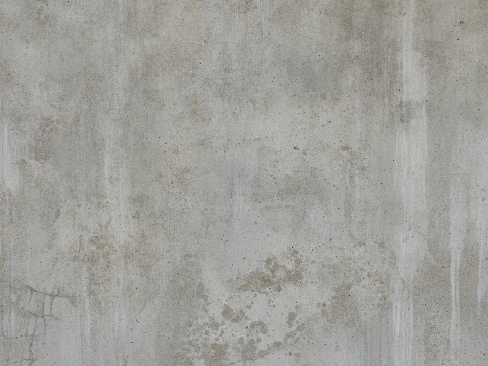
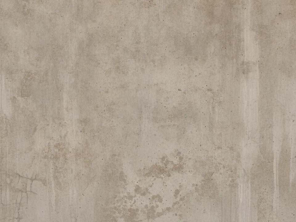
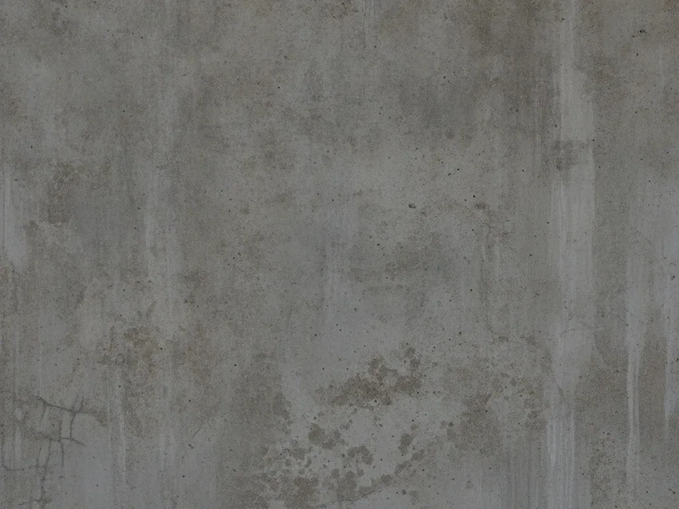
The set has four JPG files at 1600x1200 px. Each one is a frontal photo of a raw concrete wall under diffuse light. Up close you see small pores, faint water marks, darker stains and thin hairline cracks running through the surface.
The variants change tone and crop. Some walls are pale and dusty, others darker and more stained. The texture fills the frame in every file, with no corners, edges or fixtures, so you can crop freely without losing the effect.
Concrete is mostly grey, which makes it unusually flexible. It carries almost no color of its own, so it works as a physical surface under a brand palette instead of competing with it.
Where it works
Raw concrete reads as honest, built and urban. Typical uses:
- Portfolios for architects, interior studios and builders
- Product pages for tools, hardware and streetwear
- Posters and flyers for concerts, clubs and exhibitions
- Section backgrounds tinted in a brand color
You will find more weathered surfaces in grunge backgrounds, and more neutral materials in background textures.
Concrete also works well in product photography. A pale variant makes a clean floor for sneakers, watches or ceramics, and the stains add realism without stealing attention. For dark mode sites, the deeper variants give a page some depth where a flat grey would feel empty and digital. Use it the same way for slides.
The set is a good fit for long scroll layouts, since each file looks different enough to mark a new section.
How to use it in CSS
The most useful trick with concrete is background-blend-mode. Layer the texture with a flat color and set the mode to multiply. The grey picks up the color, and the stains and pores show through as darker detail.
.panel {
  padding: 96px 32px;
  color: #ffffff;
  background-color: #1f6f5c;
  background-image: url("concrete-02.jpg");
  background-size: cover;
  background-position: center;
  background-blend-mode: multiply;
}

.panel--accent {
  background-color: #c4472d;
}
Swap the background-color and you get a new tinted panel from the same file. multiply always darkens, so start from a fairly bright brand color. Try overlay or soft-light for a lighter, more contrasty result. The CSS background image guide lists how the layers stack.
Pairing and type tips
Concrete supports bold type. Condensed sans serifs, heavy grotesques and stencil faces all suit it. Keep body text on solid blocks rather than on the texture, because pores and cracks add visual noise at small sizes.
After tinting, measure contrast again. A blended panel is often darker than the brand color alone, which can help white text but hurt dark text. Aim for 4.5:1 for normal text and 3:1 for large headings.
Use one blend color per section. Several tinted concrete panels in a row look deliberate when the colors come from a fixed palette, and random when they do not.