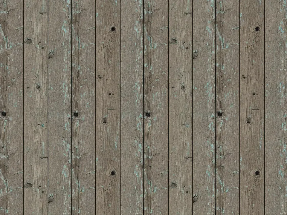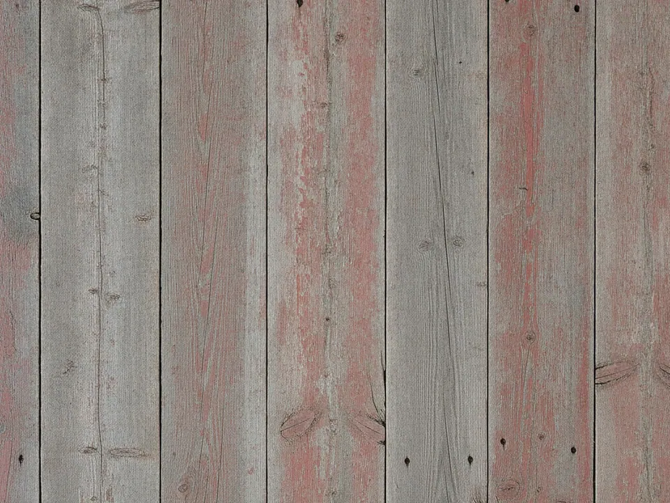
What is in the set
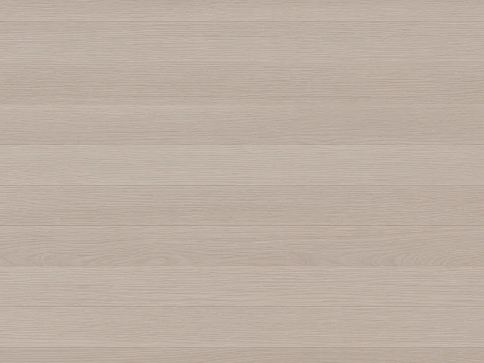
The set has three JPG files at 1600x1200 px. Each one shows light natural oak floor planks from directly above. The grain is straight and fine, the boards are clean, and the daylight is soft and even across the frame.
The three variants differ in tone and crop. One is paler and cooler, one a little warmer, and the plank width and direction change between files. All of them fill the frame from edge to edge, so you can crop to any shape.
Compared with weathered wood, oak is quiet. There are no cracks, paint traces or deep knots. That makes it a surface for content to sit on, not a feature in its own right.

Where it works
Light oak reads as fresh, natural and tidy. It is a strong fit for:
- Online shops for furniture, lighting and home goods
- Flat lay product photos for ceramics, stationery and tech accessories
- Minimal portfolio and studio sites
- Real estate and interior design listings
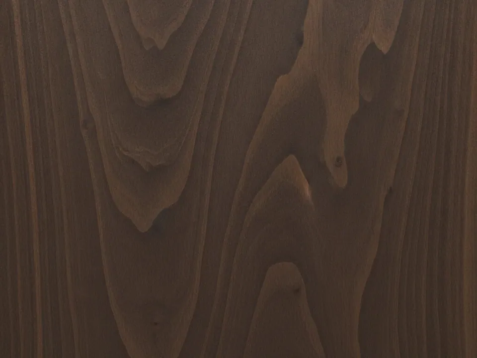
See more in wood backgrounds. For a darker, richer surface in the same family, the dark walnut texture works as a counterpart, for example in a footer.
How to use it in CSS
A 4:3 photo cropped into a narrow phone screen loses most of its planks. A simple fix is to change the crop and plank direction with a media query. Rotate one variant in an image editor to make a portrait copy, then swap it in on small screens.
.showcase {
  min-height: 560px;
  background-color: #d9c3a0;
  background-image: url("oak-planks-01.jpg");
  background-size: cover;
  background-position: center;
}

@media (max-width: 600px) {
  .showcase {
    min-height: 480px;
    background-image: url("oak-planks-01-portrait.jpg");
    background-position: 50% 30%;
  }
}
The browser only downloads the image that matches the active rule, so phones do not load both files. The base color matches the wood, which avoids a white flash during loading. More on sizing and loading is in fast background images.
Pairing and type tips
Oak is light, so dark text works directly on it for short headings. For longer copy, use a white card with plenty of padding. Clean sans serifs and simple geometric icons match the Scandinavian look.
Keep the palette restrained: off-white, soft black, and one muted accent such as sage, dusty blue or terracotta. Photograph products in daylight from above, so their shadows fall the same way as the light on the boards.
White space matters as much as the wood. Leave large calm areas and avoid filling every plank with objects.
For a product grid, use the paler variant behind the whole grid rather than inside every card. One continuous surface looks like a real table, while repeated small crops of the same boards look artificial and busy. If cards need separation, use white backgrounds with thin borders and keep the wood visible in the gutters between them.