What is in the file
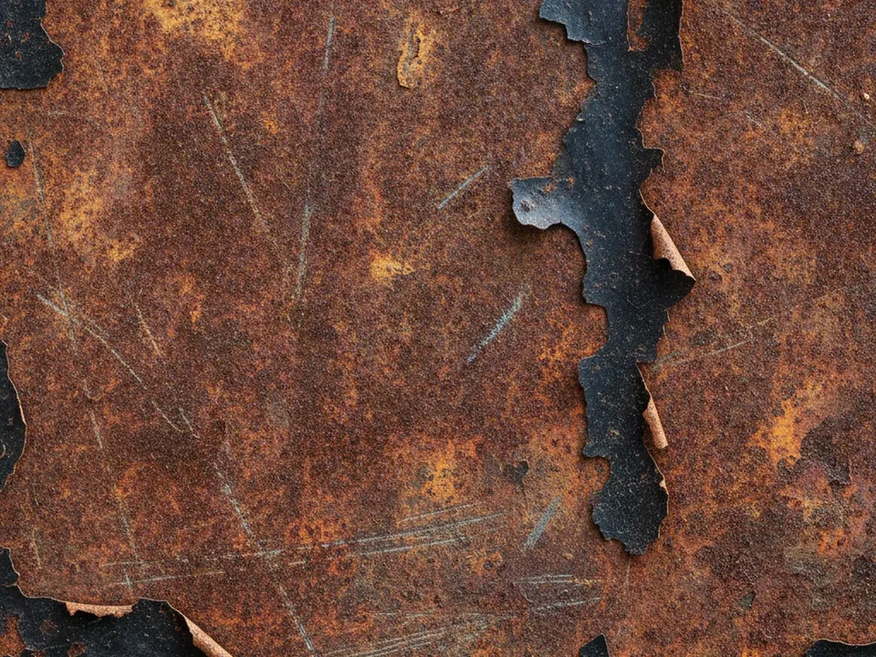
One JPG at 1600x1200 px. It shows a sheet of steel close up and straight on. Orange and brown corrosion covers most of the surface, with patches of dark paint that are lifting and flaking off. Fine scratches cut through both layers.
The lighting is even, so there are no glare spots or deep shadows. The rust fills the frame from edge to edge, which means any crop, from a thin strip to a square, keeps the same rough character.
The palette is warm and saturated. Rust orange is a strong color in its own right, so treat this file as a feature texture rather than a quiet backdrop.
Where it works
Corroded metal reads as age, wear and grit. It fits projects that want that edge:
- Display headlines filled with the texture
- Game menus and landing pages for survival, horror or post industrial worlds
- Brands for garages, motorcycles, workshops and craft beer
- Album covers, gig posters and merch graphics
It belongs to the grunge backgrounds group. For a darker, sepia take on decay, the vintage grunge background is a close companion.
Rust also works in small doses inside interfaces. A rusted badge, a thin divider strip or the background of a single feature card brings texture to an otherwise flat layout. In games, it is a natural fit for button plates, inventory frames and loading screens, where the eye expects worn materials. Keep those elements large enough for the texture to read, since rust turns into a muddy brown blur below about 100 px.
How to use it in CSS
Rust is too loud behind long text, but it is excellent inside text. With background-clip: text the image paints only within the letter shapes. Make the text color transparent so the texture shows.
.rust-title {
  font: 900 clamp(3rem, 10vw, 8rem)/0.9 Impact, "Arial Black", sans-serif;
  text-transform: uppercase;
  color: #b5501c;
}

@supports (background-clip: text) or (-webkit-background-clip: text) {
  .rust-title {
    background: url("rusted-metal.jpg") center / cover;
    -webkit-background-clip: text;
    background-clip: text;
    color: transparent;
  }
}
The @supports block applies the texture only where clipping works. Everywhere else the heading keeps a solid rust color. Heavy, wide letters show the most texture, so use the boldest weight you have. The text stays real, selectable text, which keeps it accessible to screen readers and search engines. See the CSS background image guide for more on background-clip.
Pairing and type tips
Put rust filled headings on a near black or dark charcoal background. The warm orange glows against it. Check that the darker patches inside letters still meet 3:1 against the page for large text. If they do not, choose a crop with more orange.
Keep the rest of the page plain: off-white body text, simple sans serif, generous spacing. One rusted element per screen is enough. A cool accent, such as steel blue, balances the warmth.