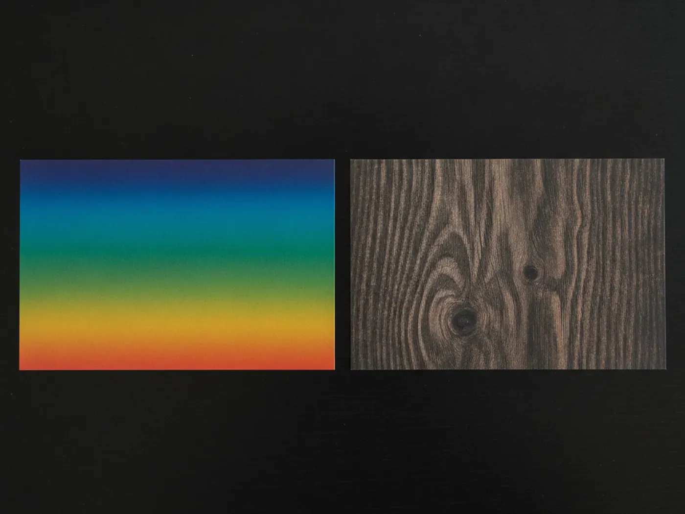
- A CSS gradient is computed by the browser and adds no file, so it has zero network weight.
- linear-gradient, radial-gradient and conic-gradient are image values, not colors.
- A gradient cannot show fine detail such as grain, fiber or wood grain, a raster image can.
- Layering a gradient over a photo is the standard way to darken an image for readable text.
Two ways to fill a box with color
Both a gradient and a raster image are valid values for background-image in CSS. The difference is where the pixels come from. A gradient is math the browser evaluates at paint time. An image is a file the browser downloads and decodes.
| Gradient | Image | |
|---|---|---|
| Network cost | None | One file per breakpoint or density |
| Sharpness | Sharp at any size, any zoom | Fixed pixel grid, can soften when scaled up |
| Detail | Smooth color transitions only | Grain, fiber, texture, photographic subjects |
| Exact color | Any hex or named color, exactly | Approximated by whatever the file was shot or rendered in |
Neither option is better in general. Each is the right tool for a specific job, and most pages end up using both.
CSS defines three gradient functions. linear-gradient() transitions along a straight line at any angle. radial-gradient() transitions outward from a center point, as a circle or an ellipse. conic-gradient() transitions around a center point, like a color wheel or a pie chart. All three accept any number of color stops, placed with lengths or percentages.
.a { background: linear-gradient(135deg, #0b1b33, #2f6fed); }
.b { background: radial-gradient(circle at 30% 30%, #ffce45, #0b1b33); }
.c { background: conic-gradient(from 90deg, #0b1b33, #2f6fed, #0b1b33); }
When a gradient is the right tool
Reach for a gradient when the job is color, not content. Good candidates include brand colored surfaces, section dividers, placeholder fills while an image loads, and subtle depth behind flat UI.
- You need an exact brand hex value, not an approximation from a photo.
- The area is large and performance matters more than texture.
- The effect is simple: two or three colors blending, a soft radial glow, a repeating stripe.
A soft gradient can also carry light grain so it does not look sterile. The subtle grain gradient set pairs a smooth color field with a fine noise layer baked into the file, which is a useful shortcut when you want gradient-like color with a bit of texture and do not want to build the grain in CSS yourself.

When you need a real image
A gradient cannot invent detail that was never there. Wood grain, woven fabric, worn concrete and plant foliage all carry irregular, high frequency information that only a photograph or a rendered texture reproduces convincingly.
Reach for an image when the background needs to read as a physical material or a real place: a dark walnut wood texture behind a furniture brand, a linen fabric texture behind a textile shop, or a skyline behind a travel page. Trying to fake that depth with layered gradients takes more CSS than loading one well compressed JPG, and still looks flat next to the real thing.
There is a middle case worth naming separately: images that read as abstract rather than photographic, such as the soft gradient mesh backgrounds. These are raster files, not CSS gradients, because the blurred color blobs in a gradient mesh are painted with far more control points than a CSS radial or conic gradient supports. A CSS gradient has one or a handful of color stops along a single axis or point, while a gradient mesh image varies color across a whole two dimensional surface, which is why it still gets exported as a file instead of written as a CSS rule.
Layering a gradient over a photo
The two techniques are not an either-or choice. Stacking a gradient on top of a photo, in the same background-image list, is the standard way to darken an image enough for text to stay readable without editing the file itself. The full property reference, including how layer order and the shorthand behave, is in the CSS background-image guide.
.banner {
  background:
    linear-gradient(rgb(0 0 0 / 0.55), rgb(0 0 0 / 0.15)),
    url("concrete-wall.jpg") center / cover no-repeat,
    #6b6b6b;
}
The gradient paints on top because it is listed first, the photo sits under it, and the flat color shows if the image fails to load. Nothing here needs JavaScript or image editing software.
Performance adds up differently
A gradient's cost is a small amount of GPU work at paint time, repeated on scroll and resize. An image's cost is a file download, a decode step, and a Largest Contentful Paint candidate if it sits above the fold. The full breakdown of that cost, including why CSS backgrounds are discovered later than an img, is covered in fast background images.
In practice this means a gradient-only hero loads instantly on any connection, while a photographic hero needs format choices, sizing per breakpoint and a loading strategy to hit the same bar. Neither problem is hard, but only one of them exists if you choose a gradient.
Using a gradient as a stand-in for an image
A plain color or gradient set as background-color behind an image shows instantly, before the file arrives, and prevents a white flash. Pick a flat tone or a soft gradient close to the photo's dominant color, and the swap from placeholder to final image barely registers.
This costs one extra line of CSS and no extra request, since background-color and a solid gradient are both free to render.
The same idea works for an error state. If an image request fails, a background color set underneath it is still visible, so the layout never shows a blank, unstyled gap where the photo should have been.
Building patterns without a single pixel downloaded
Gradients are not limited to smooth, single-direction fades. repeating-linear-gradient() and repeating-radial-gradient() restart the color stops once they reach a set distance, which draws stripes, chevrons and grids with no image file at all.
.stripes {
  background: repeating-linear-gradient(
    45deg,
    #0b1b33 0 10px,
    #142a52 10px 20px
  );
}
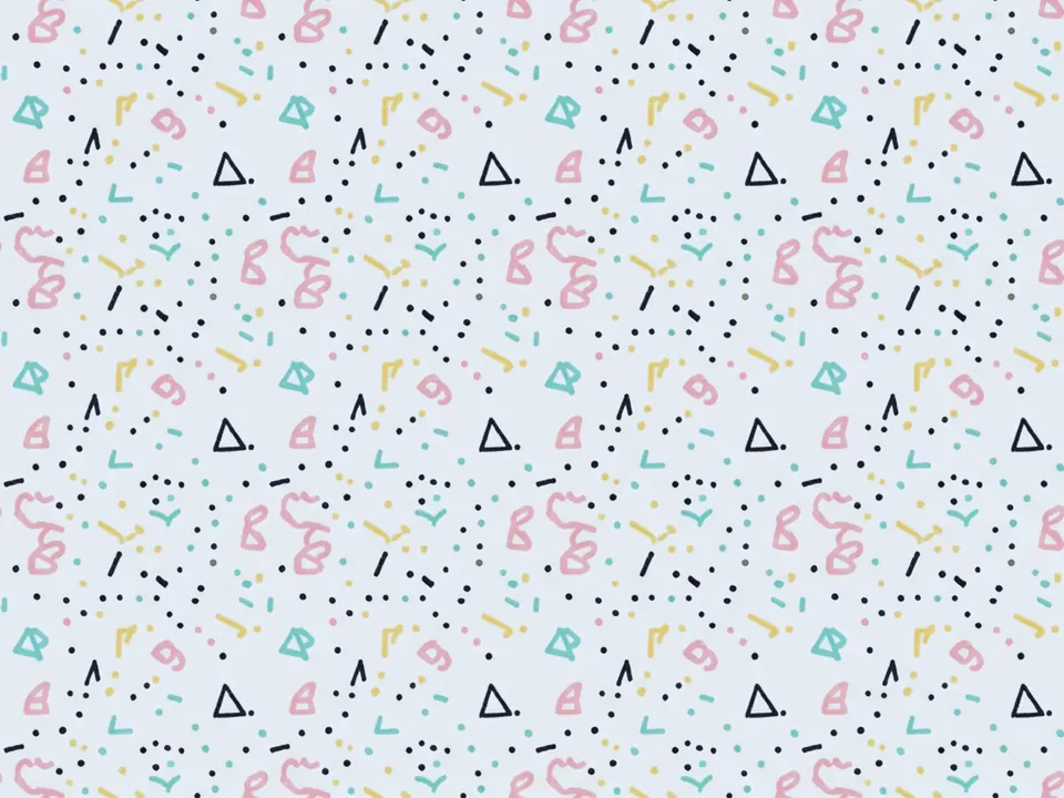
This is worth comparing against a raster pattern set, since both produce a repeating visual but at a different cost. A flat graphic pattern such as the memphis pattern background carries hand drawn shapes, squiggles and varied colors that a gradient has no way to reproduce. A simple geometric grid, closer to a thin line pattern than a hand drawn one, sits right at the edge of what a repeating gradient can fake with plain lines, and is worth building in CSS if the design allows it, since it then scales to any size with no extra file and no blur.
A quick decision checklist
- Need an exact brand color, not an approximation: use a gradient.
- Need a physical material, place or photographic subject: use an image.
- Need text to stay readable over a busy photo: layer a gradient on top of it.
- Want a placeholder while an image loads: use a flat color or gradient close to the image's tone.
- Building stripes, grids or simple repeating patterns: a repeating gradient is usually smaller and sharper than a tiled image.
When in doubt, start with a gradient. It is free to try, free to remove, and tells you quickly whether the page actually needed a photograph at all.