What is in the set
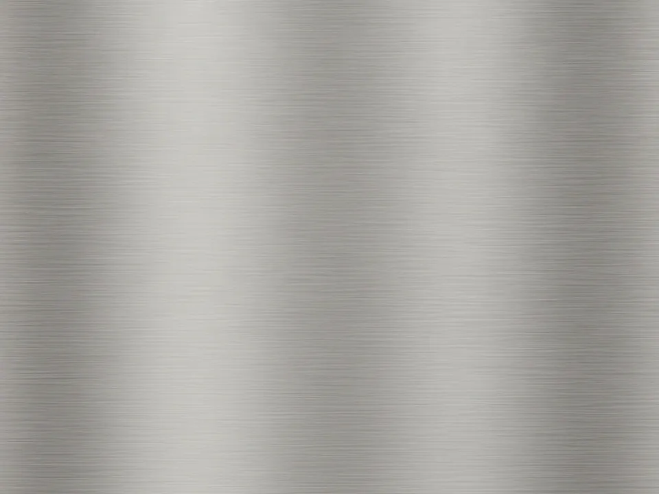
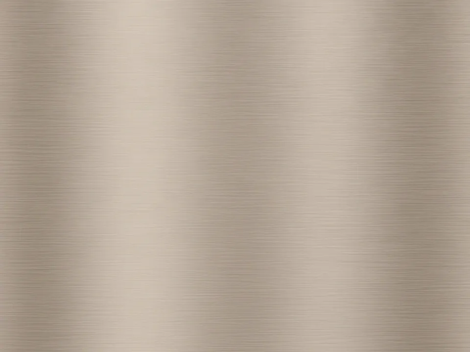
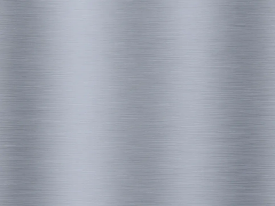
The set holds three variants of the same stainless steel sheet. Each one is a flat close photo with fine horizontal brush lines running edge to edge. Studio lighting keeps the surface even, so no corner is much brighter than another.
- Neutral steel: cool grey with soft, wide reflections.
- Bright steel: lighter overall, close to a satin finish.
- Dark steel: lower exposure, with the brush lines more visible.
All three files are 1600x1200 px JPG. They sit in our background textures collection.
Where it works
Brushed metal signals precision. It suits pages that sell physical products with metal parts: audio gear, tools, watches, kitchen equipment. It also works behind a login card on an internal dashboard, where you want a surface that feels solid but stays quiet.
Use it in bands, not everywhere. A metal hero above a plain white content area reads well. A full metal page tires the eye fast, because the horizontal lines compete with every line of text.
How to use it in CSS
The brush lines are horizontal, so let the image scale with cover and keep it anchored to the center. A thin highlight gradient on top adds a sheen that responds to the layout instead of being baked into the photo. Multiple backgrounds stack in order: the first layer listed is drawn on top.
.hero-metal {
  background-color: #8a8f94;
  background-image:
    linear-gradient(180deg, rgba(255, 255, 255, 0.25) 0%, rgba(255, 255, 255, 0) 40%),
    url("/img/brushed-metal-neutral.jpg");
  background-size: auto, cover;
  background-position: 0 0, center;
  background-repeat: no-repeat;
}
The background-color is a fallback while the JPG loads. Pick it from the mid grey of the variant you use. For loading tips on large hero images, see our guide to fast background images.
Pairing and type tips
Mid grey steel is the hardest surface for text contrast. Dark text on the bright variant usually passes 4.5:1. White text on the dark variant usually passes too. On the neutral variant, test before you ship, or place text on a solid panel. Our article on text contrast on backgrounds covers how to measure it.
Geometric or grotesque sans serifs fit the material. Keep accent colors few: one saturated color, such as a signal orange or electric blue, stands out cleanly against grey metal.