What is in the set
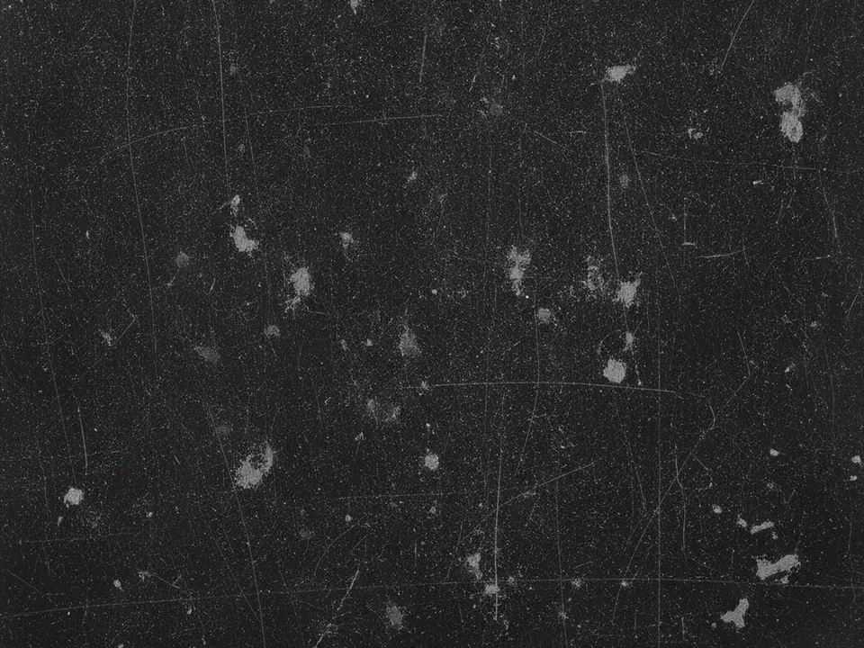
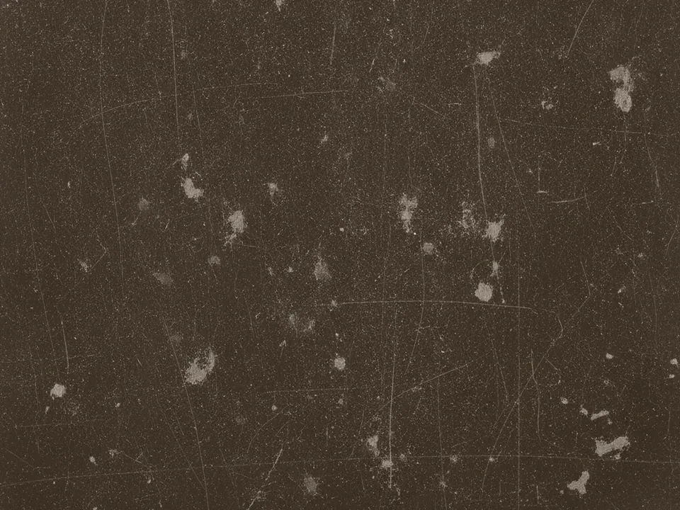
The set has two JPG files at 1600x1200 px. Each one is a flat, frontal photo of a black painted metal surface, covered in fine scratches, small scuffs and a light layer of dust, lit evenly so no single mark stands out.
The two variants differ in overall tone: the original reading as a neutral near black, the second pulled slightly warmer. Both keep the same density of scratches and the same even lighting, so swapping between them does not change the mood much, only the color temperature.
The grey wear marks are subtle rather than dramatic. This is a worn surface, not a heavily rusted or torn one, which keeps it usable behind text without the texture pulling too much attention.
Where it works
A matte black scratched surface fits content with an edge:
- Music, band and label pages
- Gaming, esports and hardware sites
- Streetwear and accessory product pages
- Bold, dark portfolio sections
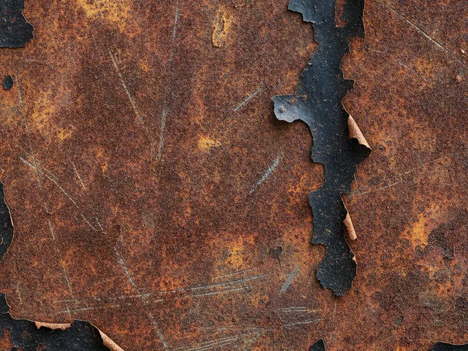
It is part of grunge backgrounds and background textures. For a rougher, more aged metal surface, compare the rusted metal grunge texture.
How to use it in CSS
Because the base is already dark, you rarely need an extra overlay for contrast, but a short gradient at the bottom helps separate a footer navigation bar from the scratches above it.
.site-footer {
  background-color: #0b0b0c;
  background-image:
    linear-gradient(to top, rgba(0, 0, 0, 0.6), transparent 60%),
    url("scratched-black-01.jpg");
  background-size: cover;
  background-position: center;
}

.site-footer a {
  color: #f3f3f3;
}
Light grey or white text at this contrast level comfortably clears the 4.5:1 ratio required for normal body text against the dark gradient band. For more on pairing text with dark photographic backgrounds, see text contrast on backgrounds.
Pairing and type tips
White, off-white or a single bright accent color such as acid green or electric blue reads well against this surface. Keep the accent to small elements like buttons or underlines rather than large blocks of color, which can look out of place on a worn metal surface.
Condensed, heavy weight sans serif headings suit the industrial mood, while body copy should stay in a plain, readable weight so long passages do not strain the eye against the scratches.
Avoid stacking another grunge texture, such as a paper or concrete background, in the same section. One worn surface reads as deliberate styling, two competing textures read as noise.