What is in the set
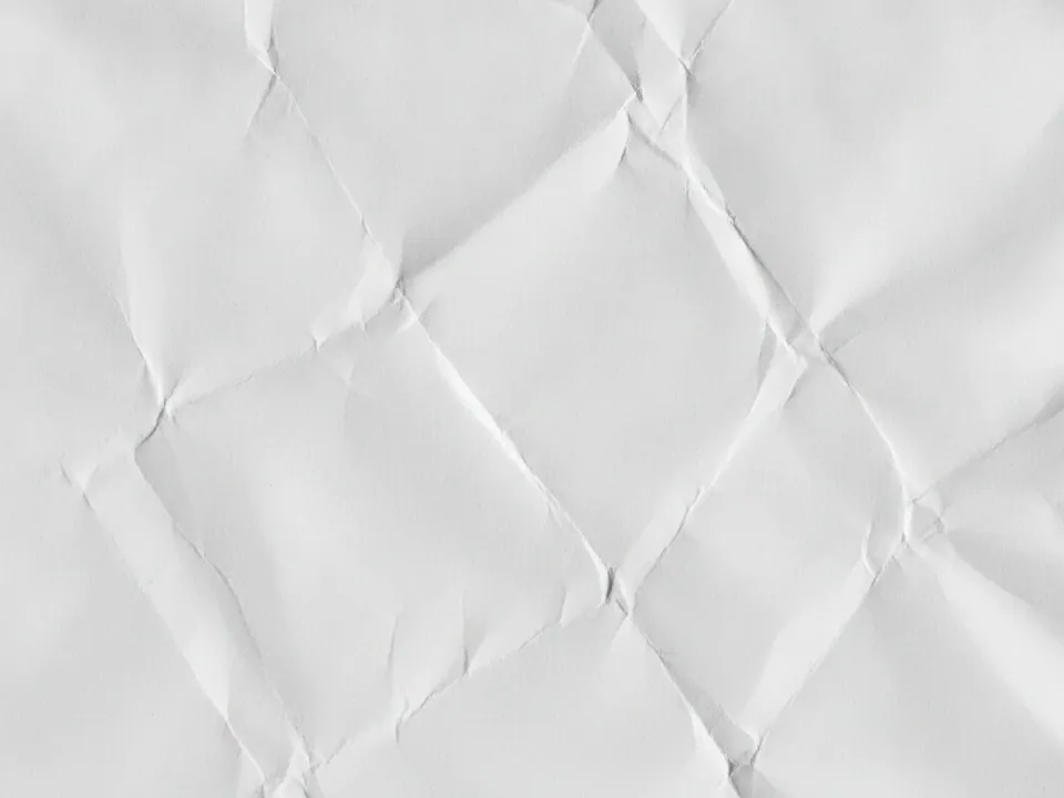
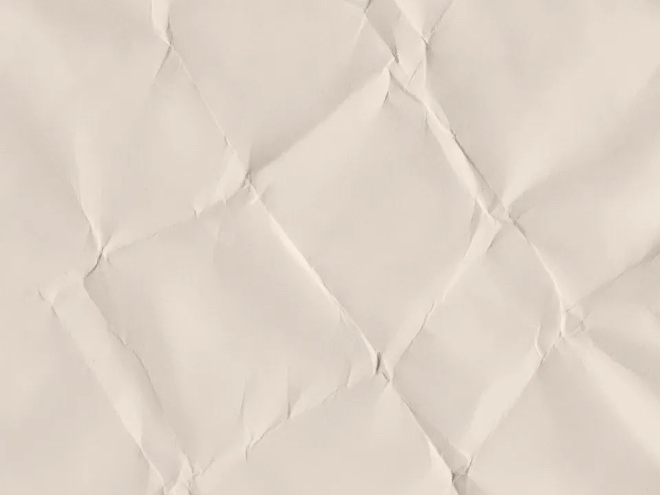
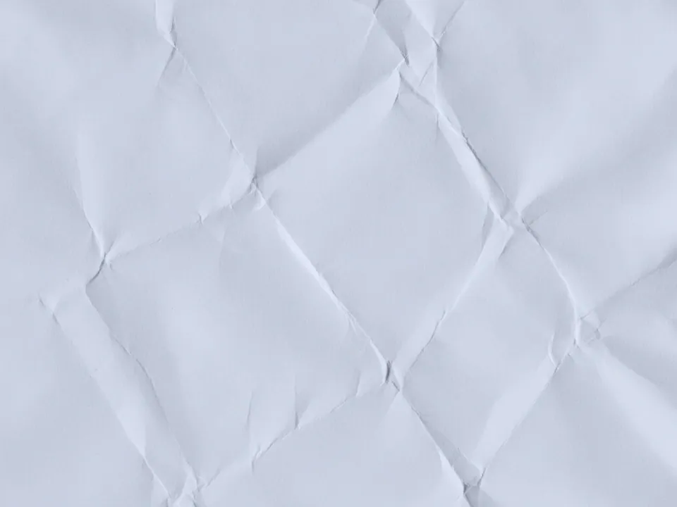
The set has three JPG files at 1600x1200 px. Each one is a flat scan of a white paper sheet that was crumpled and then flattened back out, showing sharp creases and soft shadows that follow the fold lines, under even, shadowless studio lighting.
The three variants shift the overall tone from the original clean white through additional warm and cool readings, which changes how neutral or cream the paper appears without changing the crease pattern. No writing, printing or color marks appear on any file.
Because the folds are irregular and scattered across the whole sheet, the texture crops well into any aspect ratio while still showing a clear sense of crumpled paper rather than a flat sheet.
Where it works
Crumpled white paper reads as simple, tactile and handmade, which suits:
- Notes, to-do list and productivity apps
- Stationery, printing and craft shops
- Minimal blog and newsletter headers
- Handwritten letter or journal style sections
It is part of paper backgrounds and background textures. For an aged, colored alternative in the same family, see the old paper set.
How to use it in CSS
Because this texture is light and low contrast, it is a good candidate for a dark mode swap rather than a permanent choice, so users who prefer a dark theme are not stuck looking at bright white paper.
:root {
  --paper-bg: url("crumpled-paper-01.jpg");
  --paper-color: #2a2a28;
}

@media (prefers-color-scheme: dark) {
  :root {
    --paper-bg: none;
    --paper-color: #e8e6df;
  }
}

.note {
  background-color: #f6f4ee;
  background-image: var(--paper-bg);
  background-size: cover;
  color: var(--paper-color);
}
Swapping the image out entirely in dark mode, rather than just dimming it, keeps the surface flat and predictable for readers. More on this pattern is in backgrounds for dark mode.
Pairing and type tips
Dark grey or black text sits comfortably on this texture at normal sizes, since the paper stays light and the creases are soft rather than deeply shadowed. A handwritten or typewriter style font suits notes and journal content, while a plain sans works better for app interfaces.
Keep interface elements, such as buttons and form fields, simple and flat. A texture this detailed does not need extra shadows or gradients on top of it to feel tactile, it already carries that quality.
If you place form inputs directly over the paper, give them a solid light fill so the crease pattern does not show through the input text and reduce legibility.