What is in the set
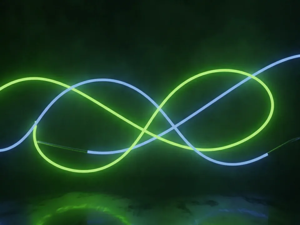
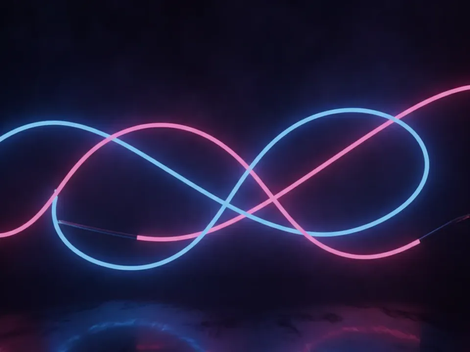
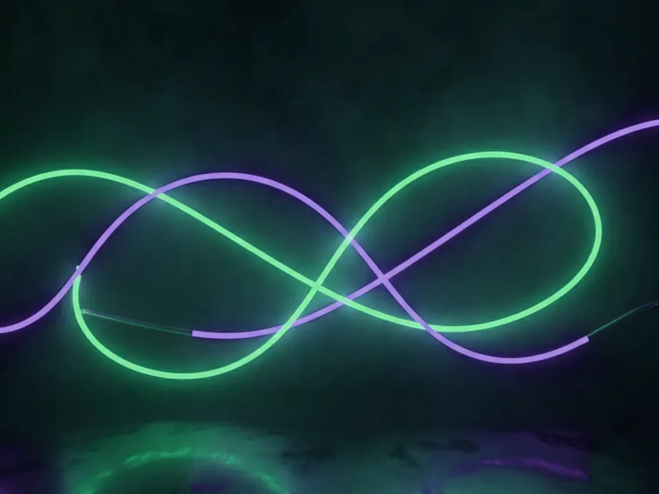
The set has three JPG files at 1600x1200 px. Each shows glowing neon tube lines in pink and electric blue, bent into abstract arcs against a deep black background. A soft haze sits around the tubes, with faint reflections below them.
There is no text or lettering baked into any file, and no readable shapes beyond the arcs themselves. The variants, named Original, Rose and Violet, shift the hue balance: Rose leans warmer and pinker, Violet pushes the blue tones toward purple. The black field and the haze stay consistent across all three.
Because the glow sits away from the frame edges, you can crop any variant into a wide banner or a square tile and keep the arcs readable. The black areas at top and bottom give clean space for a logo or a short line of text.
Where it works
Neon glow reads as modern, electric and a little loud, in a good way. It suits:
- Landing pages for concerts, DJ sets and festivals
- Gaming, esports and streaming sites
- Club, bar and nightlife promotion pages
- Dark mode hero sections that need motion without video
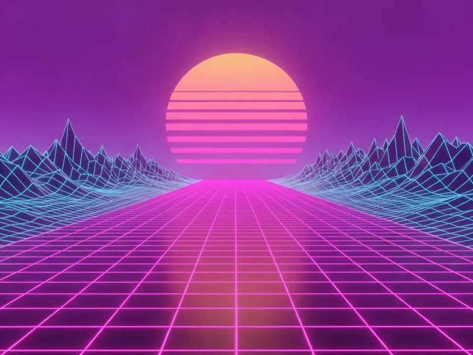
It sits in both retro backgrounds and 3D backgrounds. For a flatter, grid-based take on the same era, see the synthwave grid background.
How to use it in CSS
Set a near black fallback color so the page does not flash white while the file loads, and keep the image behind a dark overlay if you plan to place body text on top. A black to transparent gradient also helps the edges blend into the rest of a dark page.
.hero {
  --accent: #ff4fd8;
  background-color: #0a0a12;
  background-image: linear-gradient(0deg, #0a0a12 0%, rgba(10,10,18,0.4) 40%),
    url("neon-glow-rose.jpg");
  background-size: cover;
  background-position: center;
  color: #fff;
}

.hero .cta { border: 1px solid var(--accent); }
White text on the darkest parts of the image comfortably clears the 4.5:1 contrast ratio needed for body copy, but check it directly behind the brightest tube lines, where contrast drops. If the page uses motion on top of the glow, respect prefers-reduced-motion and keep the still image as the default state, as covered in text contrast on backgrounds.