- CSS background images have no built-in responsive syntax, media queries do the resizing.
- image-set() lets the browser pick a resolution or format, similar to srcset for img.
- The picture element supports real art direction, swapping the crop, not only the size.
- background-position can change per breakpoint even when the image file stays the same.
Why background images do not resize themselves
background-size: cover and contain decide how an image maps onto its box, but neither one changes which file loads. Set a single background image with no media queries, and a phone on a mobile network downloads the exact same bytes as a desktop monitor.
CSS has no equivalent of srcset for backgrounds. Everything responsive about a background image is built from ordinary CSS features applied by hand: media queries that swap the URL, image-set() for resolution and format, or moving the image into an <img> or <picture> element entirely. The property reference for size, position and the rest lives in the CSS background-image guide.
Swapping files by breakpoint
The simplest responsive technique is a plain media query that points to a smaller file below a given width.
.hero {
  background-image: url("hero-800.webp");
}
@media (min-width: 900px) {
  .hero { background-image: url("hero-1600.webp"); }
}
This cuts bytes on narrow screens, which matters directly for load time, as covered in fast background images. You can change background-position in the same query, so a mobile crop favors a different part of the frame than the desktop crop, without touching the file itself.
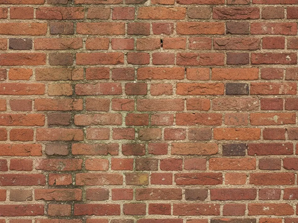
image-set() for resolution and format
image-set() lets the browser choose between resolution options or file types in a single declaration, instead of you guessing the device in a media query.
.hero {
  background-image: url("hero.jpg");
  background-image: image-set(
    url("hero.avif") type("image/avif"),
    url("hero.webp") type("image/webp"),
    url("hero.jpg") type("image/jpeg")
  );
}
The browser takes the first option whose type it supports, and a plain fallback declaration before it covers browsers that do not understand image-set() at all. Resolution descriptors such as 1x and 2x work the same way for serving sharper files to high density screens, without a media query for pixel ratio.
The same idea is simpler once the hero lives in an <img> instead of CSS. srcset with width descriptors, plus a sizes value describing how wide the image renders, lets the browser pick a file size on its own.
<img
  src="hero-800.jpg"
  srcset="hero-400.jpg 400w, hero-800.jpg 800w, hero-1600.jpg 1600w"
  sizes="100vw"
  alt="">
The browser combines the w descriptors with its own screen density to request the smallest file that still looks sharp, covering phones and high density displays from one markup block, with no media query at all.
The picture element: true art direction
Media queries and image-set() both still show the same photograph, just at a different size or encoding. Sometimes a design needs a different crop, not only a different size, such as a tight close-up on a narrow phone and a wide establishing shot on desktop. That is art direction, and CSS backgrounds cannot do it on their own.
<picture>
  <source media="(min-width: 900px)" srcset="skyline-wide.jpg">
  <source media="(max-width: 899px)" srcset="skyline-tight.jpg">
  <img src="skyline-wide.jpg" alt="" style="object-fit: cover; width: 100%; height: 100%;">
</picture>
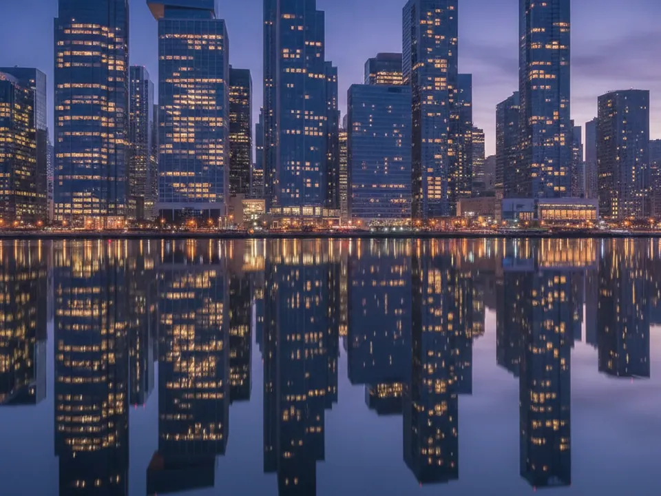
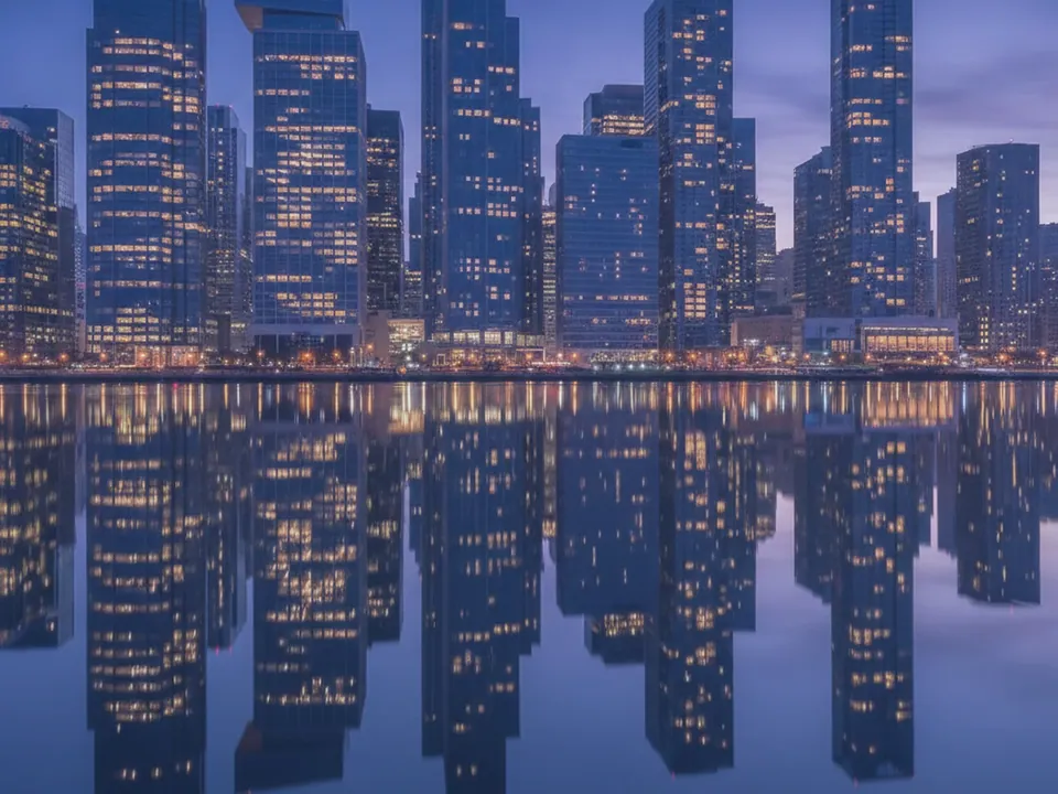
A wide scene like the city skyline at night background is a good candidate for this treatment: the full skyline works on desktop, while a phone might show only its brightest central section.
Moving to picture also restores every feature a CSS background gives up: the preload scanner can discover the file directly in the markup, alt text can describe the image when it carries meaning, and loading="lazy" becomes available if the image sits below the fold. None of that comes free with background-image, regardless of how many media queries you add.
Changing background-position without new files
Not every crop problem needs a second file. Repositioning the anchor point at a narrower breakpoint can rescue a background that only loses its subject at the edges.
.banner {
  background-image: url("brick-wall.jpg");
  background-position: center;
}
@media (max-width: 600px) {
  .banner { background-position: right center; }
}
A texture with repeating detail across the whole frame, like the red brick wall background, tolerates this well, since no single spot in the image is the one thing that must stay visible.
Picking breakpoints that match real usage
Breakpoints for background images do not need to match a design system's layout breakpoints exactly. They need to match where the image itself starts looking wrong: where a crop clips a subject, or where a large file becomes wasteful for the viewport it is shown on.
A practical starting set is 400px, 800px, 1200px and 1600px, which lines up with the 1600×1200 native size used across this site's library and gives a clean 2x step down to the smallest size.
Screen density adds a second axis on top of viewport width. A 1600px wide file looks correct at 1x on a 1600px wide screen, but a phone with a narrower CSS viewport and a higher device pixel ratio can still need a larger file than its layout width suggests, since each CSS pixel is drawn with more than one physical pixel. image-set() resolution descriptors and srcset width descriptors both account for this automatically, which is one more reason to prefer them over a plain media query once more than two sizes are in play.
Viewport queries versus container queries
Every media query in this guide responds to the viewport, the browser window itself. CSS also has container queries, written with @container, which respond to the size of a containing element instead.
.card { container-type: inline-size; }
@container (min-width: 400px) {
  .card .banner { background-position: center top; }
}
This matters once a background sits inside a component that gets reused at different widths, such as a card in a wide grid on one page and a narrow sidebar on another. A viewport media query only knows the window size, not the card's own size, so it can swap the wrong way in a narrow card on a wide screen. A container query reacts to the card itself, which is the more accurate signal for a background that lives inside reusable components rather than a full page hero.
Container queries need a named or typed container to work. Setting container-type: inline-size on the ancestor opts it into query containment along the inline axis, which is enough for most card and sidebar layouts where only the width matters. Nothing changes for the plain viewport media queries used earlier in this guide, they keep working exactly as before. Reach for a container query only once the same background rule needs to behave differently depending on which part of the page the component ends up in.
A checklist for responsive backgrounds
- Decide whether the problem is file size, crop, or both, before choosing a technique.
- Use a media query swap or image-set() when only size or format needs to change.
- Use picture when the crop itself needs to change between viewports.
- Try repositioning before exporting a new file, it is free and often enough.
- Test at the narrowest and widest viewport you support, not only your default browser width.
- Check component-level backgrounds with container queries if the component is reused at more than one width on the page.