- A pixel grid has no physical size until you assign it a resolution in pixels per inch.
- 1600x1200 px at 300 ppi prints at about 5.3 by 4 inches, the common target for sharp print.
- The web does not use ppi at all. It uses CSS pixels and a device pixel ratio.
- Upscaling a raster image adds no detail. It only interpolates between pixels that already exist.
A pixel is not a physical size
A digital image file is a grid of pixels. The file for every background on this site is 1600 by 1200 pixels. That number alone says nothing about how big the image will look, since a pixel has no fixed physical size. The same grid can fill a phone screen, a desktop monitor, or a sheet of paper, at a different physical size each time.
Size only appears once you add a second number: how many of those pixels fit into one inch. For print that number is pixels per inch, written ppi. For screens the comparable idea is a device pixel ratio, which is covered further down. Keep the two separate, because they answer different questions.
This confuses people because file browsers and design tools often print a size in inches or centimeters next to an image, as if that were a fixed property of the file. It is not. That number is only the size the tool happens to be assuming right now, usually 72 or 96 ppi by default, and changing the target ppi changes the printed size without touching a single pixel in the file.
PPI and DPI are not quite the same thing
The two terms get used interchangeably, but they describe different devices.
- PPI, pixels per inch, describes the image file: how many of its pixels are mapped into one inch of output.
- DPI, dots per inch, describes the printer: how many physical ink or toner dots it lays down per inch, which can differ from the image's pixel count depending on the printer's own dithering.
In everyday use people say DPI when they mean the ppi of an image, and most design software follows that habit too. The math below uses ppi, since that is the number that actually comes from the file.
A printer can lay down more dots per inch than the file provides pixels per inch, using dithering to simulate shades and colors the file does not explicitly contain at that density. That process can improve how smooth a print looks, but it cannot invent new picture detail that the source pixels never had.
What 1600x1200 prints at, by ppi
Divide the pixel count on each side by the ppi you choose, and you get the printed size in inches.
| Target ppi | Printed size | Typical use |
|---|---|---|
| 300 ppi | 5.33 x 4 in | Sharp print, viewed up close |
| 150 ppi | 10.67 x 8 in | Acceptable print, viewed at arm's length |
| 72 ppi | 22.2 x 16.7 in | Soft print, viewed from a distance only |
300 ppi is the long-standing target for materials read up close, like a flyer or a book page, because most people cannot resolve finer detail than that at normal reading distance. At 150 ppi the same file stretches to roughly twice the linear size, at a visible but often acceptable softness for something like a poster seen from a few feet away. 72 ppi is historically tied to old screen resolutions, not to print quality, and should not be treated as a print target.
The web does not measure in ppi
None of the math above applies to a browser. CSS works in its own unit, the CSS pixel, which is a fixed reference size regardless of the screen's physical pixel density. A background-size: 1600px rule places the image at 1600 CSS pixels wide, full stop, with no ppi conversion involved.
What does vary by screen is the device pixel ratio, or DPR: the number of physical screen pixels packed into one CSS pixel. A standard laptop display is close to a DPR of 1. Most modern phones and many laptops sit at a DPR of 2 or 3. A background sized at 400 CSS pixels wide needs an 800 or 1200 pixel wide file to look sharp on those screens, or it will appear soft, since the browser stretches a smaller file to fill the same CSS space.
.hero {
  background-image: url("hero.jpg");
}
@media (-webkit-min-device-pixel-ratio: 2), (min-resolution: 192dpi) {
  .hero { background-image: url("hero@2x.jpg"); }
}
With an <img> element, srcset with a width descriptor achieves the same result without a manual media query, letting the browser pick the right density automatically.

Upscaling has a hard limit
A 1600x1200 file is a fixed grid of roughly 1.9 million pixels. Nothing you do in software adds real information beyond that grid. Resizing it up to, say, 3200x2400 does not create new detail: it interpolates new pixel values between the ones that already exist, which softens edges rather than sharpening them.
This matters for both print and screen. Stretching a web-sized background to fill a large printed banner will look blurry no matter how good the interpolation algorithm is, because the source never had the pixel count the output needs. The only real fix is starting from a file that already has enough pixels for the largest size it will ever be used at, at the ppi or density the final output requires.
Downscaling has the opposite, and much safer, property. Shrinking a large file to a smaller pixel count throws away detail on purpose and rarely looks bad, since the remaining pixels are averaged from real source data rather than invented. When in doubt about which direction to go, start from the largest clean source you have and scale down for each specific use, rather than scaling a small file up to meet a bigger one.
Vector formats sidestep the whole problem
Every calculation above applies to raster formats: JPEG, PNG, WebP, AVIF, anything stored as a fixed pixel grid. A vector format such as SVG is defined by coordinates and math rather than pixels, so it has no native ppi at all. The same SVG pattern or icon renders crisp at any output size, on screen or in print, because the renderer recalculates the shape at whatever resolution the output needs.
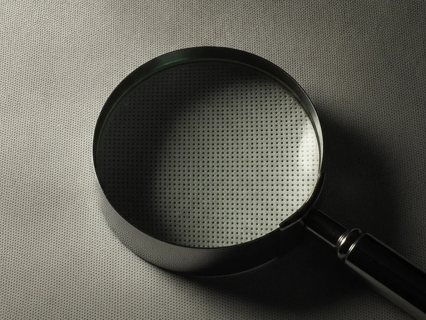
This is why flat geometric motifs, such as a halftone pattern rebuilt as vector shapes rather than a scanned photo, scale without any ppi math. The tradeoff is that SVG cannot represent organic photographic detail at all, only shapes and gradients, so it solves the resolution problem for a narrower set of images. For a photographed surface, raster is still the only practical option, and the ppi and DPR rules above apply in full.
Picking the right file for the job
A practical rule: decide the output first, then work backward to the pixel count you need.
- For a screen hero at full width, check the widest layout you support and multiply by the device pixel ratio you want to cover, usually 2x.
- For a printed flyer or card, multiply the physical size in inches by 300 ppi on each side.
- For a large format print viewed from a distance, 150 ppi is often enough, which roughly doubles the usable printed size for the same file.
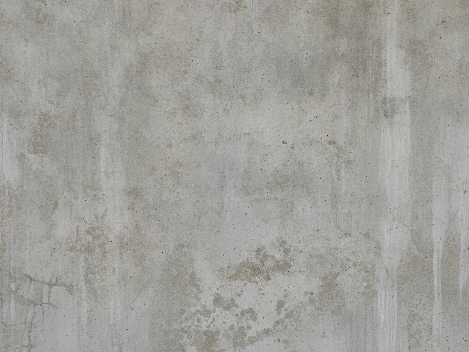
Photographic, evenly lit textures scale particularly well in both directions, since there is no sharp linework to reveal softening. A marble texture or a concrete background at 1600x1200 covers a generous print size at 300 ppi and still reads sharp as a web hero at normal screen widths. Read more on serving the right file per breakpoint in fast background images, and on checking a tile's repeat before you resize anything in seamless tileable textures.
One file, two outputs: a worked example
Take a single 1600x1200 file from this library and follow it into two different jobs.
A background can serve a screen and a printed page from the same file, as long as the output size respects what the pixel count can support at a reasonable ppi.
On the web, the file sits behind a hero section at a CSS width of, say, 1200px. On a standard display that is well within the source resolution, so the image renders sharp. On a phone at a device pixel ratio of 3, the effective pixel need rises to 3600px wide, well past what the file has, so a sharper source or a smaller display width is needed at that breakpoint.
On paper, the same file placed into a printed card at 5 by 3.75 inches lands at 320 ppi, comfortably inside the sharp range. Stretched to a 16 by 12 inch poster, the same 4:3 file drops to 100 ppi, under the 150 ppi comfort threshold, which is fine for a poster read from a few feet away but would look soft on a page held close to the eye. The pixel count never changes. Only the output size decides whether it looks sharp.