
What is in the set
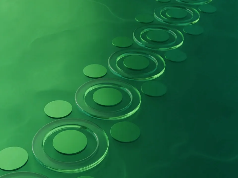
Three 3D renders built around circles. Concentric rings and flat discs float at an angle, catching soft reflections on their glossy surfaces. Light moves across the scene in a smooth gradient from teal to deep blue.
- Variants differ in the angle of the rings.
- Some show tighter groups of discs, others more open space.
- All files are 1600x1200 px JPG.
Browse related renders in 3D backgrounds.
Where it works
Circles suggest motion, cycles and connection, without pointing to anything literal. The cool palette reads as trustworthy and technical. That suits payment services, analytics tools, cloud products, online events and investor decks.
Compared with sharper 3D styles, these renders are quiet. They hold a hero section on their own, yet stay calm enough behind a title and one button.
How to use it in CSS
A common layout puts text on the left and visuals on the right. Instead of cropping with cover, size the image to the section height and push it to the right. Fill the left side with a solid color sampled from the image edge, so the join is invisible.
.hero-rings {
  min-height: 600px;
  padding: 8rem 5vw;
  background-color: #0b1e3a;
  background-image: url("/img/circled-teal.jpg");
  background-repeat: no-repeat;
  background-size: auto 100%;
  background-position: right -10vw center;
}

@media (max-width: 720px) {
  .hero-rings {
    background-size: cover;
    background-position: 70% center;
  }
}
The three value background-position offsets the image from the right edge, so part of the rings runs off screen. On small screens, switch back to cover. Our CSS background image guide explains the edge offset syntax.

Pairing and type tips
White text reads clearly on the deep blue side. On teal highlights, check contrast, since bright teal can drop white text below 4.5:1. Our article on text contrast on backgrounds shows how to test it.
Clean geometric sans serifs echo the round forms. Use one warm accent, such as amber or coral, for the main call to action. To keep the page fast, follow fast background images.