What is in the set
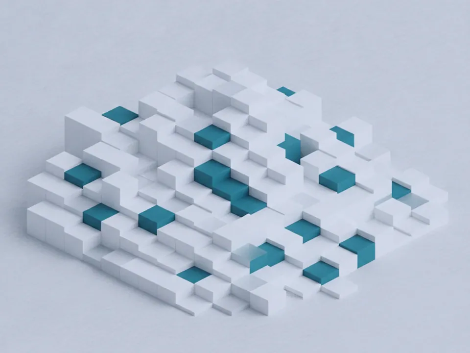
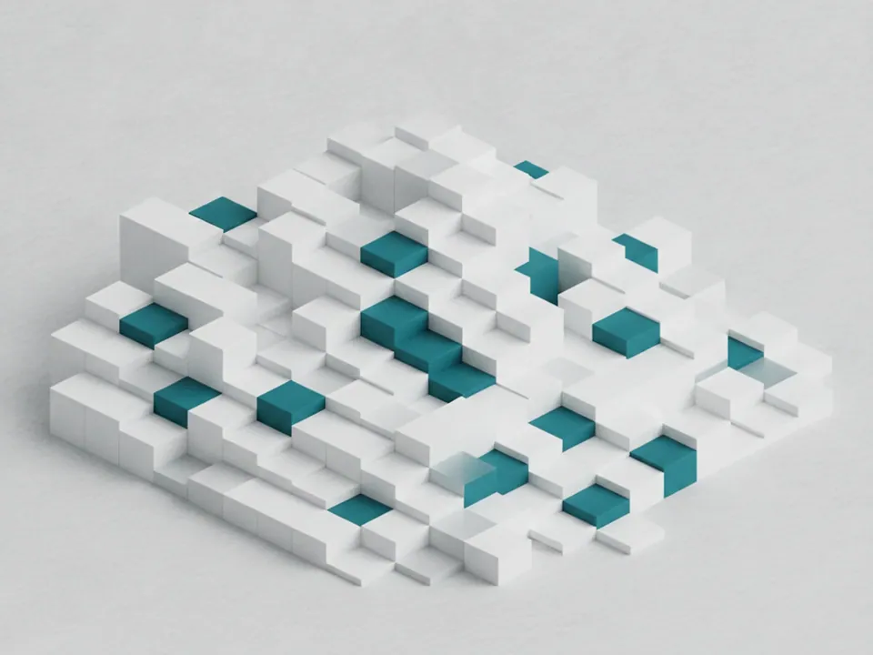
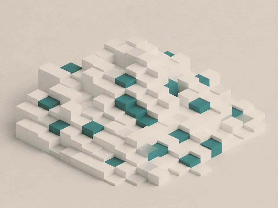
The set has three JPG files at 1600x1200 px, each a render of isometric cubes at different heights forming a stepped surface. The cubes are matte white and soft grey, lit cleanly with one accent color picked out on a handful of the raised blocks, and the texture fills the frame edge to edge.
The variants are named Original, Warm and Cool. Original keeps a neutral blue accent on a grey white surface, Warm shifts the accent toward amber on a slightly warmer grey, and Cool pushes the surface and accent toward a cooler blue grey. The cube arrangement and lighting angle stay the same across all three.
Because the surface is even and repetitive, the set crops cleanly into any shape, from a short banner strip to a full page background, without an obvious missing piece.
Where it works
This set reads as structured, technical and precise. It fits:
- SaaS feature pages and pricing tables
- Tech product launches and app landing pages
- Data, analytics and dashboard products
- Design system and component documentation sites
It belongs to 3D backgrounds. For a rounder, more organic render in the same category, see the circled background set.
How to use it in CSS
Since the three variants only differ by accent color, a CSS custom property lets you keep one background image file reference while switching the accent used in nearby UI, so the page feels coordinated rather than picking the accent at random.
:root {
  --cube-accent: #3b6ea5;
}

.pricing-hero {
  background-color: #e7e6e2;
  background-image: url("cubes-3d-original.jpg");
  background-size: cover;
  background-position: center;
}

.pricing-hero .badge { background: var(--cube-accent); color: #fff; }
Matching the badge color to the image accent, rather than to an unrelated brand color, keeps the page feeling like one system instead of two unrelated choices. For more on when a flat gradient could replace a render like this, see CSS gradients vs image backgrounds.