What is in the set
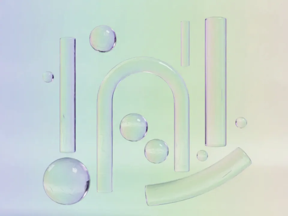
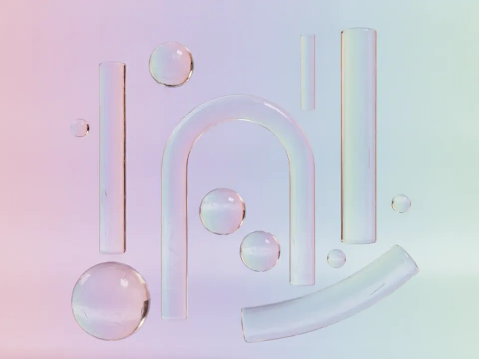
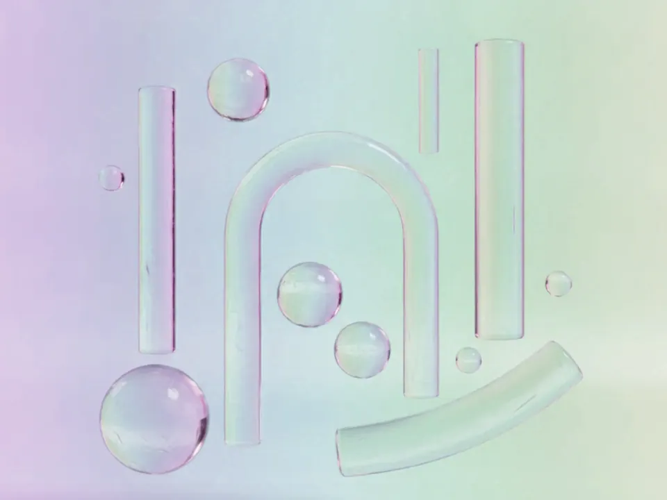
The set has three JPG files at 1600x1200 px, each a render of frosted glass spheres, cylinders and arches floating on a soft pastel gradient background. Light passes through the shapes with gentle refraction, and each one casts a soft, diffused shadow.
The variants are named Original, Rose and Violet. Rose shifts the pastel gradient and glass tint toward warm pink, while Violet pulls both toward a cooler lilac. The arrangement of shapes and the softness of the shadows stay consistent across all three, so the overall composition does not change when you swap one for another.
The shapes sit with clear negative space around them, which leaves room near the edges and corners for a heading, logo or short line of copy without crowding the glass forms.
Where it works
This set reads as light, modern and a little luxurious. It fits:
- Beauty, skincare and personal care product pages
- App onboarding screens and feature highlight sections
- Design studio and creative agency portfolios
- Waitlist, soft launch and coming soon pages
It belongs to 3D backgrounds. For a cooler, more saturated 3D render in the same category, see the 3D abstract waves background.
How to use it in CSS
Because the pastel gradient is pale, plain dark text can look thin and low contrast if placed carelessly over the brightest part of the gradient. Add a small, solid colored chip behind short labels rather than relying on the pastel tone alone.
.feature {
  background-color: #f1e9f6;
  background-image: url("glass-shapes-violet.jpg");
  background-size: cover;
  background-position: center;
}

.feature .tag {
  background: #3a2a4a;
  color: #fdfbff;
  padding: 4px 10px;
  border-radius: 4px;
}
That dark chip against pale text clears the 4.5:1 ratio needed for small text with room to spare, while light grey text directly on the gradient can fall short of even the 3:1 ratio used for larger headings. Check your exact crop before shipping, since the brightest gradient area can shift between the three variants.