What is in the set
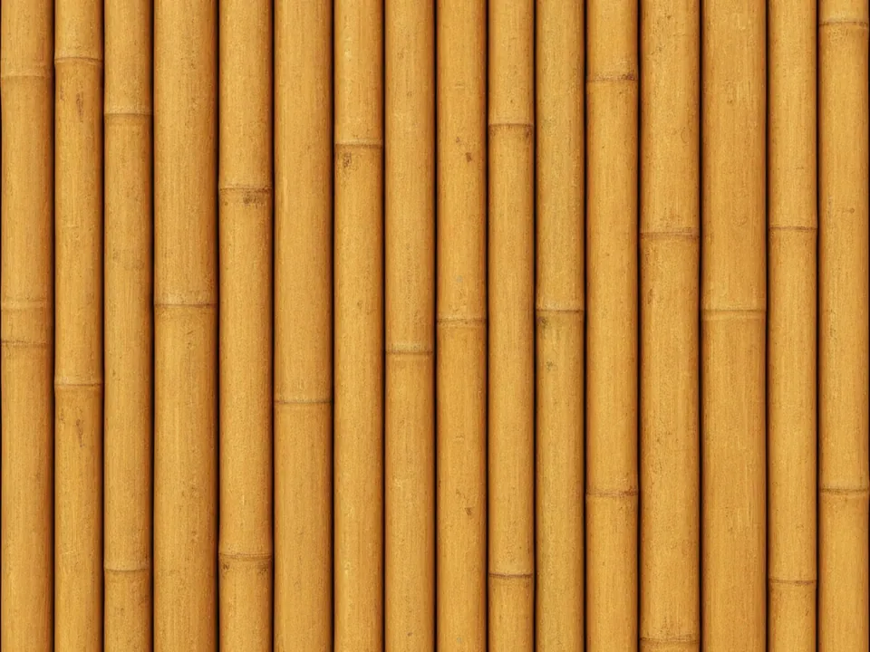
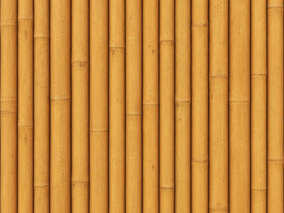
The set has two JPG files at 1600x1200 px. Each shows natural golden bamboo poles standing side by side, shot flat and frontal under even studio light. The nodes, the slightly raised rings where each pole segment joins, are clearly visible and repeat down the frame.
The variants are named Original and Warm. Original keeps the bamboo close to its natural straw and gold color, while Warm pushes the tone toward a richer honey shade, useful for a cozier, more amber mood. Both keep the same pole spacing, so swapping between them does not change the layout.
The poles are vertical and evenly spaced, so the texture has a clear structure rather than a random grain, closer in feel to woven fabric than to a photographed wood plank. That regularity makes it easier to predict how the pattern will crop at different widths.
Where it works
Bamboo reads as natural, sustainable and calm. It fits:
- Spa, massage and eco wellness websites
- Sustainable or zero-waste product packaging pages
- Asian cuisine restaurant menus and headers
- Garden, plant and nature focused blogs
It belongs to both wood backgrounds and nature and floral backgrounds. For a green companion texture, see green leaves background.
How to use it in CSS
Because the poles already repeat down the vertical axis, you can tile the image along one direction instead of stretching a single crop over a tall section. Repeating only on the x-axis keeps the node spacing consistent at any width.
.menu-header {
  background-color: #c9a227;
  background-image: url("bamboo-warm.jpg");
  background-repeat: repeat-x;
  background-size: auto 100%;
  background-position: center;
}
Keep the section height close to the source image height so the poles are not stretched out of proportion. For text, a dark card near the base color keeps enough contrast without masking the poles entirely.