What is in the set
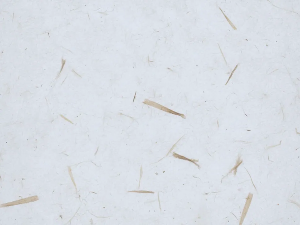
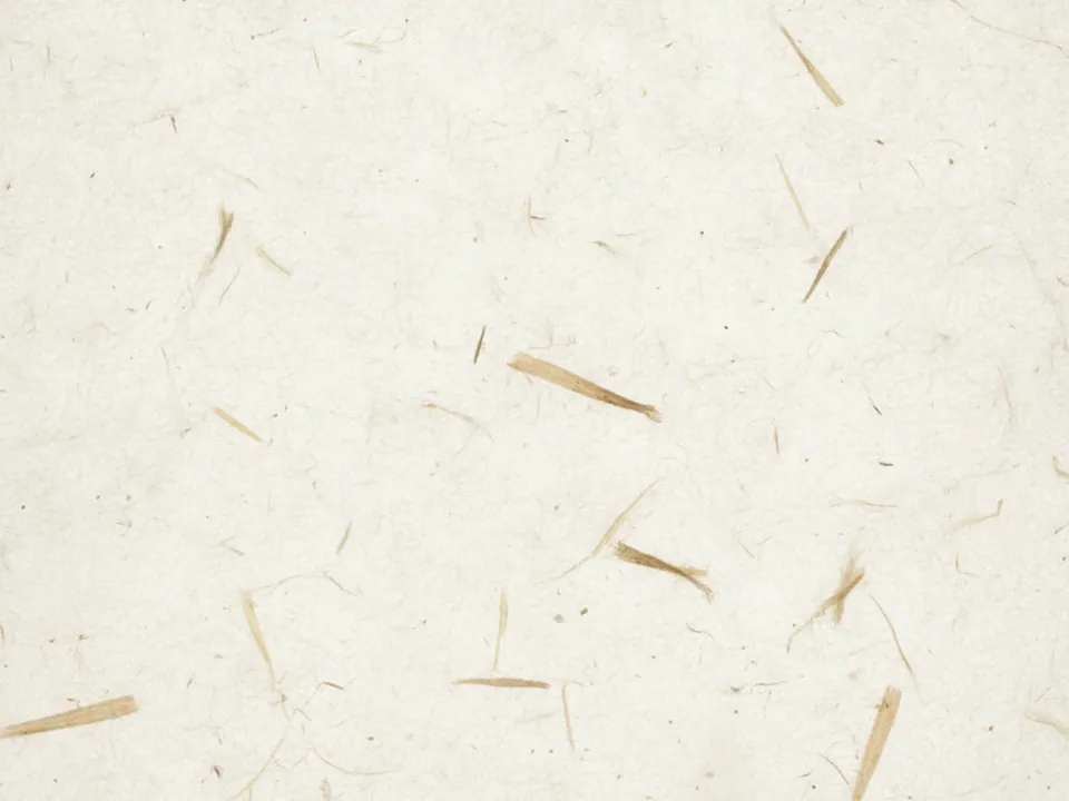
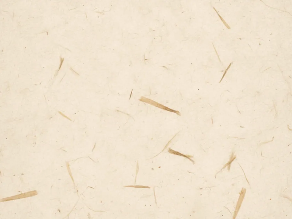
The set has three JPG files at 1600x1200 px. Each one is a flat, backlit scan of off-white washi rice paper. Long plant fibers run through the sheet in loose, irregular paths, and light passes through the thin spots, giving the paper a soft translucent quality.
The three variants are named Original, Warm and Cool. They share the same fiber pattern but shift the overall tone: Original sits close to a neutral off-white, Warm leans toward cream and straw, and Cool reads a touch grey and paper white.
Unlike old paper or kraft stock, washi has almost no stains or wear. The fibers are the only texture, which keeps the surface quiet and even across the frame.
Where it works
Rice paper reads as calm, handmade and a little precious. It suits pages that want quiet rather than noise:
- Spa, wellness and ryokan style hospitality sites
- Minimal design portfolios and studio pages
- Wedding and ceremony invitation layouts
- Editorial headers for essays and long reads
Browse more in paper backgrounds. For a rougher, more utilitarian paper surface, the kraft paper texture pairs well in a footer or a secondary section.
How to use it in CSS
Because washi is thin and pale, a plain fallback color keeps the layout steady while the image loads. You can also lay a tinted color over the paper with a blend mode, rather than editing the file itself.
.ceremony {
  background-color: #f1ece0;
  background-image:
    linear-gradient(rgba(214, 196, 150, 0.35), rgba(214, 196, 150, 0.35)),
    url("rice-paper-original.jpg");
  background-blend-mode: multiply;
  background-size: cover;
  background-position: center;
}
The gradient layer sits above the photo and the two blend together, so the same file can take on a warmer or cooler cast for different sections without a second export. More tinting techniques are in background blend mode.