What is in the set
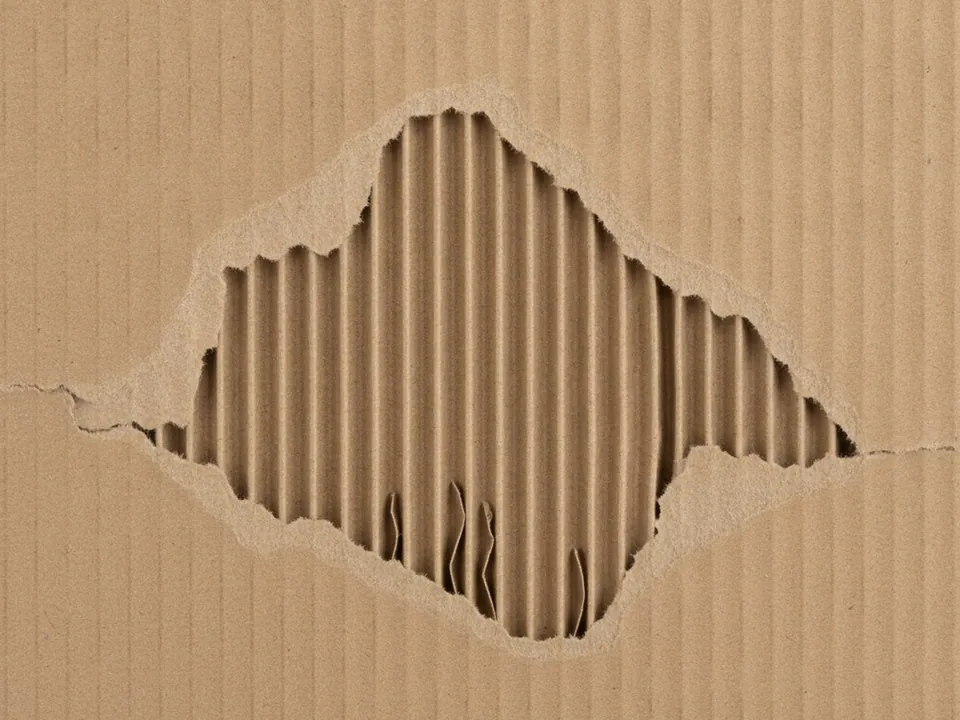
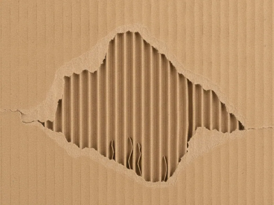
The set has two JPG files at 1600x1200 px. Each one is a flat, frontal photo of brown corrugated cardboard where the smooth outer layer has been torn away, revealing the wavy ridges of the inner fluting underneath, lit evenly across the frame.
The two variants differ in tone, with the original reading as a natural kraft brown and the second shifting slightly warmer. Both show the same ridge pattern and tear marks, so the composition stays consistent while only the color temperature changes.
The ridges run in one consistent direction across the frame, which gives the texture a subtle sense of motion compared with a flat sheet of brown paper.
Where it works
Corrugated cardboard reads as practical and raw material, which fits:
- Packaging, shipping and courier pages
- Moving and storage service sites
- DIY, craft and upcycling project blogs
- Eco friendly or recycled product branding
It is part of paper backgrounds. For a smoother, uncut paper surface in a similar kraft tone, see the kraft paper texture.
How to use it in CSS
Because the ridges run in one direction, rotating the crop with background-position adjustments between a landscape and portrait section keeps the ridge direction looking intentional rather than accidental at different aspect ratios.
.shipping-banner {
  min-height: 300px;
  background-color: #8a6a44;
  background-image: url("cardboard-02.jpg");
  background-size: cover;
  background-position: center;
}

.shipping-banner .tag {
  background: #fff;
  padding: 6px 14px;
  border: 2px dashed #3a2c1a;
}
A dashed border on a label element, as shown above, echoes real packing tape without needing a second image layer. For general guidance on sizing this kind of banner, see the CSS background image guide.
Pairing and type tips
Black, dark brown or white text all read clearly on this mid brown surface, so the choice depends on mood rather than contrast constraints. A stencil or stamped style font matches the shipping and packaging theme, while a plain sans suits a cleaner eco branding look.
Keep accent colors close to the natural palette: kraft brown, black and white, with at most one bright color such as a shipping orange or recycling green for calls to action.
Avoid placing detailed product photography directly over the ridge pattern, since the wavy lines can compete with product edges. A flat color card behind product shots keeps them clearly separated from the texture.