What is in the set
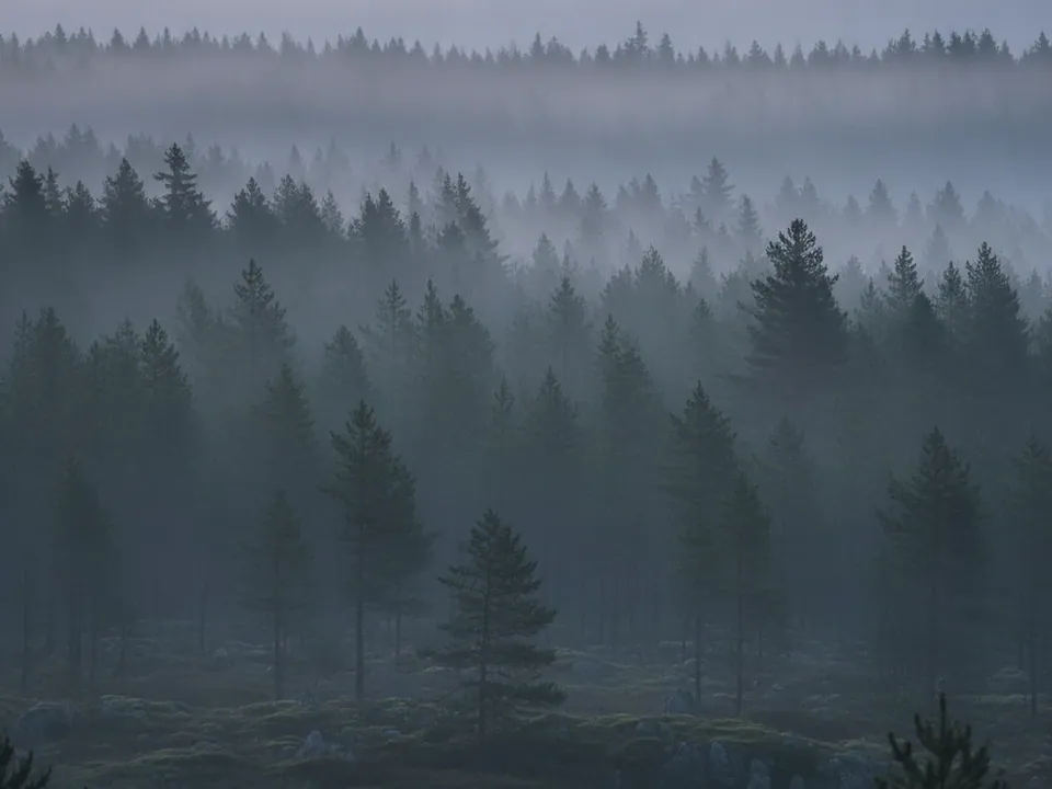
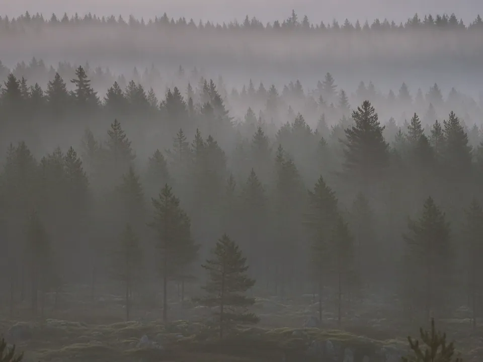
The set has two JPG files at 1600x1200 px, both photos of a misty pine forest at dawn. Layered rows of tree silhouettes recede into soft fog, with muted green and grey tones throughout and no people anywhere in frame.
The variants are named Original and Warm. Original keeps the cool, misty grey green of early dawn light, while Warm adds a faint amber cast to the fog, closer to the moment just before sunrise breaks through. Both keep the same layered depth, with the nearest trees darkest and the furthest almost dissolved into the mist.
Because the composition reads from near dark to pale fog, there is plenty of open, low contrast sky toward the top of the frame for a heading or short line of text.
Where it works
Misty forest reads as calm, reflective and quietly dramatic. It fits:
- Wellness, meditation and sleep apps
- Outdoor gear, hiking and camping brands
- Nature documentary and podcast promos
- Slow living, journaling and personal blogs
It belongs to nature and floral backgrounds. For an open, brighter sky in the same category, see the blue sky with clouds background.
How to use it in CSS
The muted tones here suit a dark themed page well, since the fog and shadow already sit close to a dark palette. Keep the fallback color close to the misty grey green so there is no mismatch while the image loads, and add a light overlay only where text needs to sit.
.hero {
  background-color: #3c4a40;
  background-image: url("misty-forest-original.jpg");
  background-size: cover;
  background-position: center;
}

.hero .eyebrow {
  background: rgba(10, 16, 12, 0.45);
  color: #f3f6f1;
  padding: 6px 14px;
  display: inline-block;
}
That overlay brings pale text comfortably past 4.5:1 contrast even over the lightest fog, while unstyled dark text in the sky area alone can drop close to that line. For more on choosing background tone for a dark theme, see backgrounds for dark mode.