What is in the set
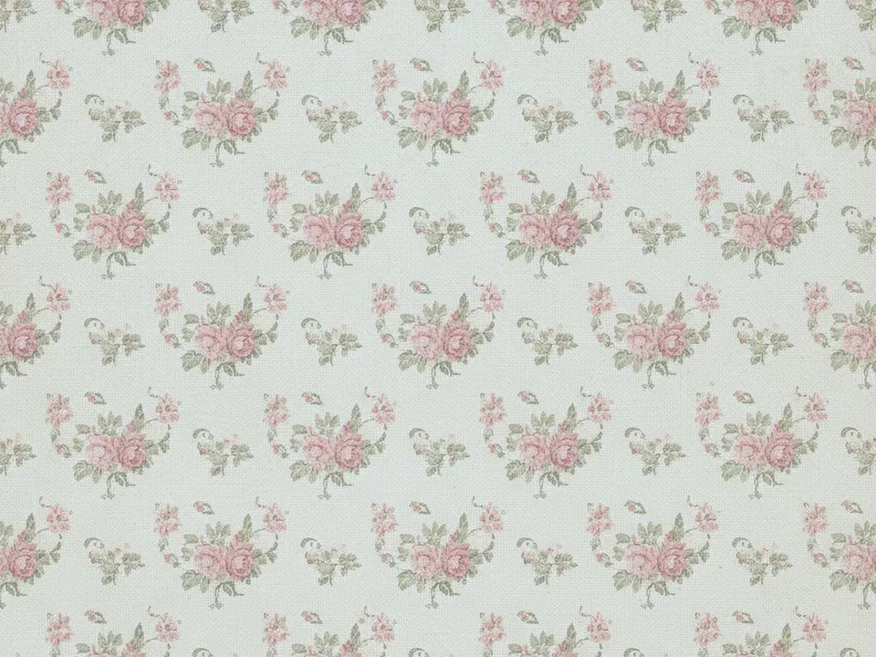
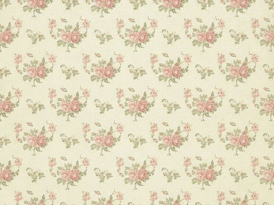
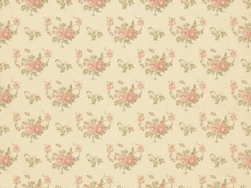
The set has three JPG files at 1600x1200 px, each a flat scan of a 1950s style floral wallpaper. Small roses and leaves repeat across a cream ground, with the colors faded and a light paper aging visible in the surface, as if from an old roll of wallpaper rather than a fresh print.
The variants are named Original, Warm and Cool. Warm shifts the cream and rose tones toward peach, while Cool pulls the leaves and background slightly toward a dustier grey green. All three keep the same print scale, so the roses stay a similar size across files.
Because the print repeats evenly, the pattern holds together at almost any crop, from a tall phone banner to a wide header strip.
Where it works
This pattern reads as homely, gentle and a little retro. It suits:
- Tea rooms, bakeries and cozy cafe sites
- Vintage, thrift and secondhand shop pages
- Wedding, shower and garden party invitations
- Home decor and craft blog headers
It sits in vintage retro backgrounds and nature and floral backgrounds. For a heavier, more formal floral in the same era, see the vintage damask wallpaper.
How to use it in CSS
Because the print is faded and low contrast, you can often place dark text directly on the cream areas without a card, as long as the text sits away from the busiest clusters of roses. Test the ratio where the text actually falls, not on the cleanest patch of the image.
.menu-header {
  background-color: #f1e9d8;
  background-image: url("vintage-floral-warm.jpg");
  background-size: 600px 450px;
  background-repeat: repeat;
  padding: 32px 24px;
}

.menu-header h1 { color: #4a3b2a; }
Dark brown text at this weight against the cream ground clears 4.5:1 contrast easily, since the floral details are pale. If you plan to overlay larger blocks of text, check the exact spot with a contrast tool rather than assuming the whole image behaves the same. More on this in text contrast on backgrounds.